The network for creativity
Join 1.25M professional creatives like you
Connect with clients, get discovered, and run your business 100% commission-free
Creatives on Contra have earned over $150M and we are just getting started
Back to feedPost
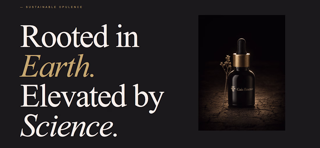
Does setting the vibe before the prompt actually change what Lovable builds?
I configured typography, color, and layout density before writing a single line — then let it build a full brand world page for a fictional luxury skincare brand, Gaia Essence.
Cormorant Garamond + DM Sans Light + parchment + obsidian + burnished gold. Set in the aesthetics panel. Not in the prompt.
What landed: the font pairing alone shifted the output from generic template to editorial. The tool made creative decisions — roman numerals, gold italic treatment, dark/light section contrast — without being asked.
What surprised me: "no buttons, pure brand world" was interpreted correctly on the first run.
What I'd change: more control over line height and surface hierarchy within the color token system.
The aesthetics update changes the quality ceiling, not just the starting point.
What are you building with it? Drop it below.
nice work
good job
The network for creativity
Join 1.25M professional creatives like you
Connect with clients, get discovered, and run your business 100% commission-free
Creatives on Contra have earned over $150M and we are just getting started
Related posts
Got two new hero section designs I worked on recently..
Both follow very different directions:
➤ Cinematic + Minimal
➤ Bold + Energetic
Trying to figure out which one feels stronger overall.
Which layout do you think works better — left or right?
14 voted
33%
28 voted
67%
42 votes
Closed
Will go for Cinematic+Minimal
Okay brand designers & strategists, this one’s for you 👀
A founder hires you because their brand “looks good” but still isn’t converting.
What’s your 3-step approach for fixing the issue?
First of all, is to talk about positioning and visibilities and if this is perfectly sorted out sales will start coming in
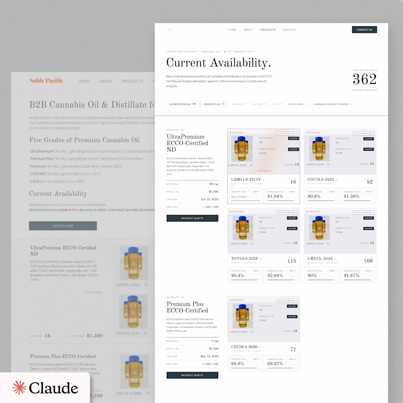
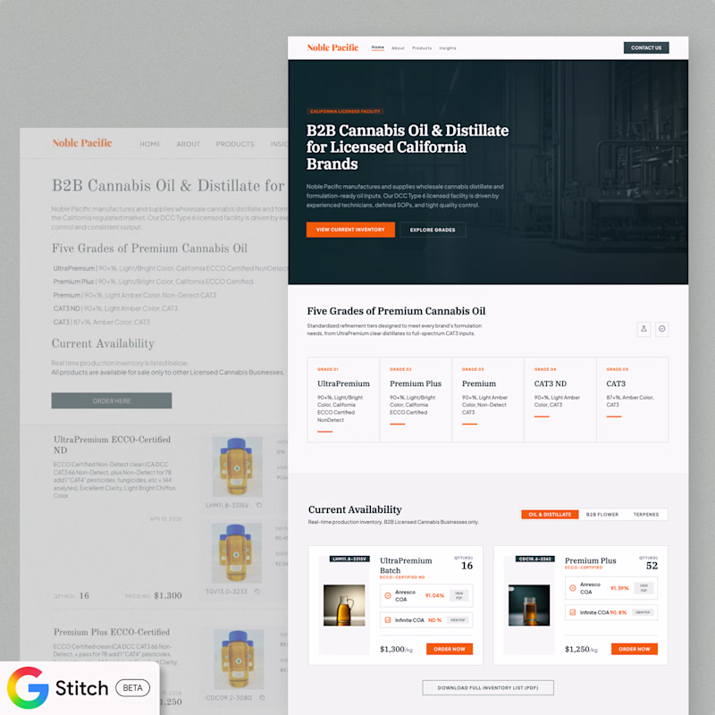
How's Vibe Design going for you?
Bellow is a single prompt Product page redesign with Claude Design and Google Stitch. Which one you'd go with? Any thoughts / examples of results you're getting?
16 voted
42%
22 voted
58%
38 votes
Closed
Trending
Claude
Claude has entered the design space. How are you using Claude Design?
Contra University
Learn from expert creatives how to earn more using next-gen AI tools.
creativeaiflow
Creative AI workflows are evolving. What tools do you use, and what are their strengths and weaknesses?
portfolioreview
The best portfolios tell a story, not just show a grid. Share yours for feedback.
freelancerlife
Freelancer life is wins, pivots, and everything in between. What’s yours right now?