The network for creativity
Join 1.25M professional creatives like you
Connect with clients, get discovered, and run your business 100% commission-free
Creatives on Contra have earned over $150M and we are just getting started
Back to feedPost

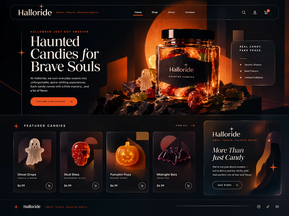
Color Matches The Vibe Of the Hauntedness Everytime ⋆。°✩🎃✩°。⋆
Designed this a fine UI for a fictional candy website called 'Halloride' which displays my exellence in designing UI with clear, accurate and consistent brand identity using simple tools like Adobe and Canva
I'm available for massive projects + my services are open.


The network for creativity
Join 1.25M professional creatives like you
Connect with clients, get discovered, and run your business 100% commission-free
Creatives on Contra have earned over $150M and we are just getting started





Related posts

Doppel — Threat Graph
Making complex cybersecurity concepts clear through motion.
For the Doppel Threat Graph product film, I contributed to the visual development and animation. The product connects digital threats across multiple channels, revealing how individual signals form part of a coordinated attack campaign.
The challenge was to translate this technical functionality into a clear visual narrative—showing why the connections between threats matter and how they help reveal the bigger picture.
My work covered storyboard and motion exploration, animation, and scene refinement throughout the feedback process. The focus was on introducing information progressively and guiding attention toward the relationships central to the product’s value.
The result is an animated product film that introduces Doppel Threat Graph and makes its core functionality easier to understand. The project demonstrates how motion design can bring clarity to a complex software product.
Services: Storyboard Exploration · Motion · Animation


That's unbelievable great job 🎉🎉🔥🔥

Why do so many law firm websites look exactly the same?
Dark blue.
Courthouse imagery.
Scales of justice.
A serious-looking attorney standing in front of a city skyline.
It signals “law firm” immediately.
But does it actually make the firm more trustworthy?
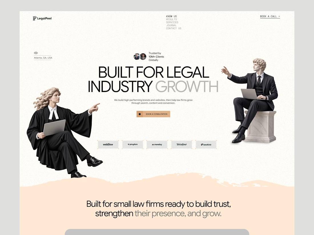
We’ve been redesigning LegalPeel, our studio focused specifically on the legal industry, and this is one of the directions we’ve been exploring.
The goal isn’t to make legal feel less professional.
It’s to see how far we can move away from the usual visual language without losing the credibility a law firm needs.
This is where the homepage is heading.
Would this direction make you trust a legal-focused company more, or has it moved too far away from what you expect from the industry?

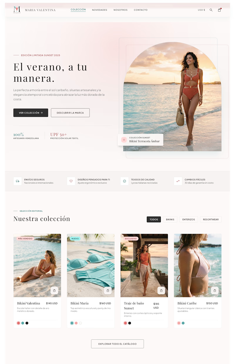
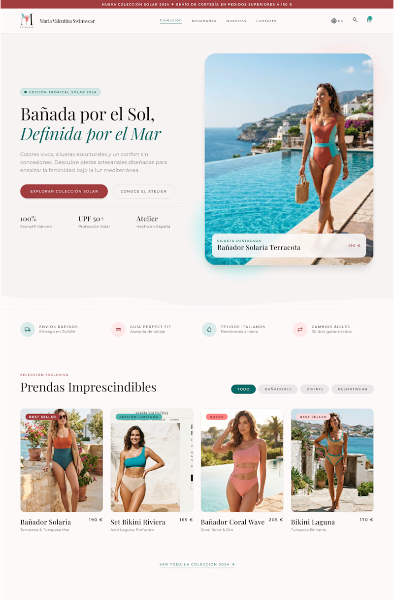
I created two design versions for this swimwear store owner client. Both are elegant and attractive with lots of white space. The brand is all about exclusiveness, elegance, and subtle details. Which one do you think is better?
4 voted
50%
4 voted
50%
8 votes
Closed

Creative work