The network for creativity
Join 1.25M professional creatives like you
Connect with clients, get discovered, and run your business 100% commission-free
Creatives on Contra have earned over $150M and we are just getting started
Back to feedPost
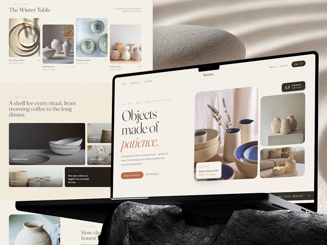
Not everything worth buying should be bought in a hurry. That idea shaped the Seram. e-commerce experience. Built around small-batch stoneware, craftsmanship, and everyday rituals, the website was designed to feel more like a quiet studio than a busy online store.
The experience brings together:
→ Seasonal collections
→ Curated product discovery
→ Craft and studio storytelling
→ Practical product details
→ Customer reviews
→ Clear shopping paths
The visual system stays warm, editorial, and restrained so the objects remain the focus. Because when something is made with patience, the digital experience should give people a reason to slow down and appreciate it.
Seram.
Objects made of patience.




Thank you so much 🙏

loving the pastel colours 👍

Awesome Good work
The network for creativity
Join 1.25M professional creatives like you
Connect with clients, get discovered, and run your business 100% commission-free
Creatives on Contra have earned over $150M and we are just getting started






Related posts

AI can build the UI in minutes.
Bringing it up to a good standard, still needs a designer. Agree or disagree?

I see some of your work and honestly your work is really premium 🎉🎉
Great job Alex🎉🎉🔥🔥


Your Hero Section Has One Job: Be Clear.
You don’t need huge headlines or long explanations. You need the right image + short headline + clear offer.
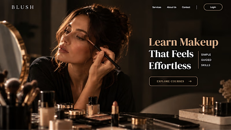
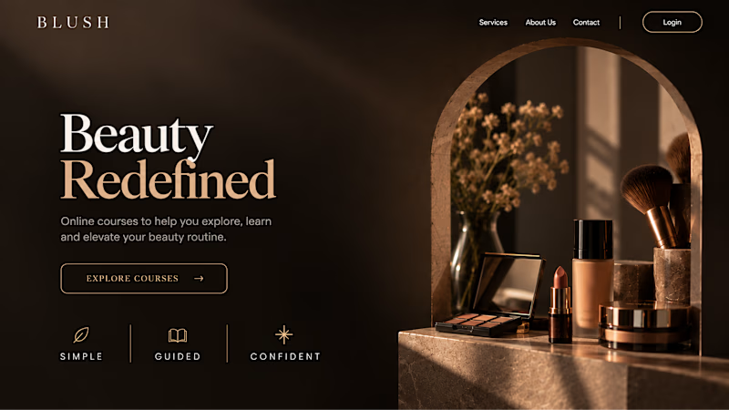
For the first version, we worked on the branding, the image and the copy together, so at first glance it’s clear: this is a makeup course, and here’s what you’ll get.
The second version is still beautiful and still feels like beauty. But what are you actually getting? A makeup course? Products? A store? That’s the problem with a Hero that looks good but isn’t thought through.
Your first screen doesn’t need to say everything. It just needs to say the right thing.

22 voted
61%
14 voted
39%
36 votes
Closed


✈️ What if booking a flight was actually fun?
I wanted to make the whole experience feel less like filling out a form and more like playing with an interface.
Turn your sound ON and give it a watch 🎧🔊.

THIS IS GREAT