The network for creativity
Join 1.25M professional creatives like you
Connect with clients, get discovered, and run your business 100% commission-free
Creatives on Contra have earned over $150M and we are just getting started
Back to feedPost

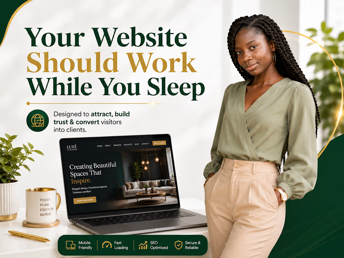
Most business owners don't lose customers because they have a bad product.
They lose customers because their website doesn't answer one simple question:
"Why should I choose you?"
A high-converting website should:
✅ Build trust within the first few seconds
✅ Clearly explain what you do
✅ Make it easy for visitors to take action
✅ Work perfectly on every device
✅ Load fast without frustrating users
Your website isn't just an online brochure, it's your best salesperson, working for you 24/7.
If your website isn't generating inquiries or sales, it may be time for a redesign.
What's the biggest challenge you're facing with your current website?
Let's discuss it in the comments. 👇
#WebsiteDesign #WordPress #Elementor #SmallBusiness #BusinessWebsite #WebDesigner #UXDesign #WebsiteRedesign #Freelancer #Contra


The network for creativity
Join 1.25M professional creatives like you
Connect with clients, get discovered, and run your business 100% commission-free
Creatives on Contra have earned over $150M and we are just getting started
Related posts

I migrated Pi-lit's site from WordPress to a custom-coded, AI-native website with its own hosting. The result:
-A scalable design system that also supports their ecommerce
-30+ pages with consistent branding throughout
-Animated illustrations of their scenes and products that bring the roadway safety story to life
See Full Case Study


Lovely work


We’re testing two filtering layouts for a template library.
Top Filters
The filters are placed above the content. This option feels lighter, leaves more space for the cards, and works well when there are only a few main categories.
Sidebar Filters
The categories remain visible in the sidebar. This makes the available options easier to scan and works better for more complex filtering, but takes up some of the content space.
Which layout would help you find the right template faster?

24 voted
39%
37 voted
61%
61 votes
Closed

Such a clean presentation. You can tell a lot of thought went into this.


Designers, which direction would you go with: photography or illustration?
83 voted
69%
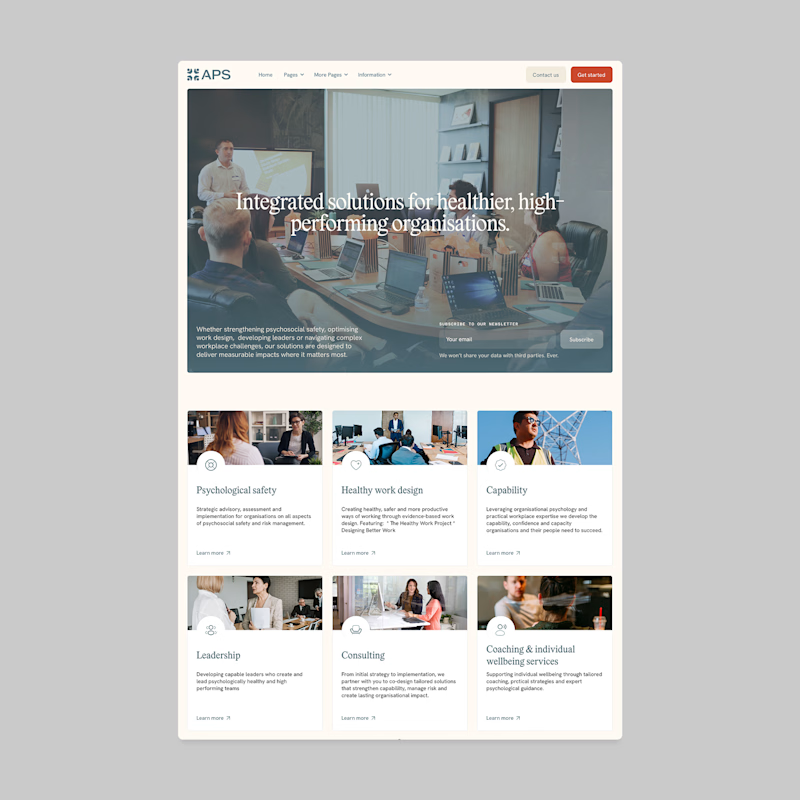
37 voted
31%
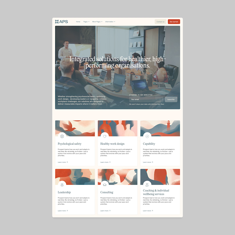
120 votes
Closed

I'll prefer photos, specially talking about organizations in your page, human faces and real scenarios can have a better effect in this case.


