The network for creativity
Join 1.25M professional creatives like you
Connect with clients, get discovered, and run your business 100% commission-free
Creatives on Contra have earned over $150M and we are just getting started
Back to feedPost
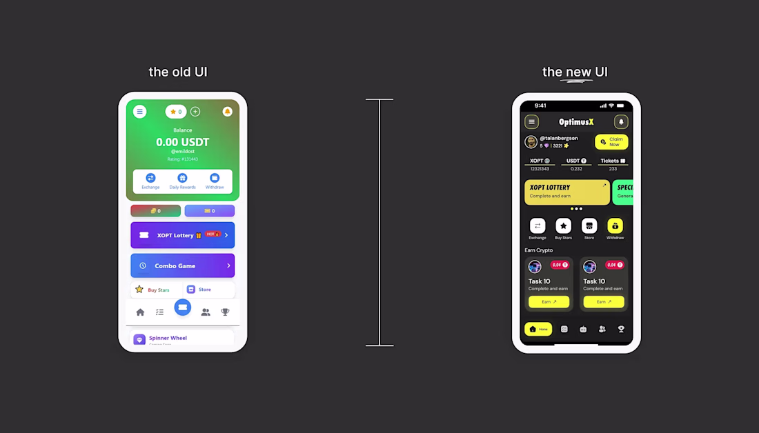
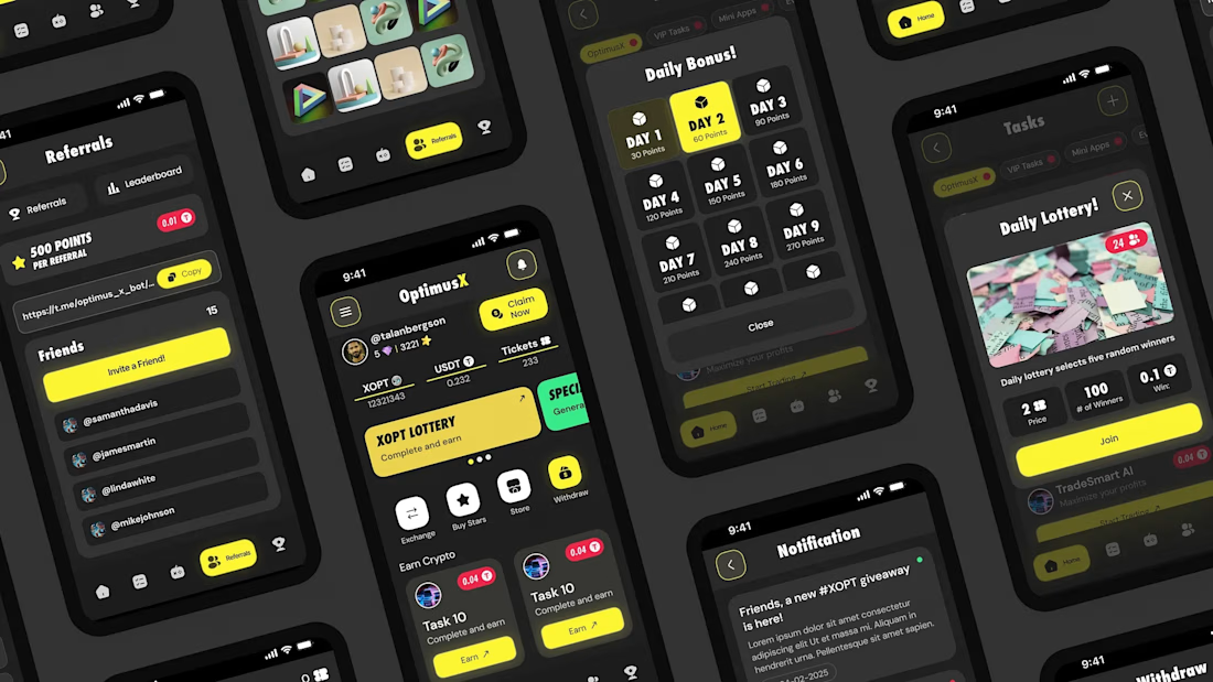
The goal was to move away from the old cluttered design and create something more effective and modern.
What changed? I switched to a sleek Dark Mode with bold yellow accents to give it a vibe. I also cleaned up the layout, making the balances easier to read and the navigation much more intuitive. Now, the app feels professional, organized, and way more user-friendly.
I’m really happy with how this transformation turned out. Which version do you prefer? Let me know your thoughts! 👇
The network for creativity
Join 1.25M professional creatives like you
Connect with clients, get discovered, and run your business 100% commission-free
Creatives on Contra have earned over $150M and we are just getting started
Trending
Claude
Claude has entered the design space. How are you using Claude Design?
Contra University
Learn from expert creatives how to earn more using next-gen AI tools.
creativeaiflow
Creative AI workflows are evolving. What tools do you use, and what are their strengths and weaknesses?
freelancerlife
Freelancer life is wins, pivots, and everything in between. What’s yours right now?
Related posts
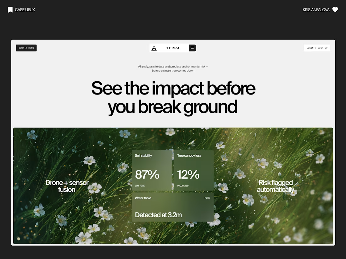
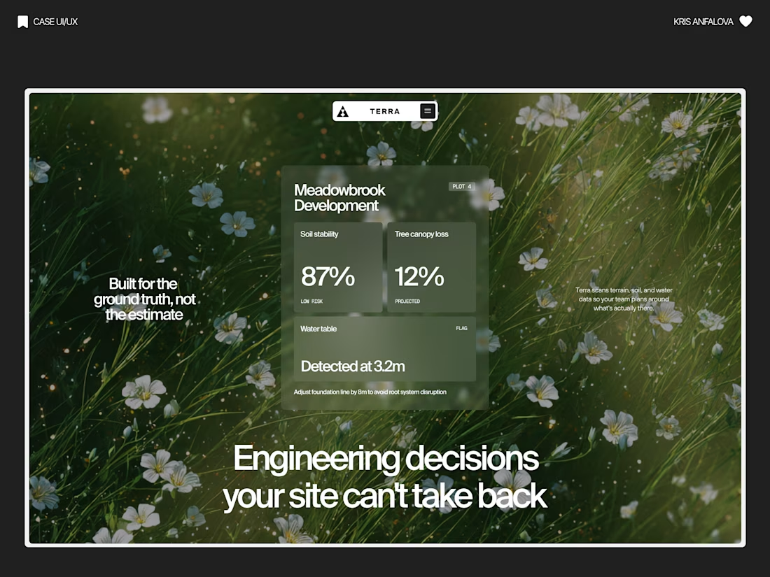
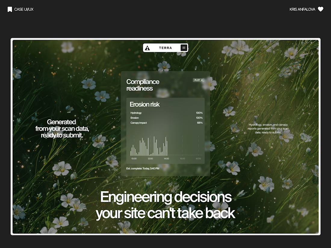
Terra — AI Environmental Risk Platform
Designed the landing page and product UI for Terra — a platform that helps land developers and engineering teams see environmental risk (soil stability, tree canopy loss, water table depth) before breaking ground.
The challenge:
Development decisions are usually based on estimates, not real ground data — and by the time issues show up, it’s often too late to reverse them. The interface needed to make complex sensor/AI data feel immediate and trustworthy, without losing emotional weight.
The solution:
Raw, organic photography (wildflowers, grass, natural terrain) paired with clean glass-panel data cards — creating a visual tension between “nature” and “precision engineering.” Bold editorial typography carries the emotional message, while translucent metric cards surface real numbers: soil stability, canopy loss %, water table depth.
A strong example of turning dense environmental data into something a non-technical stakeholder can understand in seconds.
Nice one
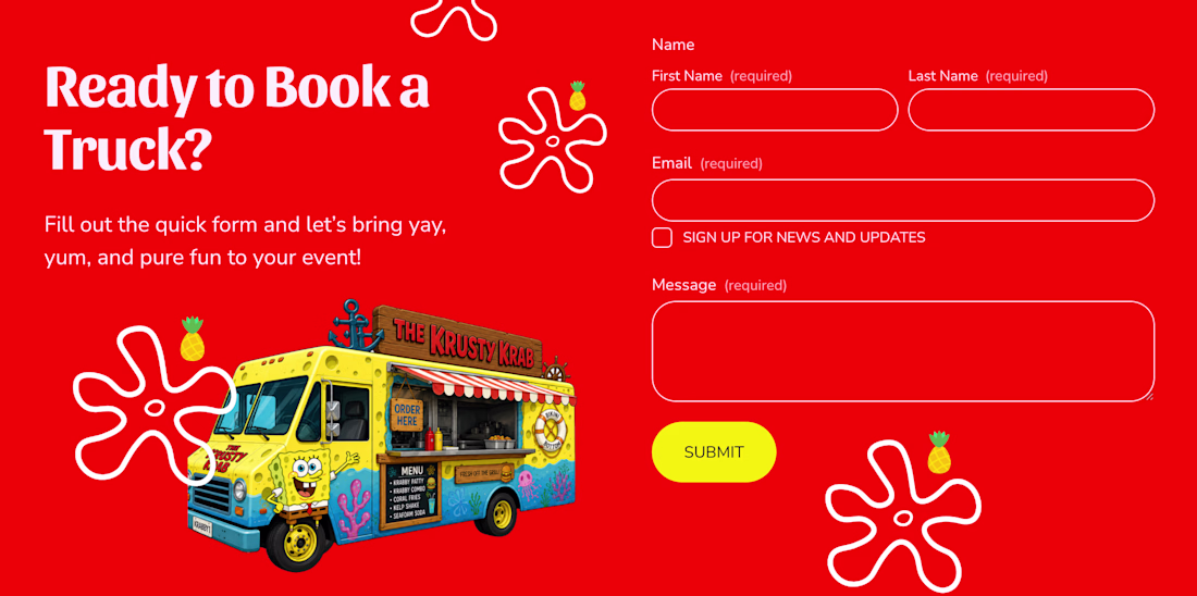
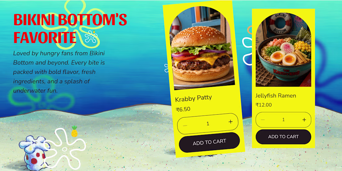
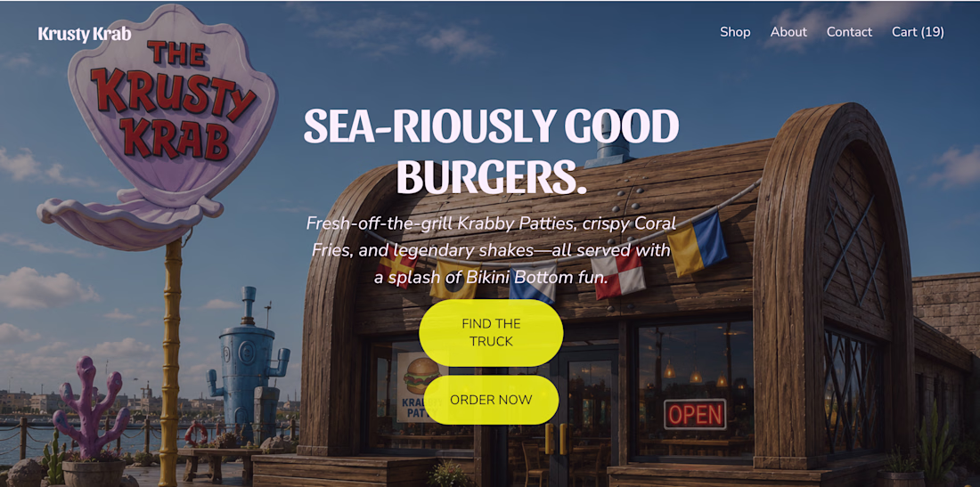
What if the Krusty Krab hit the road? 🍔🛻
I reimagined the iconic Krusty Krab as a real-world food truck and brought the idea to life with Squarespace. From playful visuals and custom illustrations to an immersive scrolling experience, every section was designed to capture the charm and nostalgia of Bikini Bottom. I also used Finish Layer to add animations, hover interactions, layered visuals, and smooth transitions that make the experience feel more dynamic and engaging.
🔗 Website: https://cardioid-helicon-94jp.squarespace.com
🔒 Password: square
squarespacedesignwebsitedesignUI DesignUX DesignSquarespaceSquarespace Website Designsquarespacechallenge
The Future in Black was built for Joy Fennell to hold a story that needed more than a standard portfolio site. Our goal from the start was to make the site feel archival and alive at once, part digital exhibit, part living brand presence, so every design decision was made to support that feeling rather than just present information.
We started with structure: how should a visitor move through this content, and what pace should that movement have? That question shaped our use of Finish Layer's block animations. Text reveals on scroll, so the story unfolds in beats instead of arriving all at once, closer to reading a book than scrolling a website. Images use hover interactions to invite a second look without pulling focus from the words around them.
From there we layered in movement. Shapes transform and shift position as the visitor scrolls, adding depth and a sense of motion that a static layout couldn't carry. This was the piece that took the most iteration, getting the timing and scale of these transforms to feel intentional rather than gimmicky meant testing several versions before landing on the current pacing.
Typography carried a lot of the brand's identity, so we uploaded Million and Inter Tight rather than relying on Squarespace's native font library. Million gives the site its editorial voice in headlines, and Inter Tight keeps body copy clean and legible against it.
The result is a site built on Squarespace's foundation, using Finish Layer's native tools alongside custom CSS and JS, pushed toward something that reads as custom, editorial, and specific to one person's story rather than a repeatable formula.
FigmasquarespacedesignsquarespacewebsitesSquarespace Website DesignWebsite CSSSquarespacesquarespacechallenge
Hey @Golden Launch this is awesome but it looks like the link you included in the comments isn't working. make sure the link is active in order for your submission to be judged 😃