The network for creativity
Join 1.25M professional creatives like you
Connect with clients, get discovered, and run your business 100% commission-free
Creatives on Contra have earned over $150M and we are just getting started
Back to feedPost

[👀Paid Collaboration] Looking for a Freelance UI/UX Designer (AI / MCP Focus)
Looking for a strong product-minded UI/UX designer with technical awareness to collaborate on projects in the MCP / ChatGPT Apps space.
This involves designing AI-native interaction patterns, exploring conversational + structured UI, and researching emerging UX standards. Potential for short-form product content as well.
You should be systems-oriented, interaction-strong, and curious about AI agents and next-gen app design.
If interested, please DM me with a short intro + relevant work.


Hey Juan, looks like an exciting opportunity! 🎉 Feel free to post a job to get more visibility. Here’s an article for reference: How to Post a Job on Contra
If you have any questions, you can reach out to hello@contra.com
The network for creativity
Join 1.25M professional creatives like you
Connect with clients, get discovered, and run your business 100% commission-free
Creatives on Contra have earned over $150M and we are just getting started








Related posts


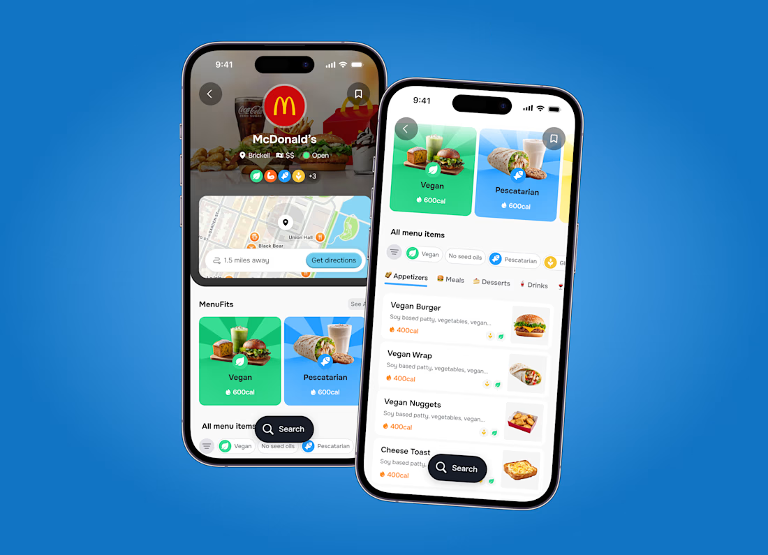

Super clean work!

Ask a coding agent to "make the UI look premium", and you get whatever it felt like building that day.
I give mine constraints instead.
I keep a list of sites that generate design markdown files for AI builds. Typography, colours, spacing, radius, shadows, components, states, responsive behaviour. A full design system in a single file.
The workflow, before any screen gets built:
Pick a visual direction. Generate the .md against what the product actually does and the outcome it needs to hit. Drop it into Claude Code or Codex or Kimi or Cursor. Use /design to fix what stays consistent across every screen.
Now the agent follows a spec, not a mood.
That file, plus a folder of five or six visual references, is the first thing I prepare before a client build.
The sites:
https://www.typeui.sh/
https://design-md.hyperbrowser.ai/
https://neuform.ai/
https://www.aura.build/
https://www.designmd.supply/
https://open-design.ai/
https://designmd.me/
Enjoy. Build. Ship.
Cheers.

This is so true! 🔥 "Make it premium" is the most subjective prompt ever - every agent has its own version of premium haha! Giving constraints like typography, colors, spacing, radius, shadows, components, states is the real pro move. That's how you get consistent design...

Kestrel - SaaS Website Design & Animation:-
I designed Kestrel, a modern SaaS website focused on clarity, simplicity, and a seamless user experience. I used elegant typography, soft colors, structured content sections, and interactive dashboard visuals to make complex product information easier to understand.
I also brought the design to life with smooth camera movements, dynamic screen reveals, seamless transitions, and realistic 3D laptop presentations. My goal was to combine functional UI design with engaging motion to create a polished digital experience.


Gorgeous 😍