The network for creativity
Join 1.25M professional creatives like you
Connect with clients, get discovered, and run your business 100% commission-free
Creatives on Contra have earned over $150M and we are just getting started
Back to feedPost

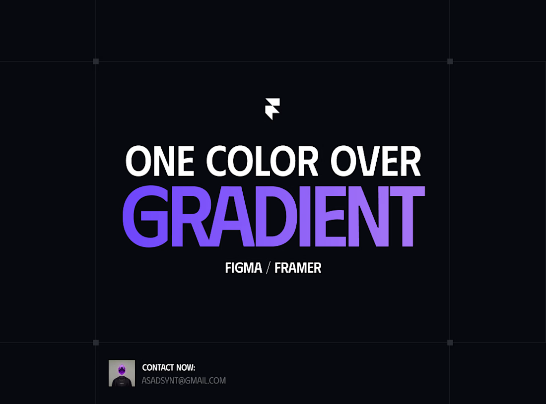
Go and check top 20 templates on @framer marketplace
you will find 95% of them having only single color in their button on cards
Instead of gradients
Why?
Because it is easy to edit for clients who buys templates
Don't ruin the experience of client in order to make your website look fleshy
Give your website 1-2 WOW factor and then keep your website simple and clean

This really stands out. The effort and thought behind it are obvious, and it shows in the final result. Keep pushing like this, you're building something remarkable.

Great job 👌
The network for creativity
Join 1.25M professional creatives like you
Connect with clients, get discovered, and run your business 100% commission-free
Creatives on Contra have earned over $150M and we are just getting started
Related posts


Looks Good


Added micro-animation to the hero section of the new Framer template I’m working on - Spandana.
Let me know your thoughts ⬇️


Trending


FLORA
Reusable workflows are replacing one-off prompts in creative AI. Share what you're building in FLORA.

Contra University
Learn from expert creatives how to earn more using next-gen AI tools.
portfolioreview
The best portfolios tell a story, not just show a grid. Share yours for feedback.
freelancerlife
Freelancer life is wins, pivots, and everything in between. What’s yours right now?
aivideo
AI video tools are moving at warp speed. Which ones are you experimenting with?