The network for creativity
Join 1.25M professional creatives like you
Connect with clients, get discovered, and run your business 100% commission-free
Creatives on Contra have earned over $150M and we are just getting started
Back to feedPost
Taste Test

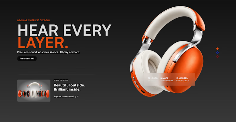
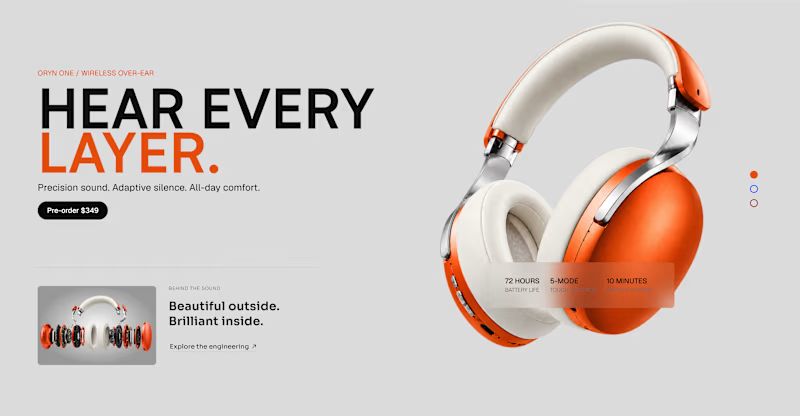
Same hero, two different moods.
Working on a new product landing page in Framer. Which direction would you go with?
☀️ Light theme
🌙 Dark theme
Vote below. Curious to hear what makes your pick work better 👇

7 voted
33%
14 voted
67%
21 votes
Closed

I would go for light, complements the design and colors better for me

I would like to pick dark theme.👍


Excellent work !

Going with Dark theme


light! it feels natural & airy.

Voting dark theme here. The orange headphones pop so much harder against black, and it matches the "hear every layer" line better than the light version does. Light theme feels safer but dark is doing more work for the product.

Both look interesting, but I'd vote for the Light theme. But let's make a dark mode button! 😂
The network for creativity
Join 1.25M professional creatives like you
Connect with clients, get discovered, and run your business 100% commission-free
Creatives on Contra have earned over $150M and we are just getting started











Related posts

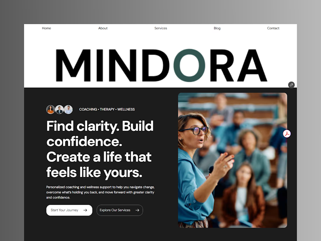
Introducing Mindora — a Life Coaching & Wellness Framer Template.
I designed Mindora for life coaches, wellness professionals, and personal growth brands looking for a calm, modern, and welcoming online presence.
Inspired by clarity, confidence, and meaningful growth, Mindora features a thoughtful layout, dedicated service sections, a blog for sharing valuable insights, and a clean visual style designed to help brands connect with their audience.
Built with Framer, it's a customizable starting point for creating a professional coaching or wellness website.
Explore Mindora and bring your next website idea to life.
Kindly check it out the template: https://www.framer.com/marketplace/templates/mindora-life-coach/



Great work

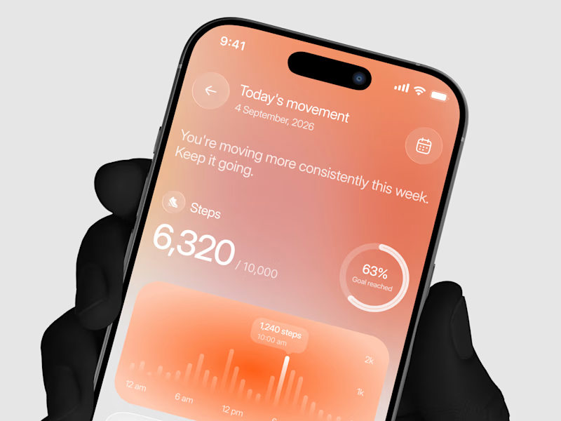
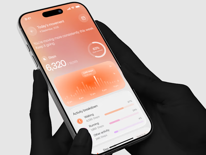
Designed a step tracking screen where you can see your daily progress and weekly trend in one glance.
Same screen, two shots. Which one would stop your scroll? 👀

11 voted
73%
4 voted
27%
15 votes
Closed


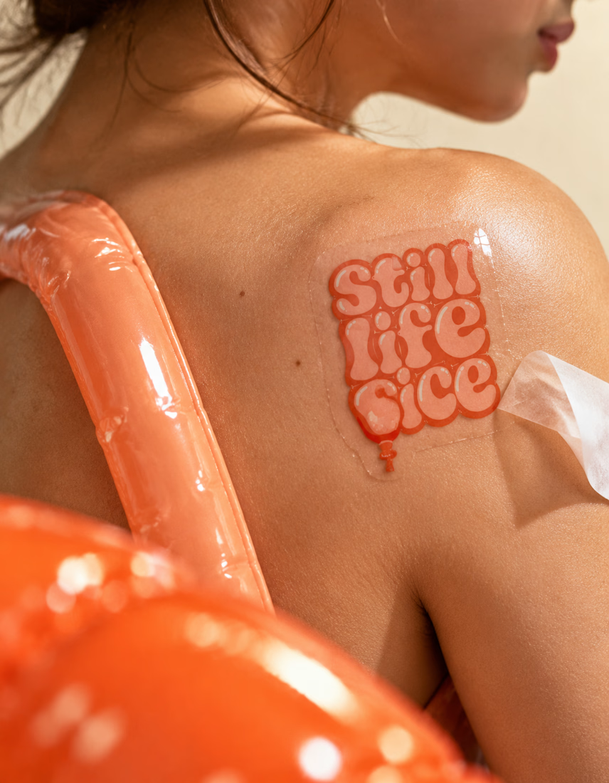
A flower that inflates arrives in the mail.
Next month, a phone made of shell.
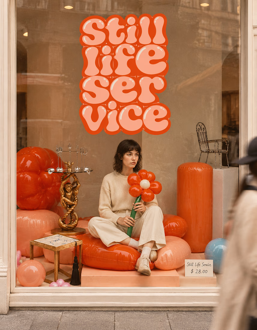
STILL LIFE SERVICE. Case study dropping soon.
Which object earns your shelf? Reply below.
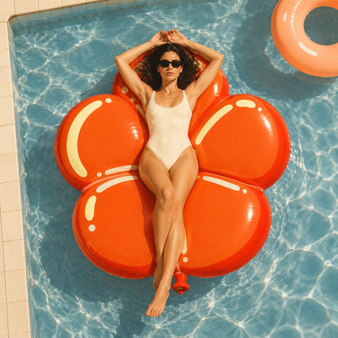

The inflatable flower. Only houseplant I'm guaranteed not to kill. Also, a new object every month is a sneaky good retention hook, people will stay subscribed just to see what's next.