The network for creativity
Join 1.25M professional creatives like you
Connect with clients, get discovered, and run your business 100% commission-free
Creatives on Contra have earned over $150M and we are just getting started
Back to feedPost
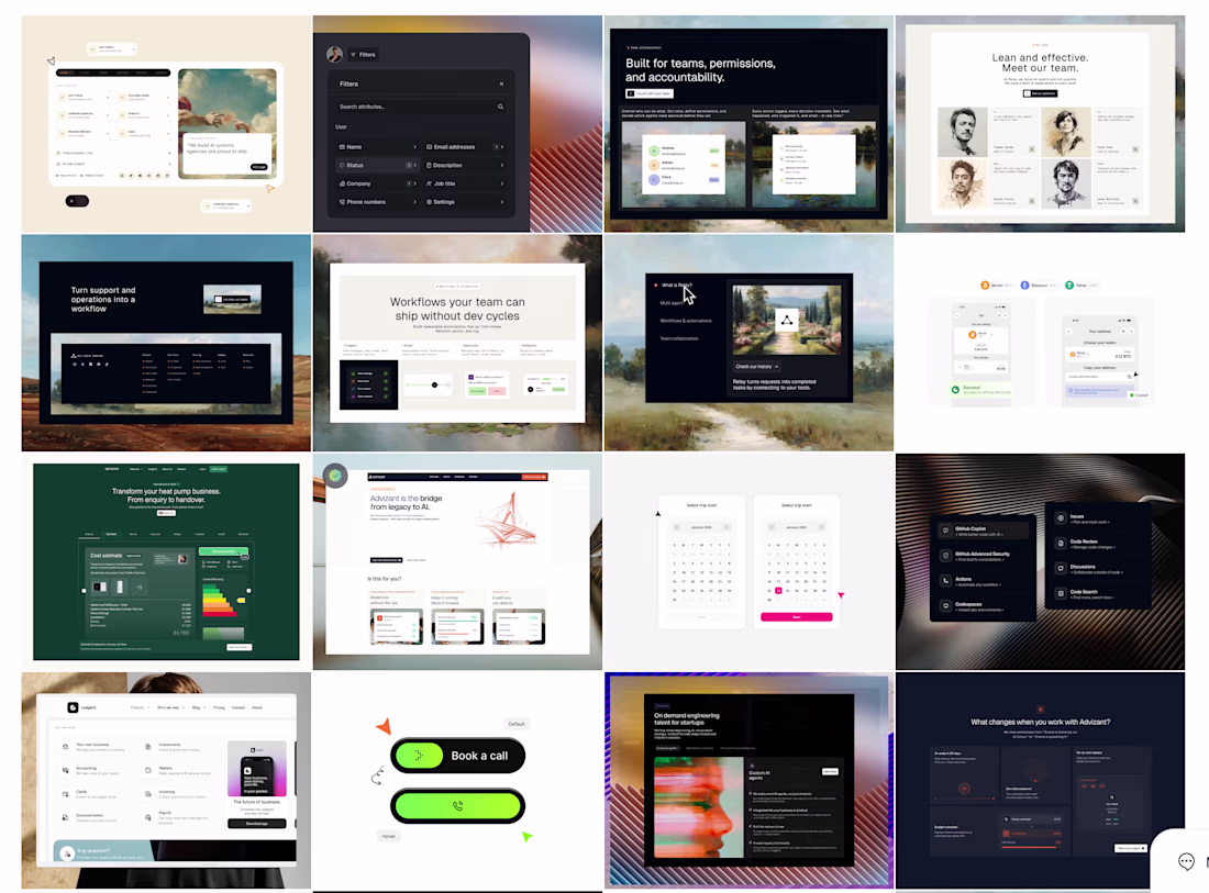
I recently redesigned my website, which presents Framer services and template work, and the process became more technical than visual over time.
The interesting part is that most improvements came from reducing complexity rather than adding more interface elements.
Less motion competing for attention.
More controlled contrast between surfaces.
More intentional spacing behavior between content-heavy sections.
Stronger typography hierarchy instead of relying on decorative visuals.
I’ve been thinking a lot lately about how modern portfolio websites often optimize for immediate visual impact but quietly reduce readability and trust after a few seconds of navigation.
So the goal here became creating something that feels structured and calm, even when the interface becomes dense.
Still refining the system before considering it finished, and would genuinely value critiques from other Framer designers/developers here.
Especially around pacing, hierarchy, and areas where the experience still feels unresolved.
Looks Good
Thanks Rasel! I appreciate it
The network for creativity
Join 1.25M professional creatives like you
Connect with clients, get discovered, and run your business 100% commission-free
Creatives on Contra have earned over $150M and we are just getting started
Related posts
A Framer portfolio template in progress. CTA section featuring three tickers that collapse into a single pill button on scroll.
Great work
The Conway project ended the way I want every project to end. The client opens his own Framer login, edits the live site, and never thinks about me again unless he wants to.
Editable on the page using the pen icon. Drafts that stay drafts. Video walkthroughs covering every workflow.
A site is finished when the team stops needing the designer to use it.
Framer, handover, studio process
Wow, amazing!
Hey bro, just curious - what brings you more leads, your portfolio here on Contra or your lifestyle/design content on X? You do both exceptionally, so I'm curious which one is more rewarding in terms of revenue? 😃
Trending
Claude
Claude has entered the design space. How are you using Claude Design?
Contra University
Learn from expert creatives how to earn more using next-gen AI tools.
creativeaiflow
Creative AI workflows are evolving. What tools do you use, and what are their strengths and weaknesses?
portfolioreview
The best portfolios tell a story, not just show a grid. Share yours for feedback.
freelancerlife
Freelancer life is wins, pivots, and everything in between. What’s yours right now?