The network for creativity
Join 1.25M professional creatives like you
Connect with clients, get discovered, and run your business 100% commission-free
Creatives on Contra have earned over $150M and we are just getting started
Back to feedPost

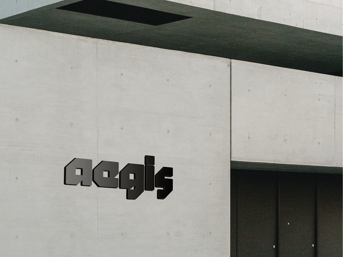
I’ve been working on the Aegis Partners identity and I’m honestly a little stuck with it.
Something feels slightly off to me, especially with the color palette. The colors feel a bit too harsh, and I’m not sure the overall direction is landing exactly where I want it to.
Before I keep tweaking things endlessly, I’d love to get some feedback from fellow designers.
What would you change or refine about the identity? I’d genuinely appreciate any thoughts.


The network for creativity
Join 1.25M professional creatives like you
Connect with clients, get discovered, and run your business 100% commission-free
Creatives on Contra have earned over $150M and we are just getting started













Related posts

Pulse Athletics... Branding & App design✨
Check it out
#app #sport #productdesign #uiuxdesign #uidesigner #uxdesigner #pulse #branding #brandidentity #brandstrategy #brandguidelines #logo #homepage

That's really stunning app design🔥🔥🔥
Great job Ziva🎉🎉🎉

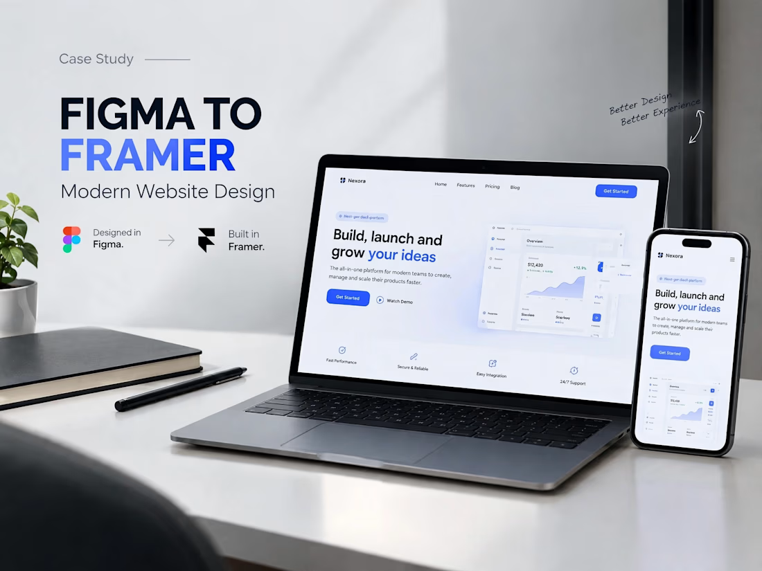
A modern SaaS website concept designed in Figma, featuring clean layouts, intuitive navigation, consistent visuals, and a user-friendly experience across different screen sizes.




Clean and confident work! The green gradient with the mark feels very modern for fintech - trustworthy but not boring. The app screens look really polished. Curious how you landed on this mark, does it represent growth / movement?