The network for creativity
Join 1.25M professional creatives like you
Connect with clients, get discovered, and run your business 100% commission-free
Creatives on Contra have earned over $150M and we are just getting started
Back to feedPost

A little design experiment I’ve been working on
Same concept. Same layout. Two completely different vibes.
Light or Dark? 👀
I’m genuinely stuck between the two, so I’d love to hear what you think, which one would you choose and why?
Always interesting to see how other creatives look at the same design from a completely different perspective.
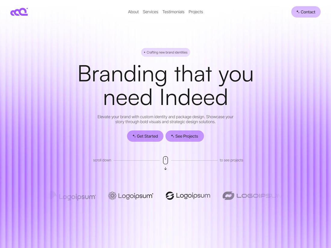
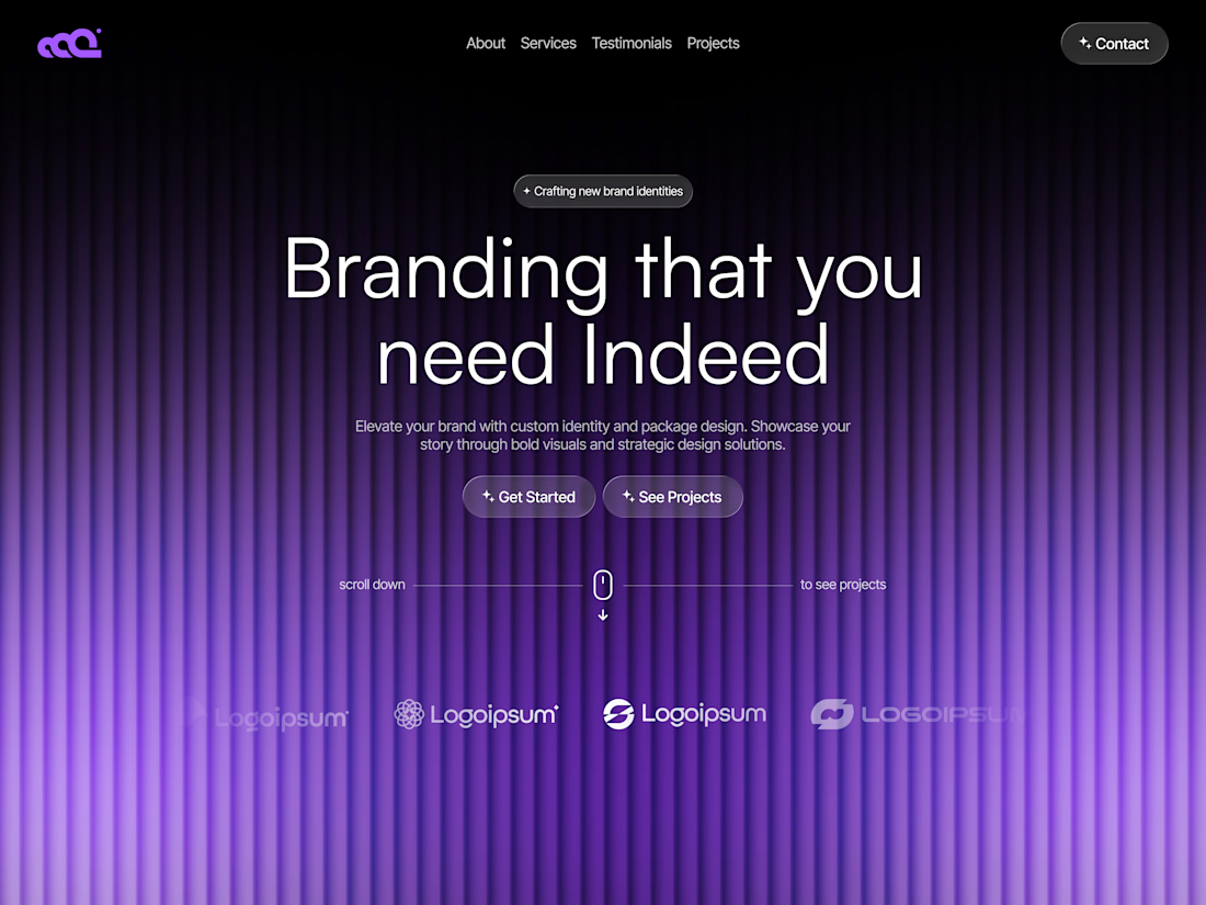

The light/dark split makes the same structure feel like two distinct products, which is a great way to test tone without changing the underlying UX. I’m drawn to the darker direction for its atmosphere, but both keep the hierarchy nicely intact.
Exactly! I was thinking the same, it’s crazy how much the tone shifts without changing the UX at all.
The network for creativity
Join 1.25M professional creatives like you
Connect with clients, get discovered, and run your business 100% commission-free
Creatives on Contra have earned over $150M and we are just getting started

Challenges
View all


Related posts


Just crossed $10k earned on @Contra HQ 🔥 - and this case study is the project that got us there. 💸
Pink, bold, unapologetic - see how we built it 👇


Huge congrats on hitting $10k well deserved! The project feels bold, confident, and really memorable. Love how the visual direction stands out without losing that polished feel 🔥

SENE Car Rentals Client project — Turned a car rental brand into a premium booking experience
For this concept, I focused on making the booking process easy to understand while keeping the overall design clean and premium. The hero section puts the car, brand, and booking form together so users can quickly find what they need.
I worked on the visual direction, layout, typography, booking flow, and overall user experience.
The goal was simple: make renting a car feel easier.
I’d love to know what you think about the design.
If you're working on a car rental, travel, or service-based business and need a website design, feel free to reach out.


This looks super clean..✨

ENDURX — Smartwatch & Fitness Tech Landing Page ⌚🔥
ENDURX is a landing page concept for a performance-focused smartwatch built around endurance, health tracking, and active everyday lifestyles.
The goal was to make the product feel powerful and energetic from the first screen while keeping the experience premium and product-focused. A bold orange palette, oversized typography, and a large smartwatch visual create a strong sense of movement and performance.
Special attention was given to:
• a product-first hero composition that makes the smartwatch the main visual focus ⌚;
• oversized “ENDURANCE” typography to communicate strength and performance;
• an intense orange gradient that gives the brand a distinctive, energetic identity 🟠;
• supporting product details around health metrics, activity tracking, battery life, and comfort;
• a clear “Get Started” CTA positioned close to the main product;
• additional product imagery that highlights the strap and all-day comfort;
• clean navigation around Features, Health, Reviews, and Contact;
• responsive mobile layouts that preserve the visual impact while simplifying the information hierarchy 📱;
• a compact mobile menu with social touchpoints and easy access to key sections.
The result is a bold digital experience that positions ENDURX as a modern wearable for people who want technology that keeps up with an active lifestyle.
Looking to launch a wearable, fitness product, or consumer tech brand?
Let’s create a product experience built to perform 🚀


Ohh my god what an a inspirational. I am not getting the perfect words explain this work.
Now it will be my dream design 😍