The network for creativity
Join 1.25M professional creatives like you
Connect with clients, get discovered, and run your business 100% commission-free
Creatives on Contra have earned over $150M and we are just getting started
Back to feedPost

Lights: A Travel Planning Landing Page That Makes Trip Planning Feel Easy
Overview
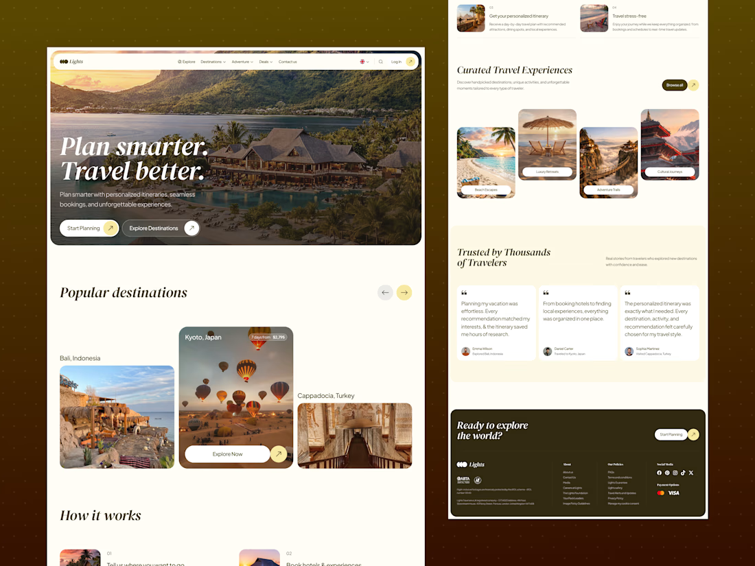
Lights helps people plan trips with personalized itineraries, curated stays, and stress-free bookings. I designed the full landing page in Figma, from layout and structure to the final UI. My goal was to make planning a trip feel exciting and effortless instead of overwhelming.
The Problem
Planning a trip can take hours of research across many tabs. People worry about picking the wrong place, missing something, or managing too many bookings. The page had to show that Lights takes the stress away and guides visitors to start planning.
My Approach
I started by thinking about how a traveler feels when planning: excited at first, then overwhelmed. I designed the page to keep the excitement and remove the stress. It opens with a dream destination, explains the process in four simple steps, and ends with real traveler stories.
Key Design Decisions
1. A bold, emotional hero. A full-width photo of a resort at sunset sets the mood right away. The headline “Plan smarter. Travel better" is short and clear, and the italic serif style adds a premium, personal feel. Two buttons, “Start Planning” and “Explore Destinations,” give visitors two ways in.
2. Popular destinations in a carousel. Large photo cards for places like Bali, Kyoto, and Cappadocia let people get inspired quickly. The center card is highlighted with trip length and price, so visitors see the most important details first.
3. “How it works” in four easy steps. Each step has a small photo, a number, and one or two lines of text: tell us where you want to go, book hotels and experiences, get your personalized itinerary, and travel stress-free. The two-column layout makes it easy to scan.
4. Curated experiences by travel style. Beach Escapes, Luxury Retreats, Adventure Trails, and Cultural Journeys help visitors choose by mood instead of searching. The staggered card layout adds movement and keeps the page interesting.
5. Trust through real voices. The “Trusted by Thousands of Travelers” section shows traveler quotes with names and the places they visited. Large, readable text makes the stories feel genuine.
6. A warm, premium color palette. Cream backgrounds, deep olive-brown, and soft yellow accents feel calm, natural, and travel-friendly. It’s different from the usual blue travel sites, so it feels more personal and memorable.
7. Consistent button style. Every button uses a rounded pill shape with a small arrow circle. This makes actions easy to recognize across the page.
8. A clear closing section. “Ready to explore the world?” gives one last call to action. The footer is organized into About, Policies, Social Media, and Payment Options, and it includes travel-protection badges that build trust.
The Result
A warm, inspiring landing page that explains the service in seconds, helps people choose a trip style, builds trust with real stories, and keeps the next step visible all the way down the page.
Tools Used
Figma
Let’s Work Together
Need a website that feels clear, friendly, and easy to use? Message me and let’s design something your customers will love.


This is very nice
The network for creativity
Join 1.25M professional creatives like you
Connect with clients, get discovered, and run your business 100% commission-free
Creatives on Contra have earned over $150M and we are just getting started



Related posts


cool

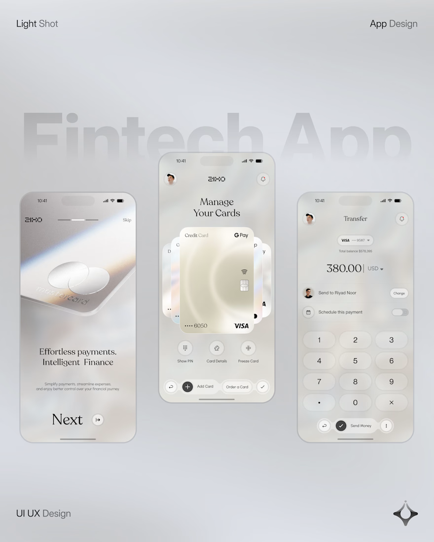
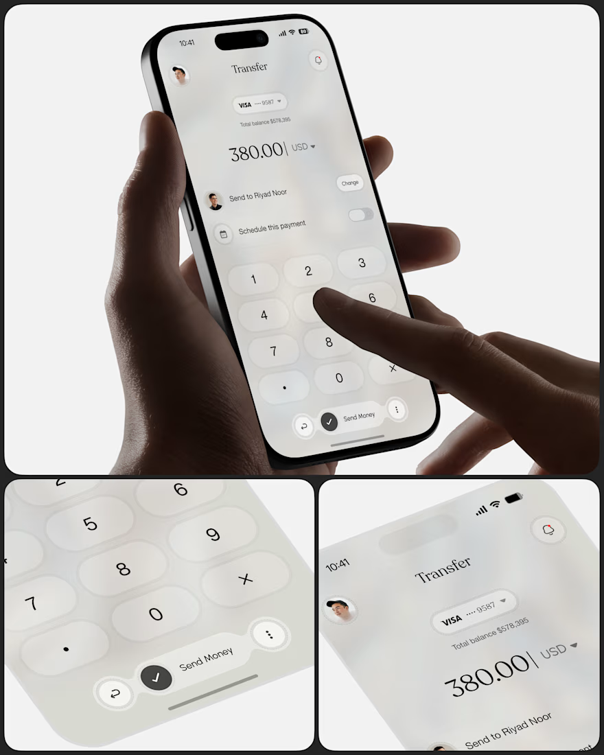
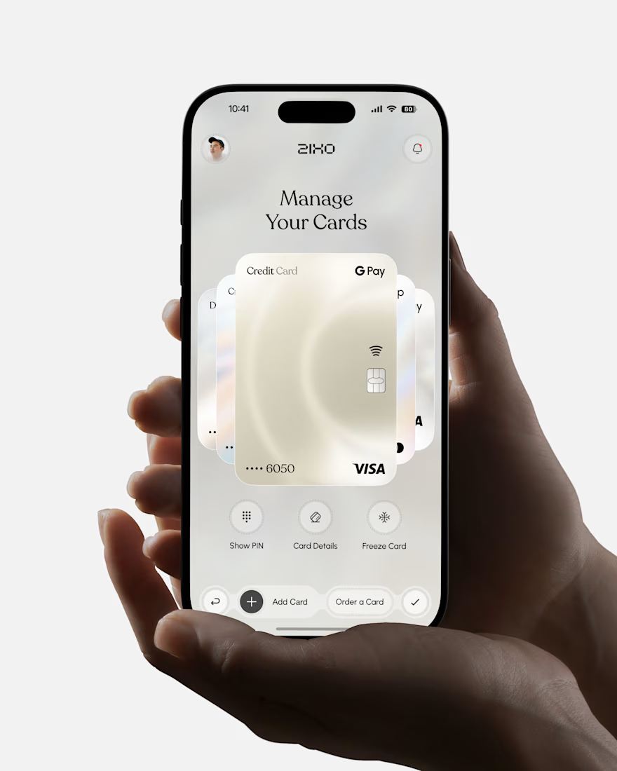
People don’t just want a banking app. They want to feel in control of their money.
Great fintech design doesn’t just look premium. It makes money feel simpler, safer, and easier to control.
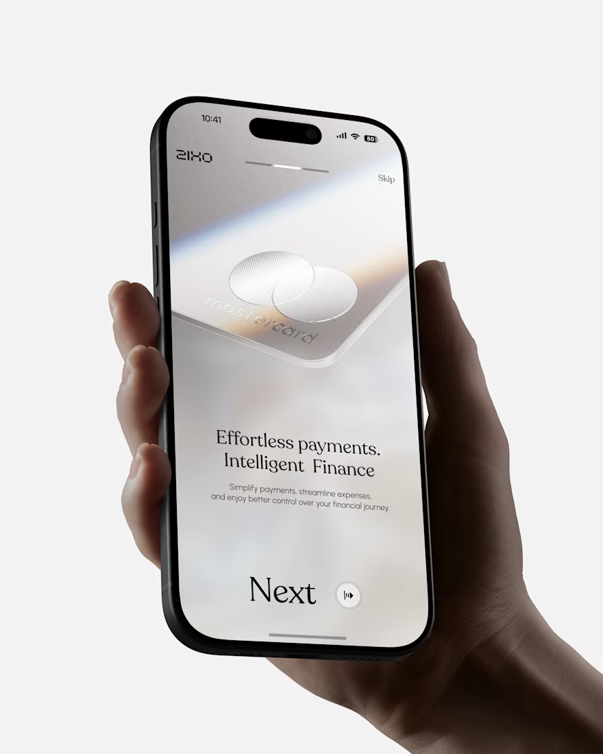
Meet Ziko, a mobile banking concept where every interaction is designed to reduce friction and build trust.
What wins your trust first: 🔒 Security, ✨ Simplicity, or ⚡ Speed?



Stunning
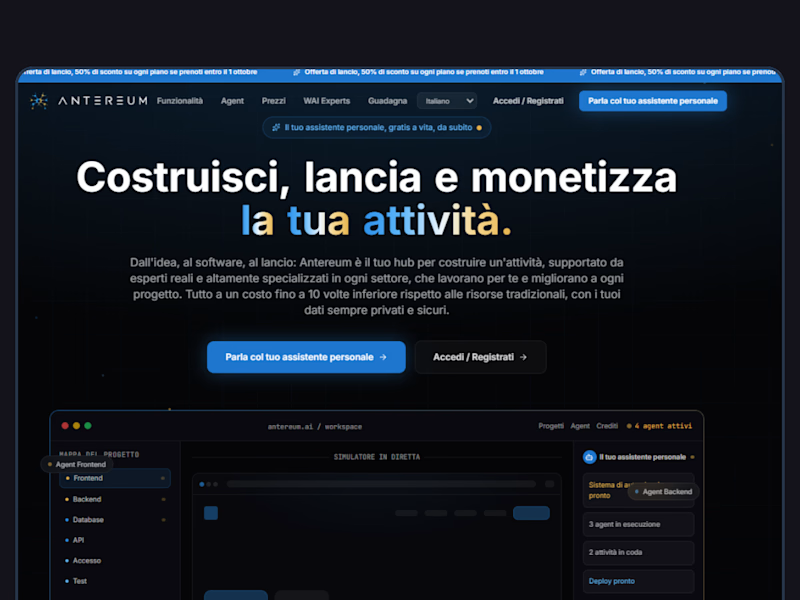
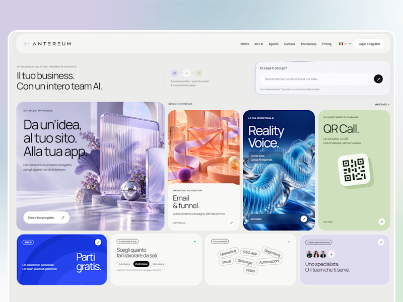
Webiste redesign for Saas company


2 voted
4%
44 voted
96%
46 votes
Closed
