
Suchi Roy
UI/UX Designer for SaaS, Websites and Web Apps
- 10
- Followers


Proposal Ping: A Landing Page for a Job Alert Tool Built for Freelancers
Overview
ProposalPing watches job boards like Upwork, Contra, and Toptal, then alerts freelancers the moment a good job appears, already scored and explained. I designed the full landing page in Figma, from layout and structure to the final UI. My goal was to show a busy freelancer why speed matters and make them want to join the beta.
The Problem
Freelancers lose good jobs for a simple reason: they see them too late. By the time they check eight different tabs, a job already has dozens of proposals. The page had to show this pain quickly and prove that ProposalPing solves it.
My Approach
I designed the page for someone who is busy, skeptical, and short on time. It opens with one clear promise, backs it with a product preview, then answers the questions a freelancer would ask next: Which boards? How fast? How does the score work? Am I in control? What does it cost?
Key Design Decisions
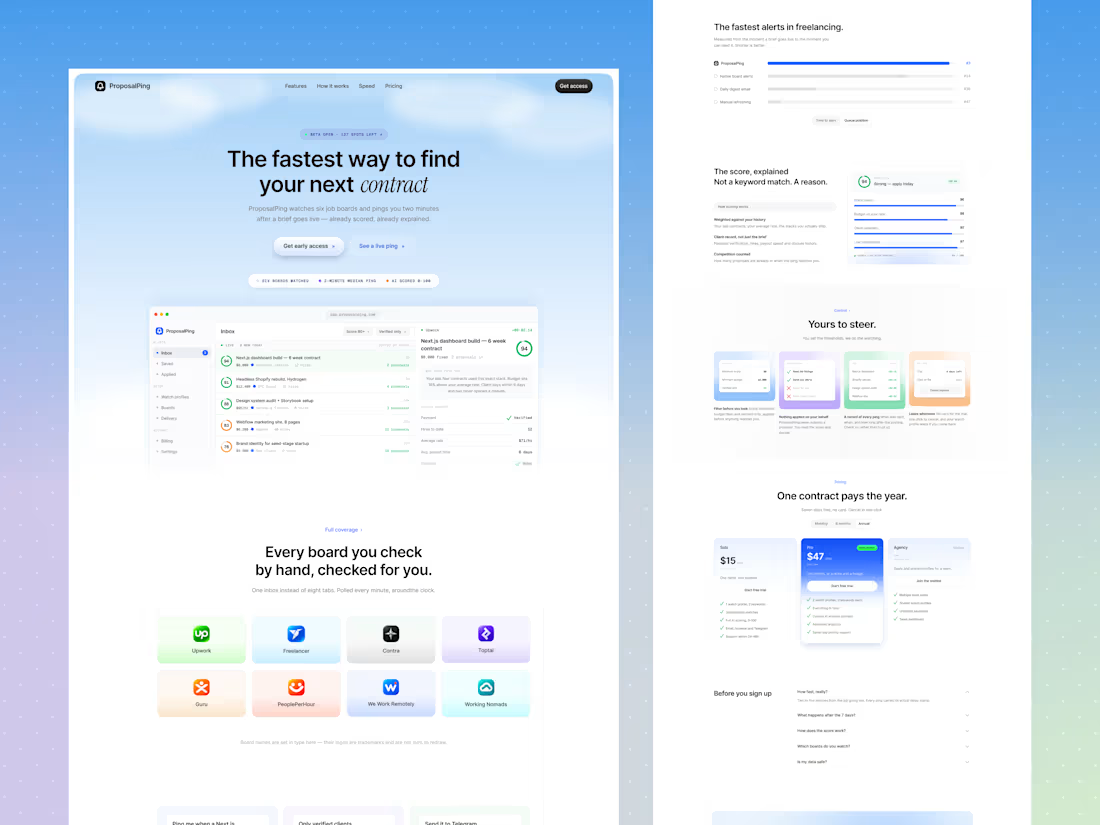
1. A hero with a clear promise and a little urgency. The headline “The fastest way to find your next contract” says the benefit in one line, and the italicized word "contract" adds personality. A small “Beta open · 127 spots left” label creates gentle urgency. Below it, “Get early access” is the main action, and “See a live ping” is a softer option for curious visitors.
2. The product in the first screen. A dashboard preview shows a scored job inbox on the left and a job detail panel on the right. Visitors see the product working before they read anything else. A row of small facts (six boards watched, 2-minute median ping, AI scored 0-100) adds quick proof.
3. Every board in one place. The “Every board you check by hand, checked for you” section shows the supported boards as colorful cards, so visitors recognize their own tools. A small note clarifies that board names are set in type and logos belong to their owners.
4. Features shown as real moments. Three cards show real alert examples: “Ping me when a Next.js job over $3k appears,” “Only verified clients, minimum $3,000,” and “Send it to Telegram the moment it lands.” Each card pairs a small interface preview with a short line, so features feel like actions, not a feature list.
5. A comparison that proves the point. “The fastest alerts in freelancing” uses a simple horizontal bar chart comparing ProposalPing with native board alerts, daily digest emails, and manual refreshing. Visitors understand the speed advantage in about two seconds.
6. Explaining the AI score. The score isn’t a black box. The page shows a 94 score broken down into stack match, budget versus rate, client reliability, and low competition, with a short explanation on the left. This builds trust in the AI, and it supports the headline: “Not a keyword match. A reason.”
7. Control and safety. The “Yours to steer” section answers a common worry: Will this tool act without me? Four small cards show filters, “nothing applied on your behalf,” a record of every ping, and the freedom to cancel anytime. The message is clear: you decide, the tool just watches.
8. Simple pricing. Three plans (Solo, Pro, and Agency on a waitlist) sit side by side. Pro is highlighted as “Most popular” with a blue card, and each plan has a short checklist. A monthly/annual toggle and the “Seven days free, no card” note remove hesitation. The headline “One contract pays the year” frames the price as an investment.
9. FAQ and a final push. An accordion FAQ answers common questions without crowding the page. A soft blue closing section repeats the call to action: “Built for the freelancer who would rather be working. Start today.”
10. A light, calm visual style. A soft sky-blue gradient, white cards, thin borders, rounded corners, and small monospace labels give the page a clean, technical feel without being cold. Blue is used mainly for actions, green for good scores, and grey for supporting details, so the most important things stand out.
The Result
A clear, modern landing page that explains a technical product in plain language, shows the speed advantage visually, builds trust in the AI scoring, and keeps the sign-up step visible from the top to the bottom.
Tools Used
Figma
Let’s Work Together
Building a product that needs a clear, trustworthy website? Message me and let’s design something your users will understand in seconds.
1
57
Interval: A Landing Page for an AI Meeting Assistant
Overview
Interval is a tool that handles the scheduling, notes, and follow-ups around meetings. I designed the full landing page in Figma, from layout and structure to the final UI. My goal was to make a busy, complicated workflow feel calm and simple and to get visitors to start for free.
The Problem
Meetings create a lot of hidden work: finding a time, avoiding double-bookings, taking notes, sending follow-ups, and collecting payments. Most tools solve only one of these. The page had to show that Interval brings it all together and make that clear within seconds.
My Approach
I focused on one feeling: relief. The headline, the visuals, and the layout all say “this is taken care of.” I kept the design light and spacious so the page itself feels as calm as the product promises to be.
Key Design Decisions
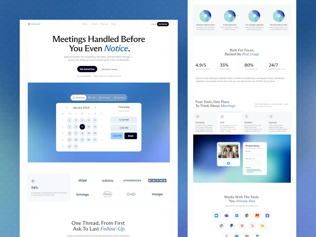
1. A hero built around a promise. The headline “Meetings Handled Before You Even Notice" tells visitors the benefit immediately. Two clear buttons (“Get started free” and “See how it works”) and small reassurance notes (“No card required” and “Takes about two minutes to set up”) remove common doubts before visitors even scroll.
2. Showing the product, not just describing it. Below the headline, a live-looking booking calendar sits on a soft blue gradient. Tabs for Scheduling, Callie, Notetaker, and Payments hint at the full toolset, so visitors see the product in action right away.
3. Trust early. A row of well-known brand logos and a strong stat (94% of bookings confirmed without back-and-forth) appear right after the hero, so visitors feel confident before reading further.
4. One story from start to finish. “One Thread, From First Ask To Last Follow-Up” uses four equal cards: someone asks to meet, a time gets held, the call gets captured, and the next step is clear. Matching icons and short text make the whole workflow easy to understand at a glance.
5. Numbers that are easy to scan. “Built For Focus, Backed By Real Usage” puts four big stats in a clean row: rating, fewer no-shows, same-day bookings, and calendars synced 24/7. A short privacy note underneath addresses a common worry: Is my calendar data safe?
6. Four tools, one place. The tools section uses simple tabs for Scheduling, Callie, Notetaker, and Payments, each with a short description. A product preview below shows a video call next to an AI-generated summary with action items, so visitors can picture the result.
7. Fits into existing workflows. “Works With The Tools You Already Run” shows a grid of integration icons, with Google and Microsoft options explained below. This answers the question, "Will it work with what I already use?"
8. Real voices. The testimonial section starts with one large featured quote, then a row of shorter customer quotes with names and roles. A simple carousel keeps it compact.
9. A memorable personal touch. Blue italic accents on key words in each headline (like "Notice," "Follow-Up," and "Real Usage") add personality and guide the eye. A big “Interval” wordmark in the footer gives the page a confident, branded ending.
10. A clean visual style. Light backgrounds, soft blue gradients, rounded cards, and generous spacing keep the page easy to read and professional. The black primary buttons stand out clearly against the light design.
The Result
A calm, modern landing page that explains a multi-feature product in plain language, builds trust quickly, and keeps the next step visible from the top of the page to the bottom.
Tools Used
Figma
Let’s Work Together
Have a product with lots of features and want to explain it clearly?
Message me and let’s design a website that makes it simple.
2
1
116
Radius: A Landing Page for an AI Product Storytelling Tool
Overview
Radius is an AI tool that helps teams turn their product into interactive demos and videos in minutes. I designed the full landing page in Figma, from layout and structure to the final UI. My goal was to explain a technical product in a simple, friendly way and get visitors to sign up.
The Problem
AI and SaaS products are often hard to explain. Visitors land on the page, don’t understand the value quickly, and leave. The page had to say what Radius does in seconds, show it in action, and prove it works for people like them.
My Approach
I treated the page as a guided story. It starts with the promise, shows how the tool works, speaks to different team needs, backs everything with proof, and ends with a clear next step. Every section answers one question a visitor is likely to ask.
Key Design Decisions
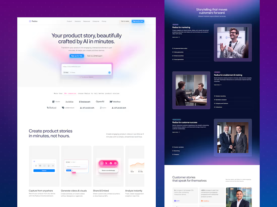
1. A hero that explains and lets you try. The headline “Your product story, beautifully crafted by AI in minutes" states the benefit right away. A soft pink and purple gradient gives it a modern AI feel without making it cold. An input box (“Try with your website!”) lets visitors start immediately, and two buttons serve two types of visitors: “Sign up for free” for those ready to act and “Talk to a GTM Expert” for those who want guidance.
2. Social proof in the first scroll. A line about companies using Radius, followed by a clean row of logos, builds trust before visitors need to read more.
3. A simple four-step feature slider. “Capture from anywhere,” “Generate videos & visuals,” “Share & Embed,” and “Analyze instantly” each get a small visual and a short line. Visitors understand the whole workflow without reading a long explanation.
4. A dark, immersive section for use cases. The switch to a deep navy gradient breaks up the page and gives "storytelling that moves customers forward” a focused feel. Each use case (marketing, enablement and training, and customer success) has a clear label, a short description, a feature checklist, and a photo. The layout alternates left and right, so the section stays interesting while scrolling.
5. Proof with real numbers. The “Customer stories” section uses a card grid to highlight results like faster content creation and higher conversions, each paired with a company logo. Big numbers are easy to scan and make the benefits feel concrete.
6. Integrations made visual. The “Connected Workflows” section shows integrations in an orbit-style graphic around the Radius logo, with simple categories listed beside it. It shows that the tool fits into what teams already use.
7. A strong ending. The page closes with a bright “Create AI-powered content that converts"—a call to action, then an email signup and an organized footer—so visitors who scroll all the way down still have a clear next step.
8. A consistent visual style. A glowing blue primary button stands out on every section, with a softer secondary button next to it. Soft shadows, rounded cards, and generous white space keep the page clean and easy to read. The palette of deep navy, electric blue, and soft pink-purple feels modern, trustworthy, and a little playful.
The Result
A clean, modern landing page that explains an AI product in plain language, shows the workflow step by step, builds trust with proof, and keeps the sign-up action visible throughout the page.
Tools Used
Figma
Let’s Work Together
Have a product that’s hard to explain? Message me and let’s turn it into a clear, engaging website.
0
64
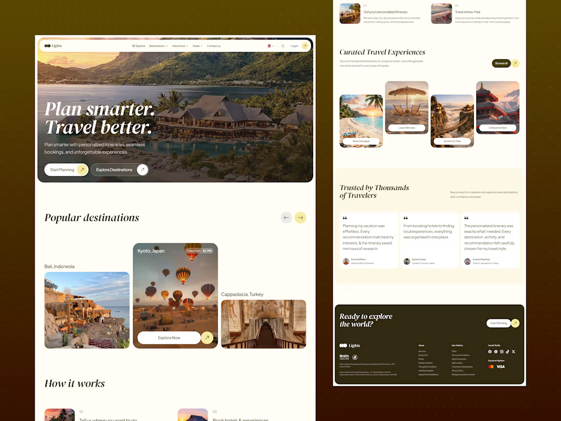
Lights: A Travel Planning Landing Page That Makes Trip Planning Feel Easy
Overview
Lights helps people plan trips with personalized itineraries, curated stays, and stress-free bookings. I designed the full landing page in Figma, from layout and structure to the final UI. My goal was to make planning a trip feel exciting and effortless instead of overwhelming.
The Problem
Planning a trip can take hours of research across many tabs. People worry about picking the wrong place, missing something, or managing too many bookings. The page had to show that Lights takes the stress away and guides visitors to start planning.
My Approach
I started by thinking about how a traveler feels when planning: excited at first, then overwhelmed. I designed the page to keep the excitement and remove the stress. It opens with a dream destination, explains the process in four simple steps, and ends with real traveler stories.
Key Design Decisions
1. A bold, emotional hero. A full-width photo of a resort at sunset sets the mood right away. The headline “Plan smarter. Travel better" is short and clear, and the italic serif style adds a premium, personal feel. Two buttons, “Start Planning” and “Explore Destinations,” give visitors two ways in.
2. Popular destinations in a carousel. Large photo cards for places like Bali, Kyoto, and Cappadocia let people get inspired quickly. The center card is highlighted with trip length and price, so visitors see the most important details first.
3. “How it works” in four easy steps. Each step has a small photo, a number, and one or two lines of text: tell us where you want to go, book hotels and experiences, get your personalized itinerary, and travel stress-free. The two-column layout makes it easy to scan.
4. Curated experiences by travel style. Beach Escapes, Luxury Retreats, Adventure Trails, and Cultural Journeys help visitors choose by mood instead of searching. The staggered card layout adds movement and keeps the page interesting.
5. Trust through real voices. The “Trusted by Thousands of Travelers” section shows traveler quotes with names and the places they visited. Large, readable text makes the stories feel genuine.
6. A warm, premium color palette. Cream backgrounds, deep olive-brown, and soft yellow accents feel calm, natural, and travel-friendly. It’s different from the usual blue travel sites, so it feels more personal and memorable.
7. Consistent button style. Every button uses a rounded pill shape with a small arrow circle. This makes actions easy to recognize across the page.
8. A clear closing section. “Ready to explore the world?” gives one last call to action. The footer is organized into About, Policies, Social Media, and Payment Options, and it includes travel-protection badges that build trust.
The Result
A warm, inspiring landing page that explains the service in seconds, helps people choose a trip style, builds trust with real stories, and keeps the next step visible all the way down the page.
Tools Used
Figma
Let’s Work Together
Need a website that feels clear, friendly, and easy to use? Message me and let’s design something your customers will love.
2
1
98