The network for creativity
Join 1.25M professional creatives like you
Connect with clients, get discovered, and run your business 100% commission-free
Creatives on Contra have earned over $150M and we are just getting started
Back to feedPost
Logo Design for Monarch Visuals ✨
A bold, electric, and futuristic Logo designed to command attention.
The Vision: Clean typography paired with an eye-catching, star-inspired emblem that stands out across digital screens, neon palettes, and physical spaces.
Looking to elevate your brand’s visual presence? Drop a message or hire me directly through my Contra profile! 📩


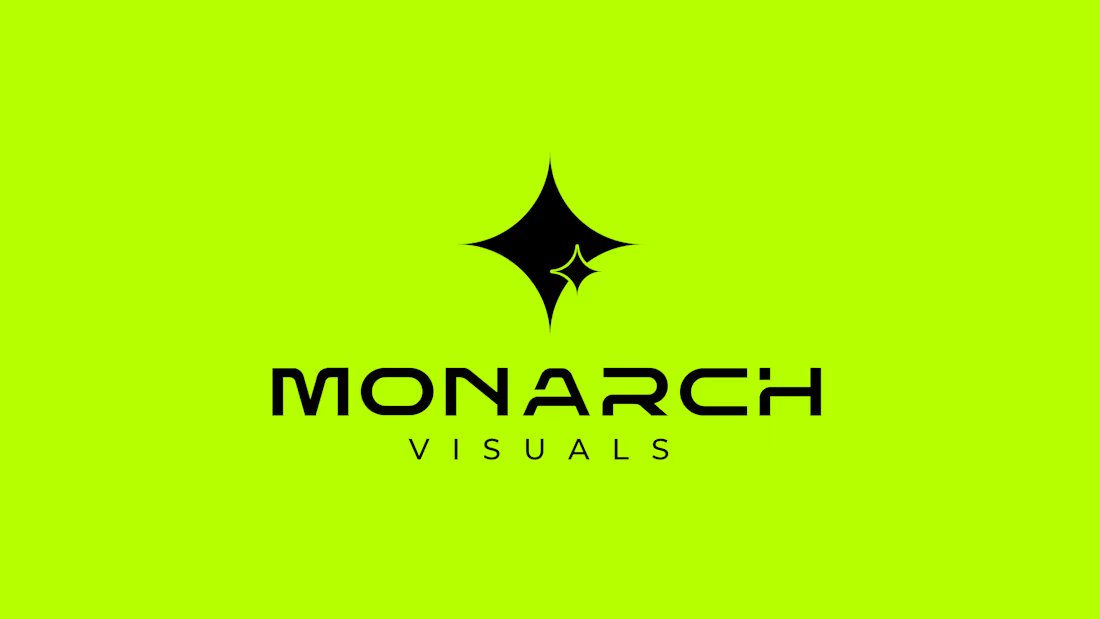
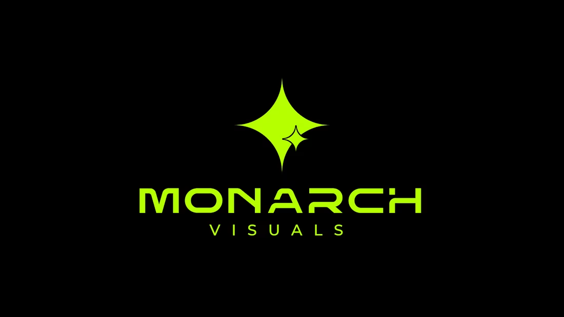
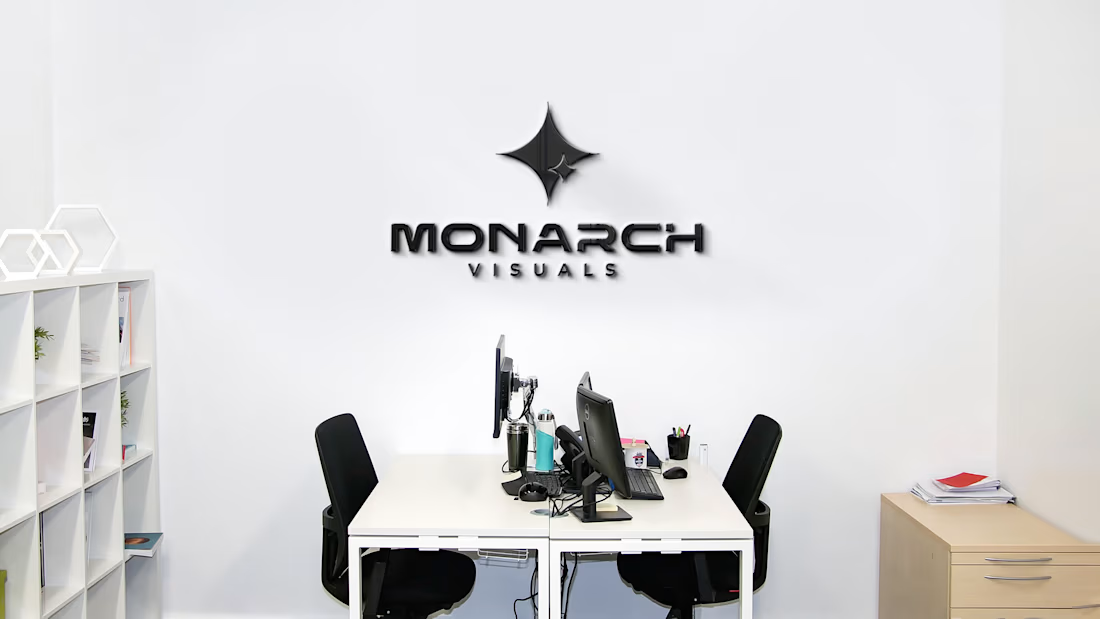
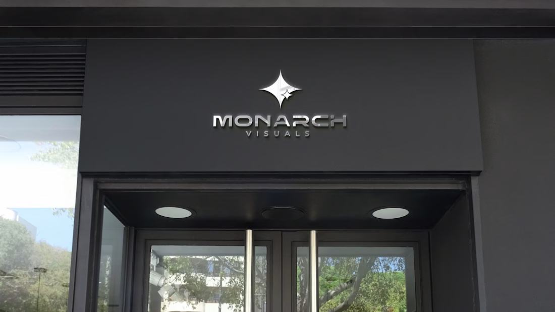

LOved the bold electric color combo

Thank you 😊

Cool concept
Thanks 🙌

Strong mark, Vijay. The star-inspired emblem on that neon lime feels electric without losing legibility, and the black inverted version proves it holds up across contexts. Clean work.
Thank You 🙌
The network for creativity
Join 1.25M professional creatives like you
Connect with clients, get discovered, and run your business 100% commission-free
Creatives on Contra have earned over $150M and we are just getting started





Related posts

My latest branding project for the Atlanta Museum of Paleontology.
Check out the full project at maximjungle.com

A T-rex drawn in one thin outline is such a good mark 🦖 I'd happily visit that museum.


How far can you take a logo beyond the first draft?
I started with Recraft's Logo Maker and a fictional idea: Bibu's Paws, a cosy little dog rescue and adoption shelter.
I wanted the identity to feel warm, homely and full of character, so I explored a few logo directions before settling on the little dog tucked inside a house.
From there, I took the idea further, building out the visual identity with an earthy colour palette, typography, illustrations and a few real-world applications: the shelter space, dog merchandise and an adoption welcome kit.
I enjoyed seeing how a small starting point could grow into a brand with its own personality and world.
Now I'm curious: if you were building a brand around this logo, what would you create next?






It turned out so cozy, you did great
Just wrapped up this brand identity for Vanta and wanted to share a quick peek! Kept the visuals super clean, warm, and fluid, letting the product and textures breathe. Let me know what you think!
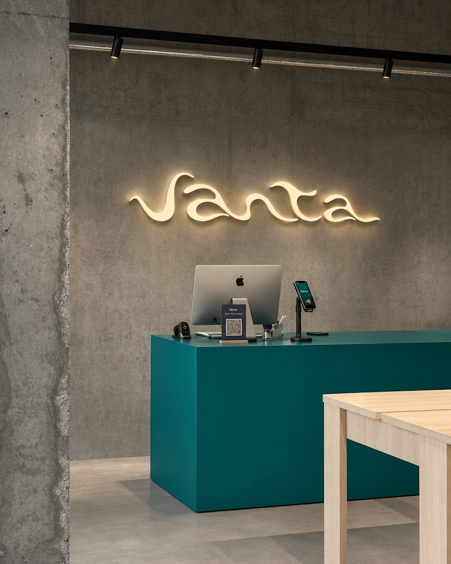
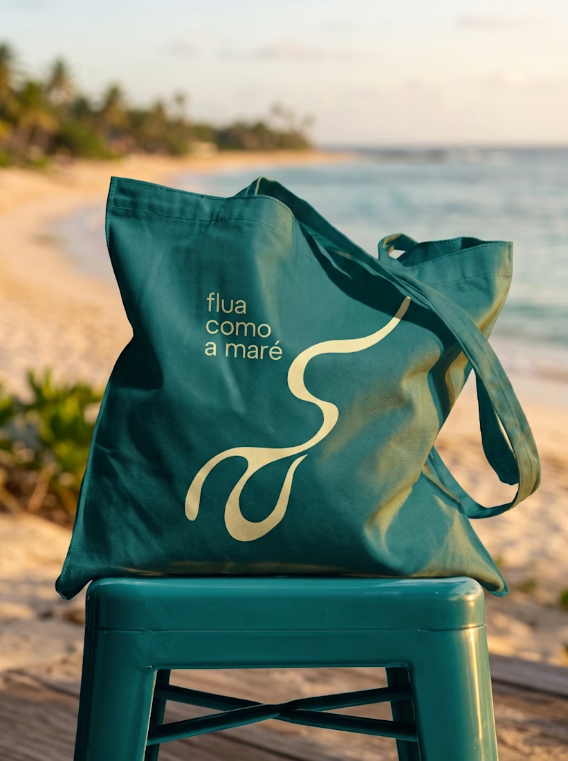
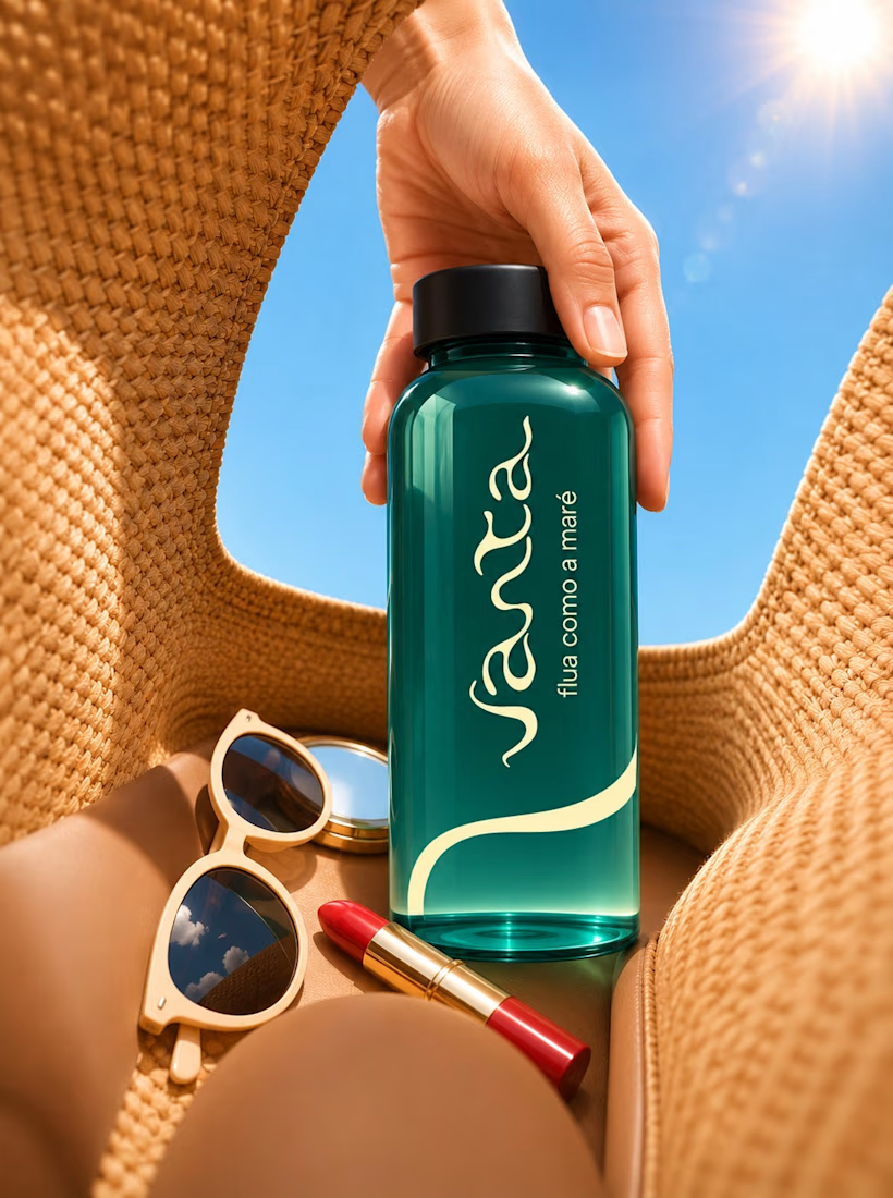

Great work!