The network for creativity
Join 1.25M professional creatives like you
Connect with clients, get discovered, and run your business 100% commission-free
Creatives on Contra have earned over $150M and we are just getting started
Back to feedPost
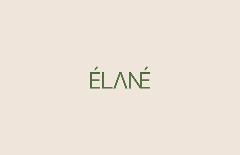
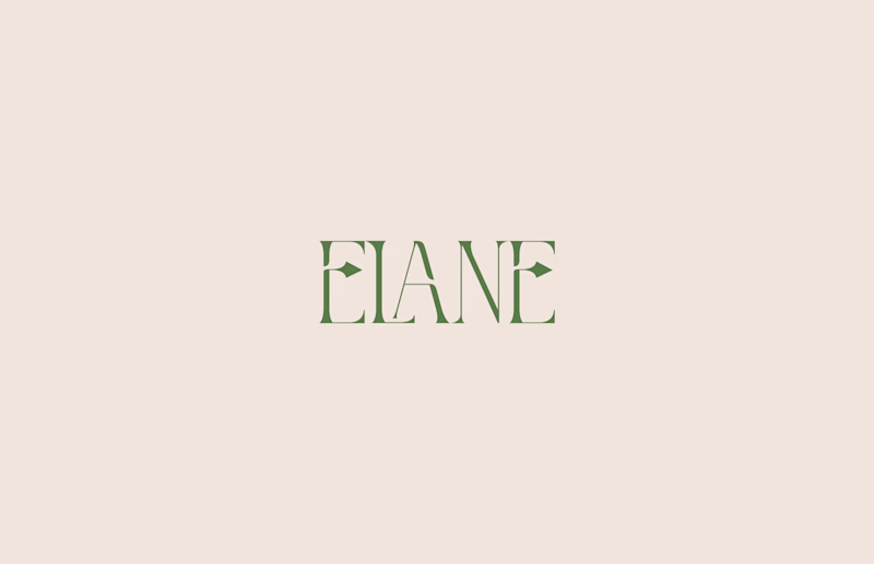
Taste Test
Logo exploration for a skincare brand.
One leans elegant, the other modern.
Which direction works best?
15 voted
75%
5 voted
25%
20 votes
Closed
Modern
Modern does it for me
Both are beautiful! The elegant version feels more premium and timeless—perfect for a luxury skincare brand targeting sophistication. The modern version is clean and approachable, great if you're going for a younger, minimalist aesthetic. I'd lean elegant for skincare since it suggests quality and heritage.
Modern for me. It’s much clearer and more legible at a glance. The elegant version has character, but readability is key for a skincare brand, especially across packaging and digital.
Elégant : les petits illustrations au niveau de E évoquent les feuilles d'arbres, par conséquent la nature. Qui attire l'attention vers un soin premium dont les produits sont naturels.
top work
modern is minimal and memorable
The network for creativity
Join 1.25M professional creatives like you
Connect with clients, get discovered, and run your business 100% commission-free
Creatives on Contra have earned over $150M and we are just getting started
Related posts
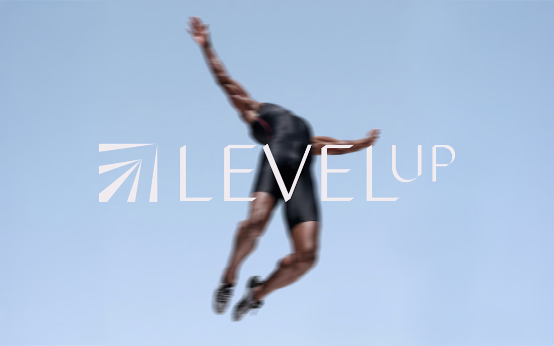
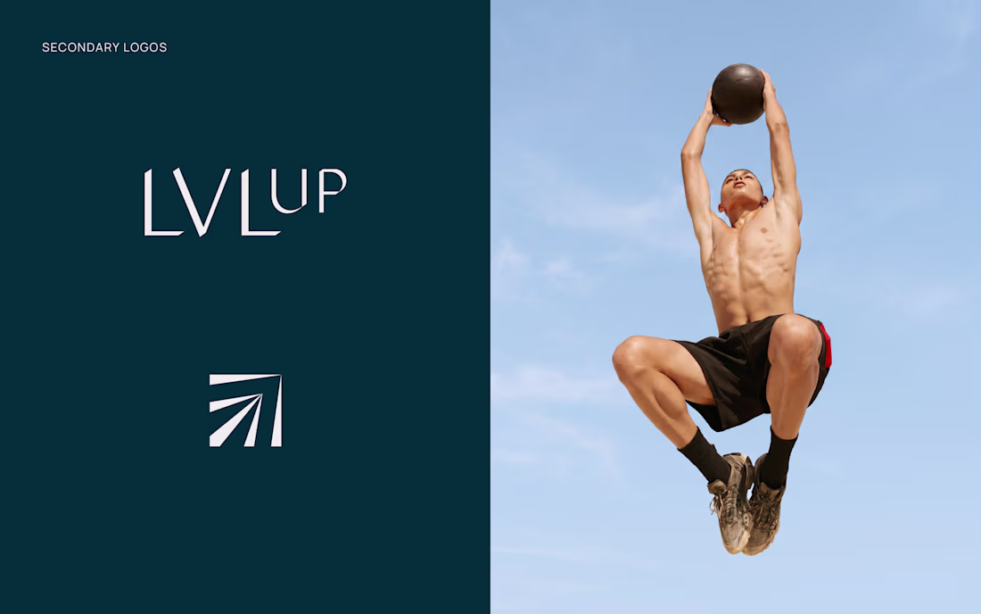
New project: brand identity for LEVELUP FRANCE
I worked on the full visual identity, from strategy to logo, color palette and brand guidelines, translating a promise of method and rigor into something visual and premium. It was a stretch, and I loved every part of it.
Amazing work
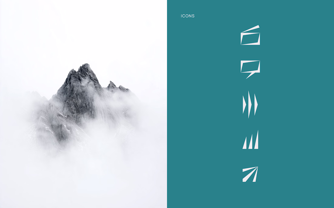
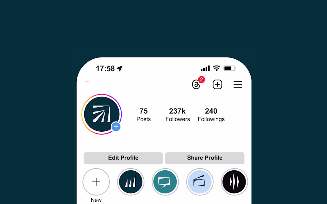
A good brand mark has to work everywhere the product shows up.
The mark was designed to adapt across every medium it appears in. Digital surfaces, product interfaces, and large format interactive billboards at logistics industry events all require different things from a logo. The mark holds up across all of them without modification.
Because the mark is translucent, it reads differently depending on where it sits, lighter and more open on white, denser on dark, bold at large format, and the adaptation works without changing anything about the shape itself.


This is beautiful
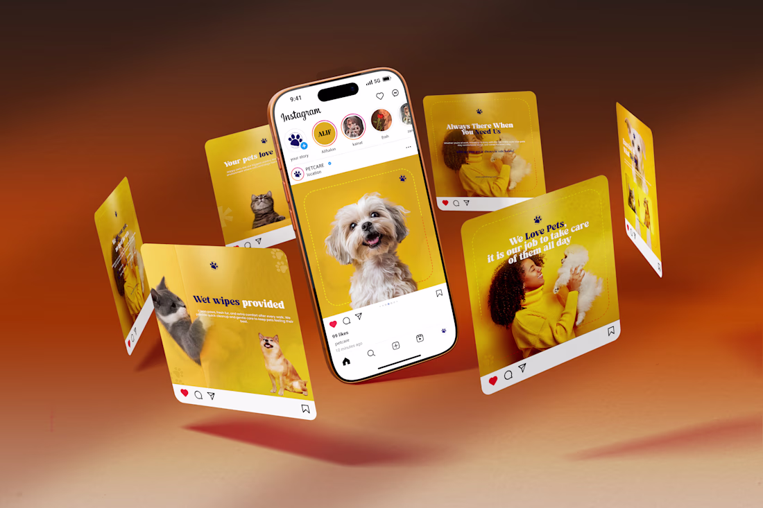
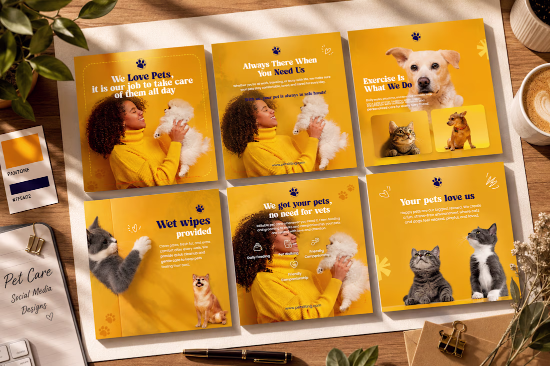
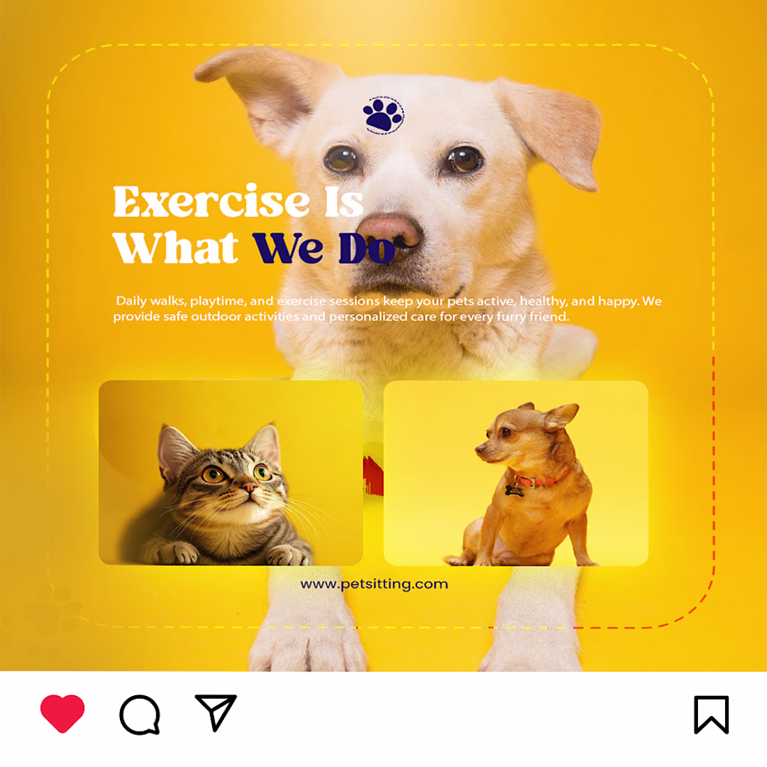
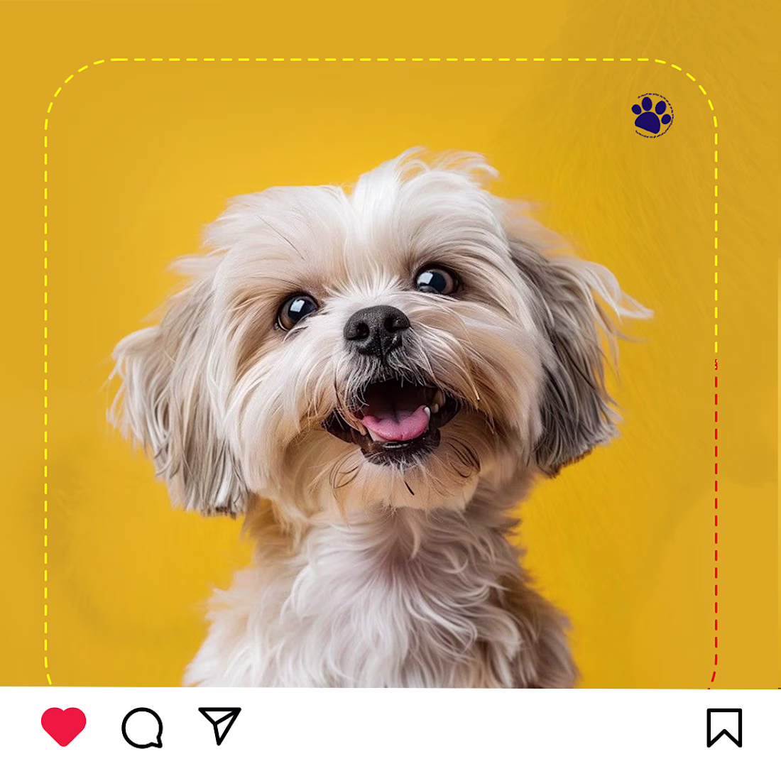
Pet Care Social Media Design
Here's a branding-focused social media carousel I designed for a pet care business. The concept combines a bright yellow color palette, clean typography, premium layouts, and engaging visuals to create a warm, trustworthy, and modern brand identity.
The goal was to design posts that are visually appealing while clearly communicating the brand's services and values.
Tools Used: Adobe Photoshop
Focus: Social Media Design | Branding | Visual Hierarchy | Typography | Color Theory
Feedback and suggestions are always appreciated! 💛
#GraphicDesign #SocialMediaDesign #Branding #AdobePhotoshop #PetCare #VisualDesign #CreativeDesign #ContentDesign #Portfolio #Behance #Designer #LinkedInDesign #UIDesign #BrandIdentity
Amazing work
Trending
Claude
Claude has entered the design space. How are you using Claude Design?
Contra University
Learn from expert creatives how to earn more using next-gen AI tools.
fifaworldcup2026
The World Cup is here and the whole world's watching. How are you designing for the world stage?
creativeaiflow
Creative AI workflows are evolving. What tools do you use, and what are their strengths and weaknesses?
freelancerlife
Freelancer life is wins, pivots, and everything in between. What’s yours right now?