The network for creativity
Join 1.25M professional creatives like you
Connect with clients, get discovered, and run your business 100% commission-free
Creatives on Contra have earned over $150M and we are just getting started
Back to feedPost
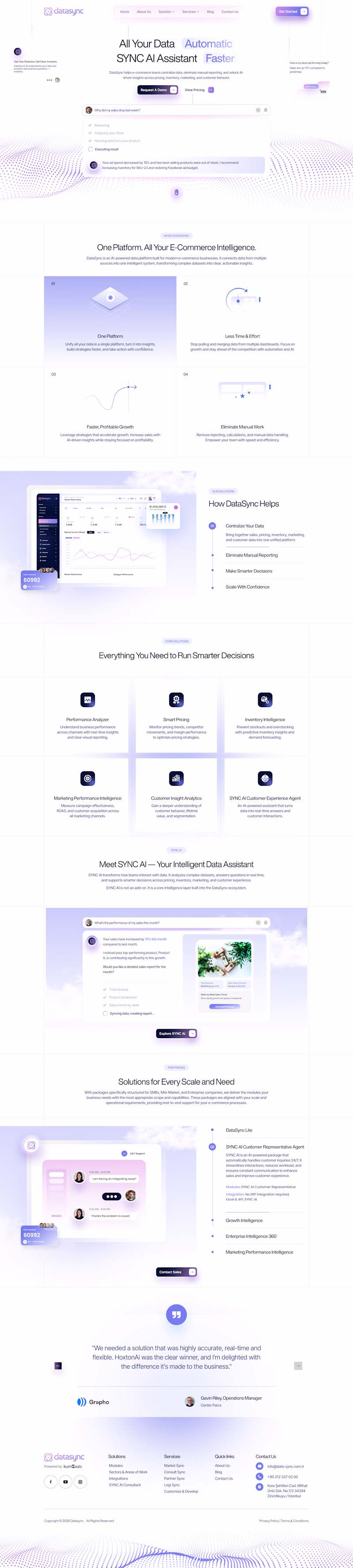
Taste Test
Thanks for letting me know Josh 😊
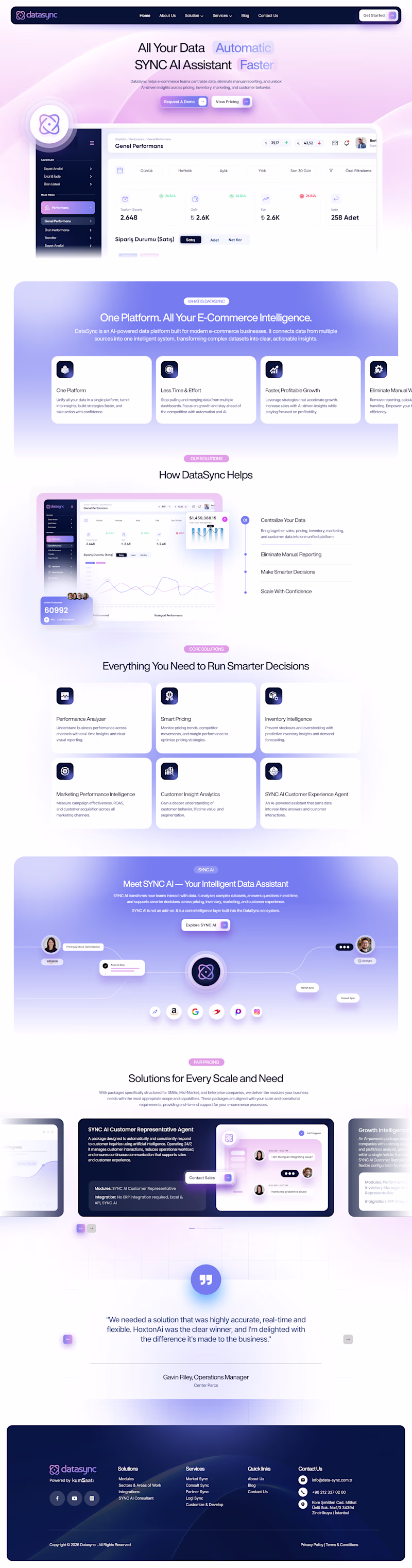
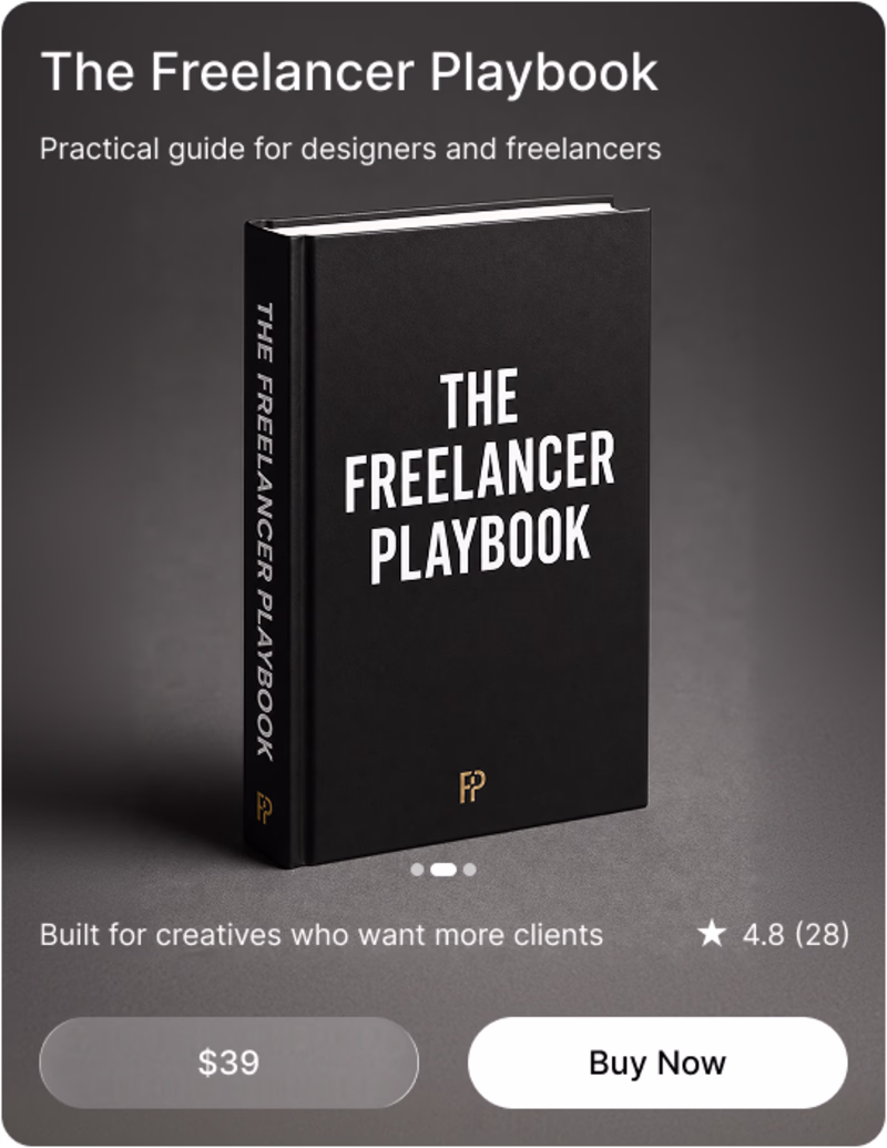
Both are really solid honestly, but B gets my vote. Something about the depth and detail just feels more complete to me.
Thank you soo much for your thoughts Farook 😊
Going for the rich and detailed option
Thanks for sharing your POV 😊
B! i think the richness of the backgrounds & attention to detail you've put in actually helps the viewer dial in more easily!
Thanks for sharing your POV 😊
Voting A. For a SaaS product like DataSync, the cleaner layout keeps the focus on the value prop and reduces cognitive load, which usually helps with conversion. B has great visual energy but it might pull attention in too many directions on a landing page.
Thanks for sharing your thoughts Rafee 😊
Will go for B
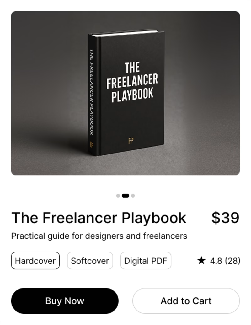
both are looking great, but I like more clean and minimal designs so I will go for A: Clean & Focused
Thankyou for sharing you Thoughts Koonj.
Rich & Detailed all day!
B gets my vote
B is nice, not because of the colors but the detailing and alighnment
I prefer the color palette of the left version, but the design elements on the right are significantly more appealing to me
For some reasons B
The richness is in the details!
Rich & Detailed
B: Rich & Detailed
Thanks 😊
Rich and detailed
A is better suited, and looks professional & serious for something working around Data. While B looks beautiful, it doesn't necessarily add to better conversion. Does feel like a cognitive load, where the colors ask for attention, but more than required.
Thankyou for your thoughts Siddhesh.
Elite work!
Voting B - the rich & detailed version feels more premium for SaaS. First impressions matter and that density of info builds trust with enterprise clients. Clean is safe but detailed converts ✨
Thanks for your feedback Nina.
B looks more branded and differentiates the product from so many other startup websites
For DataSync I'd go A. A data product gets opened every day, so the version that lowers cognitive load on the tenth visit matters more than the one that impresses on the first. Rich detail tends to read as a pitch, clean and focused reads as something people trust with their...
Thanks for letting me know Anna 😍
The network for creativity
Join 1.25M professional creatives like you
Connect with clients, get discovered, and run your business 100% commission-free
Creatives on Contra have earned over $150M and we are just getting started
Related posts
Quick one guys, which takes it for you, while both a similar, the suble difference communicates different feelings. Which is your preference
9 voted
64%
5 voted
36%
14 votes
Closed
As for me.... Am going for option 1
Clean shop
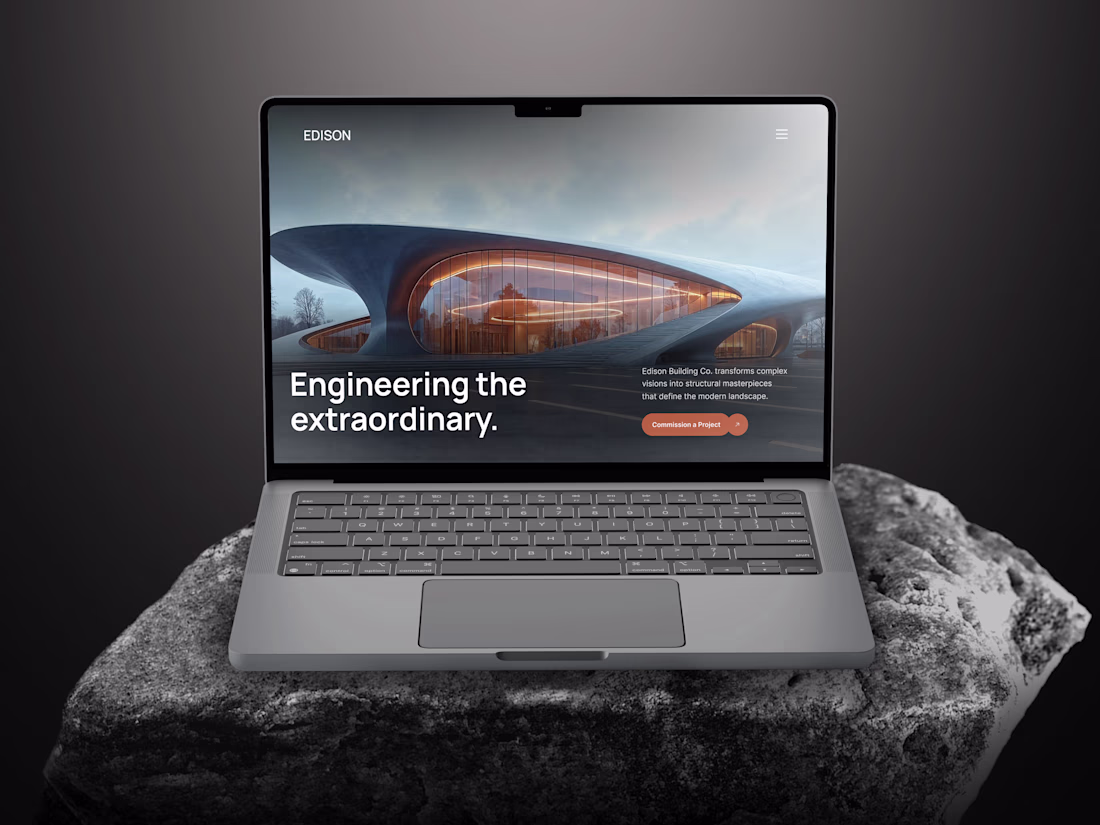
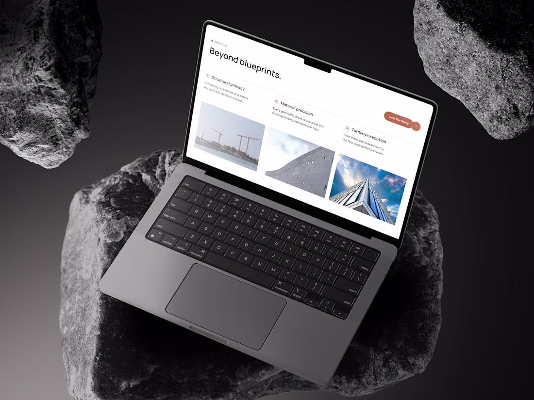
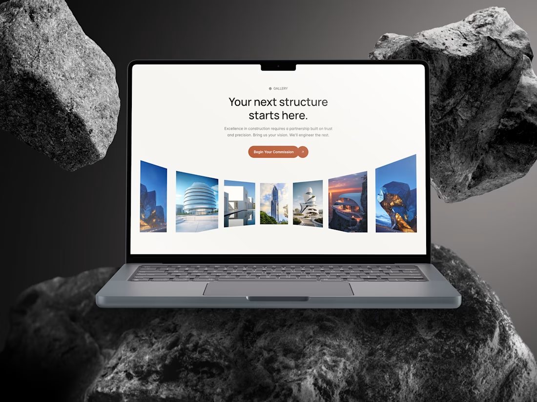
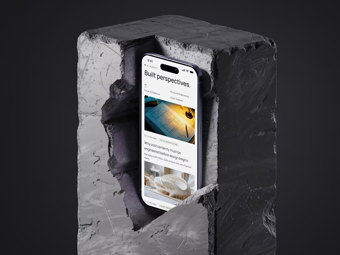
Edison is officially live on the Framer Marketplace. ♟️
Most architecture templates on the market are just re-skinned SaaS layouts. But for firms handling $50M+ structural commissions and sovereign wealth funds, that visual compromise is a tragedy.
They don't need a cheap interface. They need gravitas. Edison is not a template. It is a rigorous design system built from the ground up for elite architecture and engineering practices. No bouncy animations, no generic layouts, and zero visual clutter.
Just:
▪️ A strict 8-pt luxury spatial rhythm (exhale/inhale/release)
▪️ Uncompromising brutalist typography
▪️ True editorial precision and a highly scalable CMS architecture
Live preview https://www.framer.com/marketplace/templates/edison/
Nice Design!! 🔥
Trending
Claude
Claude has entered the design space. How are you using Claude Design?
Contra University
Learn from expert creatives how to earn more using next-gen AI tools.
MagicPath
The canvas is infinite, and exploration is becoming the workflow. How are you using MagicPath?
creativeaiflow
Creative AI workflows are evolving. What tools do you use, and what are their strengths and weaknesses?
freelancerlife
Freelancer life is wins, pivots, and everything in between. What’s yours right now?