The network for creativity
Join 1.25M professional creatives like you
Connect with clients, get discovered, and run your business 100% commission-free
Creatives on Contra have earned over $150M and we are just getting started
Back to feedPost

Meal Prep Strategies — Editorial Pinterest Pin Design
Where practical wellness education meets striking editorial design.
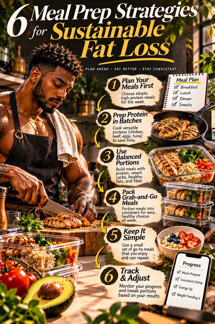
This self-initiated Pinterest pin design concept explores how visually compelling content can transform everyday health and wellness information into an engaging digital experience.
Centered around the theme of sustainable fat loss through practical meal preparation, the project combines cinematic food photography, expressive editorial typography, richly textured collage elements, and structured educational storytelling to create a visually distinctive piece designed for Pinterest's discovery-driven environment.
The creative objective was to move beyond conventional recipe graphics and generic wellness templates, developing a design that immediately captures attention while communicating useful information in a clear, approachable, and visually memorable way.
Creative Concept & Art Direction
The visual narrative follows a practical meal preparation process, showing how simple planning and consistent food choices can support a more organized approach to healthy eating.
A muscular male character anchors the composition inside a warm, contemporary kitchen, actively preparing grilled chicken alongside colorful vegetables, balanced meals, and neatly arranged food containers.
The environment feels authentic, energetic, and aspirational, emphasizing real food preparation rather than abstract wellness imagery.
Six educational strategies guide the visual story: planning meals in advance, preparing protein in batches, building balanced portions, packing convenient meals, keeping food choices simple, and reviewing progress over time.
Each section connects to recognizable food, cooking equipment, or meal-preparation activities, helping the viewer understand the advice through both written information and supporting imagery.
Typography & Visual Hierarchy
Typography serves as one of the project's strongest visual elements.
An oversized editorial serif headline establishes an immediate focal point, combining elegant letterforms with confident scale and dramatic contrast.
The phrase “Sustainable Fat Loss” receives particular emphasis through its vibrant golden-yellow treatment, creating a striking contrast against the darker photographic background.
Bold contemporary sans-serif lettering provides structure across the educational sections, while numbered markers and directional arrows establish a clear reading sequence.
The typography was designed to feel expressive and sophisticated without compromising the accessibility of the information.
Composition, Color & Visual Storytelling
The composition uses a vertically oriented editorial layout developed specifically for Pinterest's mobile-first viewing experience.
Rather than separating photography and educational information into disconnected panels, the design brings the kitchen environment, food photography, character, and educational content together into one continuous visual narrative.
Torn-paper-inspired text treatments introduce a tactile, handcrafted quality, while carefully positioned arrows create movement through the six strategies.
A rich palette of charcoal, golden yellow, warm cream, natural green, and appetizing food tones establishes a premium visual atmosphere.
Cinematic sunlight, detailed textures, and realistic food presentation add depth and warmth, making the design feel closer to a professionally art-directed wellness publication than a conventional social media graphic.
Content Communication & Design Strategy
The design balances visual impact with educational clarity.
Its oversized headline is intended to attract attention within a busy Pinterest feed, while the numbered information sections encourage viewers to explore the content in greater detail.
The food preparation imagery reinforces the practical nature of the advice, transforming the educational message into something tangible and approachable.
The six-part structure also creates a natural progression, allowing viewers to move from initial planning through preparation, execution, and ongoing improvement.
Every visual decision supports the central objective: making useful wellness information engaging, understandable, and worth saving for future reference.
Final Design Outcome
The completed concept demonstrates an editorial approach to Pinterest pin design that combines distinctive art direction, structured information, premium photography-inspired visuals, and strong typographic expression.
It showcases how educational Pinterest content can function as both an informative resource and a visually engaging brand asset.
The result is a bold, polished, and memorable digital graphic suitable for demonstrating creative capabilities in wellness marketing, content design, and Pinterest-focused visual communication.
This project reflects a design philosophy built around originality, purposeful storytelling, and the belief that useful content deserves exceptional visual presentation.
Self-initiated portfolio concept created to showcase Pinterest pin design, editorial art direction, and educational visual communication.


The network for creativity
Join 1.25M professional creatives like you
Connect with clients, get discovered, and run your business 100% commission-free
Creatives on Contra have earned over $150M and we are just getting started
Related posts

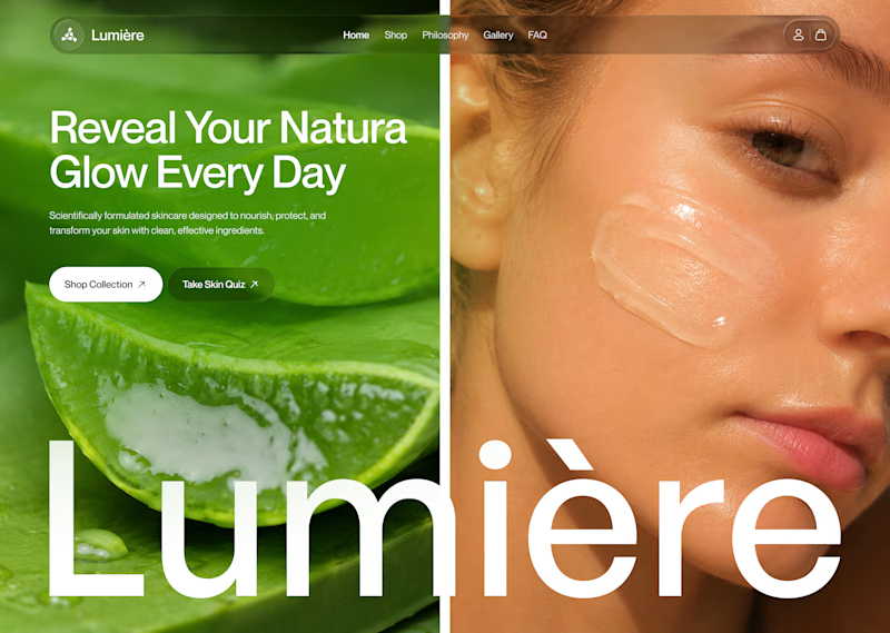
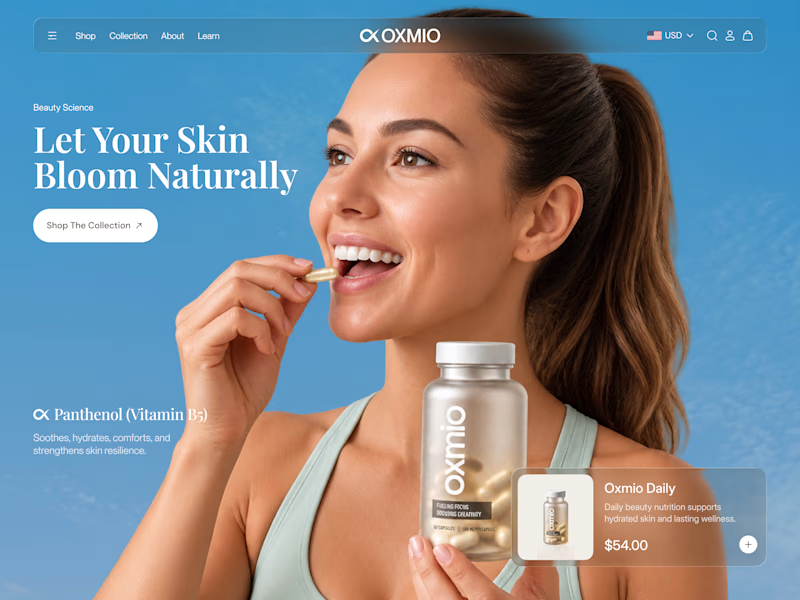
Your design has 3 seconds to earn attention. Which skincare brand wins?
A leads with confidence, energy, and aspiration. B builds trust through nature, freshness, and simplicity.
Great design doesn’t just look good. It makes people feel the brand before they read a word.
A or B? Which would make you stop scrolling?


30 voted
52%
28 voted
48%
58 votes
Closed


B without questions

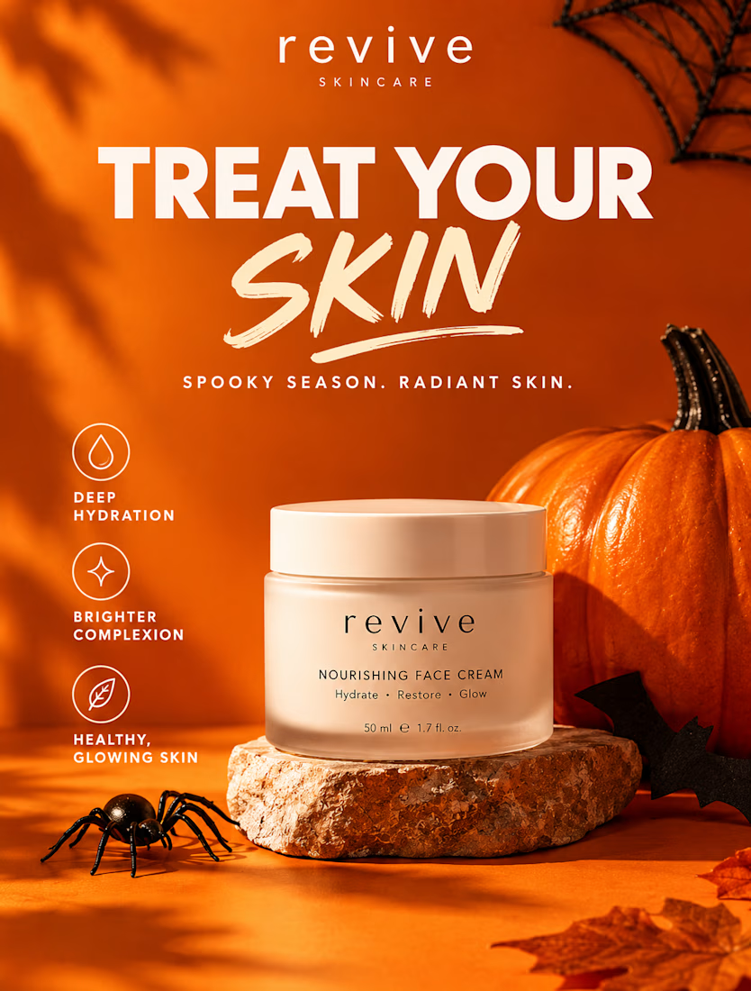
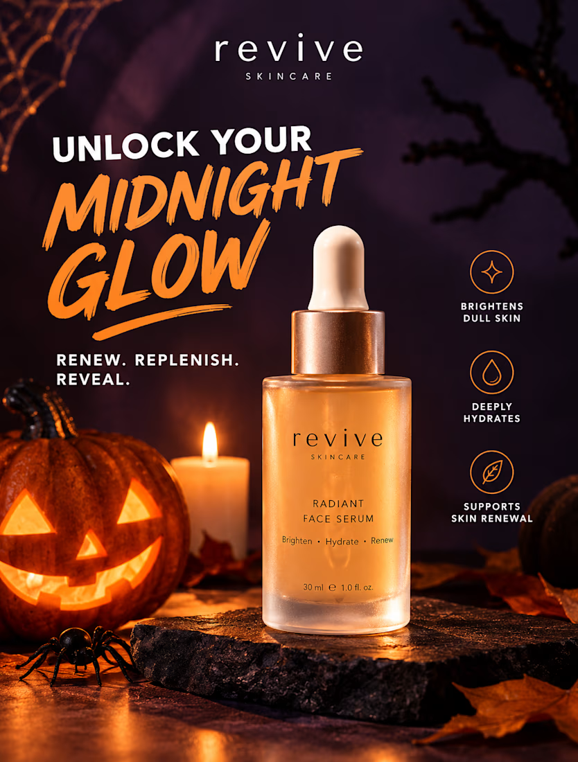
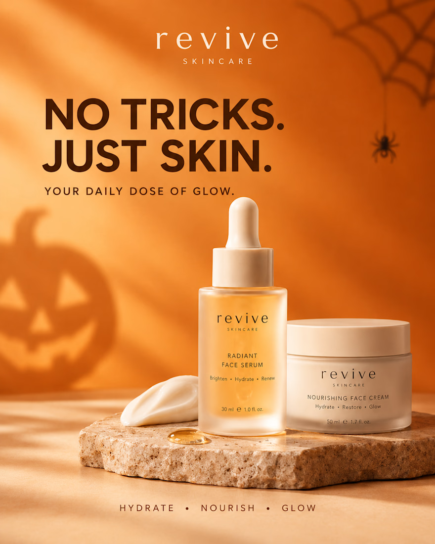
REVIVE SKINCARE | Halloween Campaign Design 🎃
A little spooky, a lot of glow. 🧡
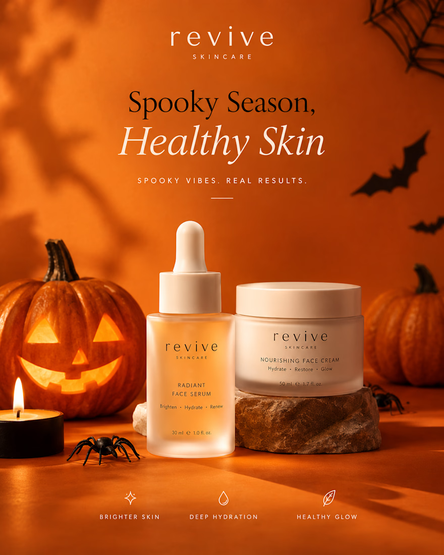
This six-design Halloween skincare campaign for REVIVE SKINCARE blends seasonal creativity with premium beauty branding, warm pumpkin-orange tones, deep plum accents, elegant typography, and realistic skincare product photography.
From bold product advertisements to self-care lifestyle visuals, every design is crafted to maintain brand consistency while capturing attention and giving the brand a polished, luxurious feel.
The campaign combines Halloween-inspired details with modern skincare aesthetics, creating scroll-stopping visuals perfect for Instagram marketing, seasonal promotions, and beauty brand storytelling.
Design highlights:
Six cohesive Instagram campaign designs
Premium skincare product advertising
Consistent brand identity and packaging
Halloween-inspired art direction
Product-focused layouts and lifestyle photography
Social media-ready visual storytelling
Designed to show how seasonal creativity can help a skincare brand stand out while keeping its identity elegant, recognizable, and memorable.
Which design is your favorite? 🎃
#SkincareBranding #SocialMediaDesign #InstagramDesign #GraphicDesign #BeautyBranding #SkincareMarketing #HalloweenCampaign #HalloweenDesign #BeautyAdvertising #ProductPhotography #InstagramMarketing #CreativeDesign #BrandIdentity #CanvaDesign #PortfolioDesign


Revive might be the solution to reviving my skin you know

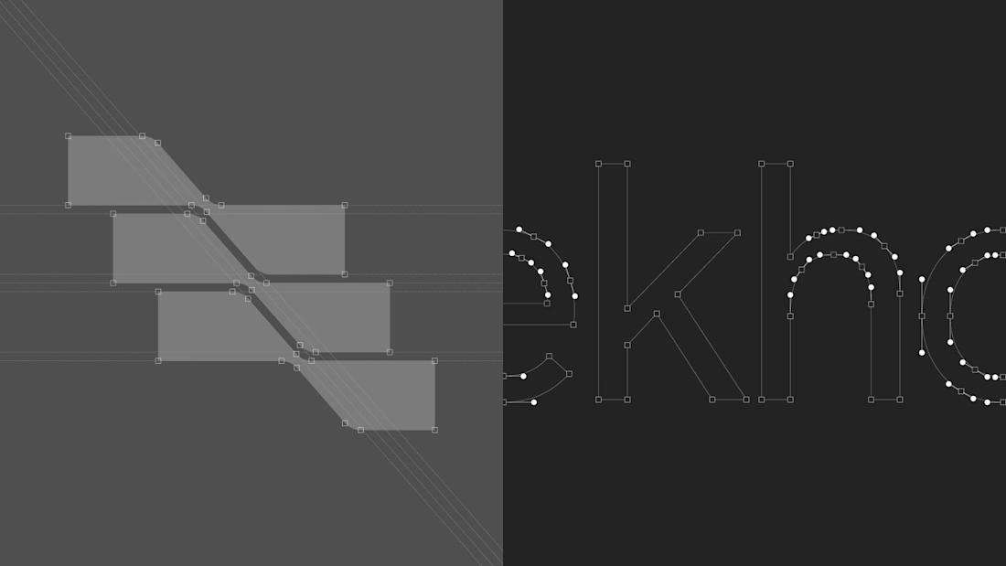
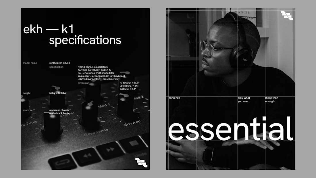
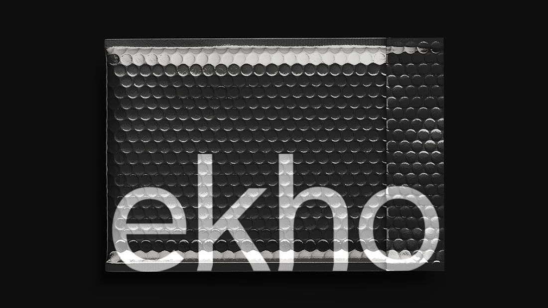
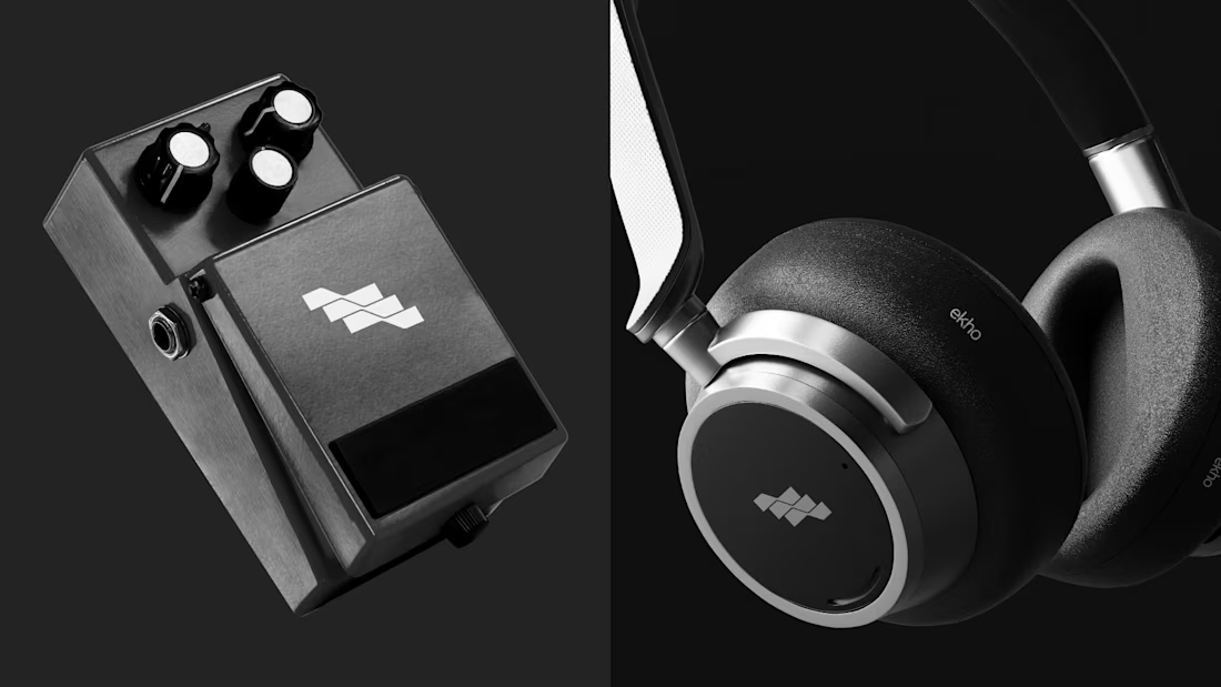
Brand identity for Ekho an audio technology brand focused on creating tools that expand the possibilities of sound design while maintaining clarity and simplicity. Inspired by the concept of “echo,” the brand reflects depth, space, and transformation in sound, translated into a modern and minimal design approach.

Top tier branding