The network for creativity
Join 1.25M professional creatives like you
Connect with clients, get discovered, and run your business 100% commission-free
Creatives on Contra have earned over $150M and we are just getting started
Back to feedPost

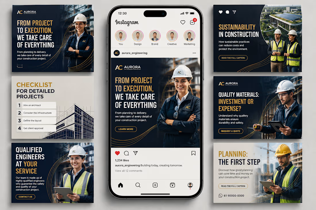
Aurora Engineering| Social Media Content & Brand Strategy
Building a strong construction brand takes more than showcasing completed projects, it requires content that communicates expertise, reliability, safety, quality, and innovation.
For Aurora Engineering, I developed a professional social media content direction designed to establish the brand as a trusted construction and engineering partner while making technical topics accessible and engaging to its audience.
The content focuses on key themes including construction planning, project execution, qualified engineers, sustainable construction, material quality, infrastructure, and construction best practices.
The strategy was built to:
• Strengthen Aurora Engineering’s professional brand presence
• Educate potential clients about construction and engineering decisions
• Showcase technical expertise through easy-to-understand content
• Build trust through professional and human-centered visuals
• Create consistent brand recognition across social media
• Encourage inquiries and potential project consultations
• Position the company as knowledgeable, reliable, and detail-oriented
The visual identity combines deep navy, warm gold, clean typography, architectural imagery, and engineering-focused photography to create a premium and authoritative appearance.
This project showcases my approach to social media management, content strategy, construction marketing, brand storytelling, visual content creation, and Instagram content planning.
#SocialMediaManager #SocialMediaManagement #SocialMediaStrategy #ContentStrategy #ContentCreation #ConstructionMarketing #ConstructionIndustry #ConstructionCompany #Engineering #EngineeringMarketing #CivilEngineering #ConstructionManagement #ProjectManagement #Architecture #Infrastructure #BuildingConstruction #SustainableConstruction #ConstructionBranding #B2BMarketing #B2BContent #IndustrialMarketing #BrandStrategy #BrandIdentity #VisualStorytelling #InstagramMarketing #InstagramContent #SocialMediaContent #DigitalMarketing #ContentMarketing #BusinessMarketing




nice work

amazing

Great Visuals

nice work
The network for creativity
Join 1.25M professional creatives like you
Connect with clients, get discovered, and run your business 100% commission-free
Creatives on Contra have earned over $150M and we are just getting started
Challenges
View all


Related posts


SOCIAL MEDIA DESIGN | Brand-Focused Visual Creatives
A curated collection of social media creatives designed for brands across food & hospitality, FMCG, sports, fitness, music, logistics, travel, and lifestyle.
Each creative is built around the brand’s visual identity, combining strong composition, typography, color, imagery, visual hierarchy, and clear messaging to create content that captures attention and communicates the product or service effectively.
The work includes promotional campaigns, product-focused creatives, brand awareness posts, feature highlights, and call-to-action designs.
Focus areas:
Social Media Design
Brand Communication
Product & Promotional Creatives
Typography & Layout
Visual Storytelling
Campaign Design
The goal is simple: make every post visually engaging while keeping the brand message clear, consistent, and memorable.
Services: Social Media Design • Brand Design • Marketing Creatives • Advertising Design • Visual Content
#SocialMediaDesign #GraphicDesign #BrandDesign #VisualCommunication #SocialMediaCreative #MarketingDesign #ContraDesigner


What caught my attention was how each layout leans on the brand's visual identity, especially the typographic hierarchy you used in the food campaign.

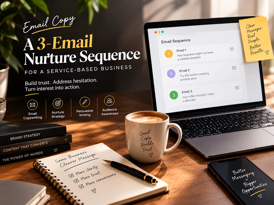
EMAIL 1 — The problem
Subject: Your business might not have a visibility problem
You’re posting.
You’re showing up.
You’re talking about what you do.
But somehow, people still don’t seem to understand why they should choose you.
That can feel like a visibility problem.
Sometimes, it isn’t.
Sometimes, the real problem is that your message isn’t making the value of your business clear enough.
When someone lands on your website or sees your content, they should be able to quickly understand:
What do you help with?
Who is it for?
And why should they care?
If those answers aren’t clear, posting more won’t necessarily fix the problem.
The message comes first.
Tomorrow, I’ll show you one simple way to check whether your current messaging is doing its job.
[Brand Strategist]
EMAIL 2 — The insight
Subject: Try this before creating another post
Open your website.
Now imagine you’ve never heard of your business before.
Give yourself 10 seconds.
Can you answer these three questions?
What does this business help me do?
Is this actually for someone like me?
Why should I trust them?
If you have to search for the answers, your potential customer probably has to as well.
And when people have to work too hard to understand an offer, they often leave.
Your copy doesn’t need to say everything.
It needs to make the right things clear.
That’s where strong positioning and messaging can change the way people experience your business.
If your message feels harder to explain than your service should be, that’s worth looking at.
[Brand Strategist]
EMAIL 3 — The next step
Subject: Your offer shouldn’t need a decoder
You already know how good your service is.
The challenge is making a stranger understand that quickly.
If your website, content, or offer currently feels like it’s saying a lot without making the main value obvious, it may be time to simplify.
Not by making your business smaller.
By making the message clearer.
If you’d like help figuring out where your messaging is losing clarity, book a consultation here — [CTA]
No complicated pitch.
Just a conversation about what’s working, what’s unclear, and what could be stronger.
[Brand Strategist]
Project description
Brief:
Create a 3 email nurture sequence for a fictional brand strategist whose prospects have shown interest but haven’t taken the next step.
Approach:
The sequence moves from identifying a messaging problem, to providing a useful insight, to presenting a low pressure next step. The copy focuses on clarity and relevance rather than aggressive selling.
Skills demonstrated:
Email copywriting, persuasive writing, audience awareness, nurture strategy, CTA writing.
Project note:
This is a speculative practice project created to demonstrate my email copywriting and strategic thinking. No client performance results are being claimed.


Great nurture sequence. Each email builds trust naturally and makes the next step feel easy.

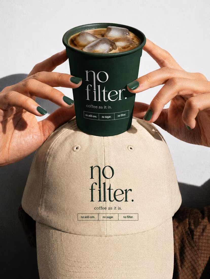
Bold coffee packaging and visual design created to give the brand a distinctive shelf presence through strong typography, modern layouts, and a cohesive visual identity.

the green nails matching the cup is a fun touch. did you plan that?