The network for creativity
Join 1.25M professional creatives like you
Connect with clients, get discovered, and run your business 100% commission-free
Creatives on Contra have earned over $150M and we are just getting started
Back to feedPost
Taste Test

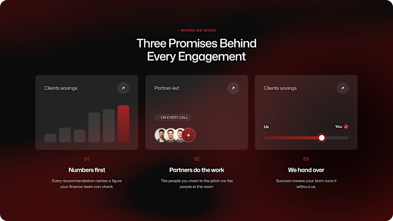
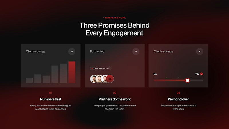
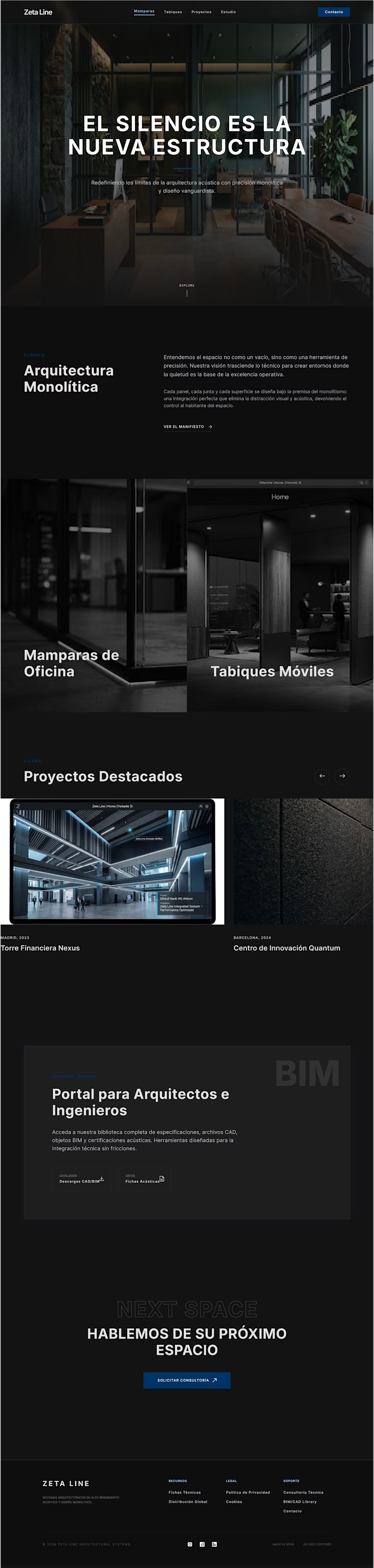
A small UI experiment: Border Radius vs. No Border Radius.
Same layout. Same content. Two different visual personalities.
I explored how the outer container treatment changes the relationship between the section, cards, and surrounding space.
Rounded → softer, more approachable, product-like.
Sharp → cleaner, more editorial, more architectural.
My pick: Sharp.
Sometimes the smallest visual decisions have the biggest impact.
2 votes
Ends in 1d

Went with Rounded. The softer corners make those dark cards feel less heavy.
The network for creativity
Join 1.25M professional creatives like you
Connect with clients, get discovered, and run your business 100% commission-free
Creatives on Contra have earned over $150M and we are just getting started





Related posts

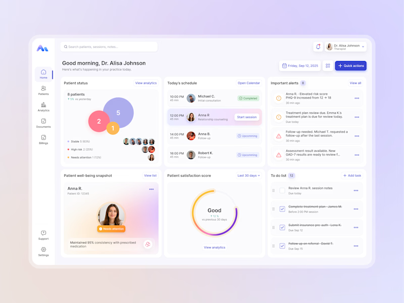
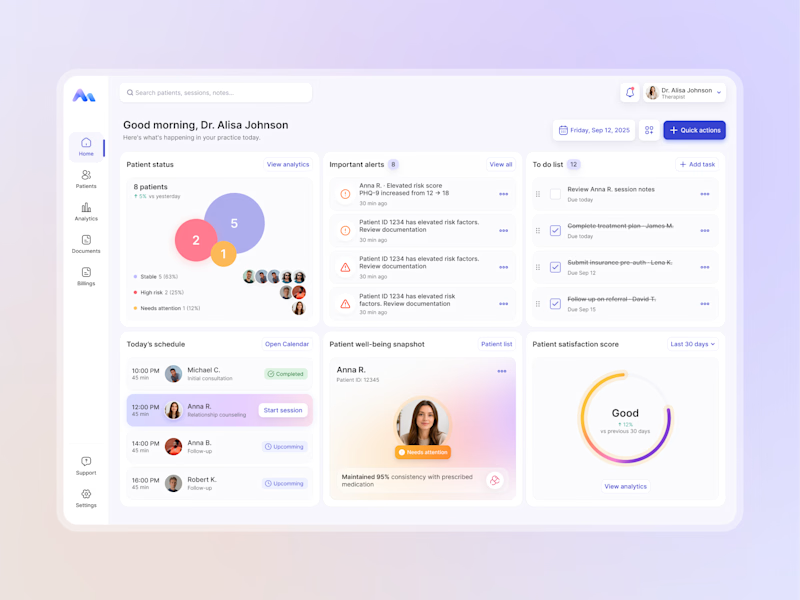
Designing for therapists means prioritizing what matters in the next few minutes, not just what looks good on a dashboard.
I explored two layout directions for a mental health practice management web app that helps psychologists manage sessions, patients, documentation, tasks, and follow-ups.
Both concepts use the same core widgets, but with different positioning and visual hierarchy. The goal was to make daily priorities easier to scan and act on.
Which option feels more intuitive - A or B? 🤔
17 voted
68%
8 voted
32%
25 votes
Closed


Recently, I created two designs for my client. One is in dark mode, and the other is in light mode. I love both of them. Which one do you like more?

5 voted
56%
4 voted
44%

9 votes
Closed

fresh light

Portfolio that gets you hired in 2026.👇
Liquid blob physics portfolio reveal.
I built this with a simple JSON prompt on Claude 🧑💻, took less than 30 minutes,
As a designer , nothing gladdens my heart more than being able to bring my designs to life with the help of Ai.

Excellent work Peace.