The network for creativity
Join 1.25M professional creatives like you
Connect with clients, get discovered, and run your business 100% commission-free
Creatives on Contra have earned over $150M and we are just getting started
Back to feedPost

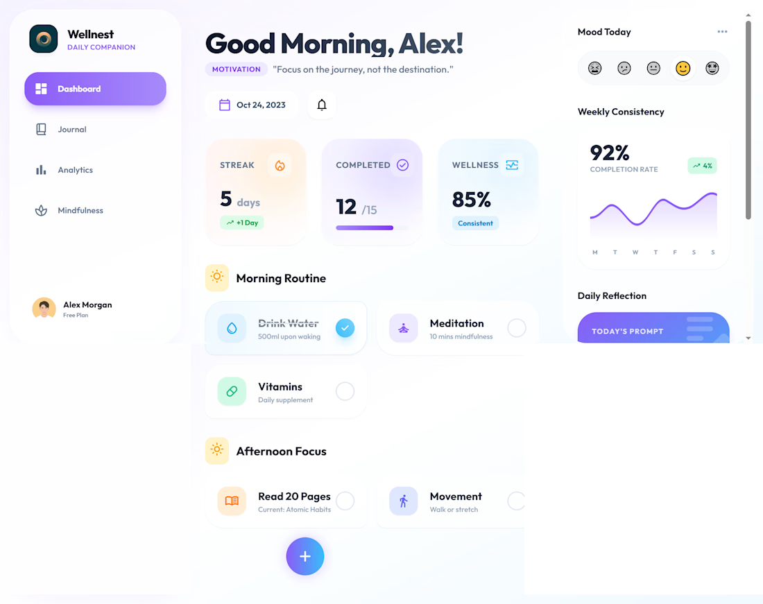
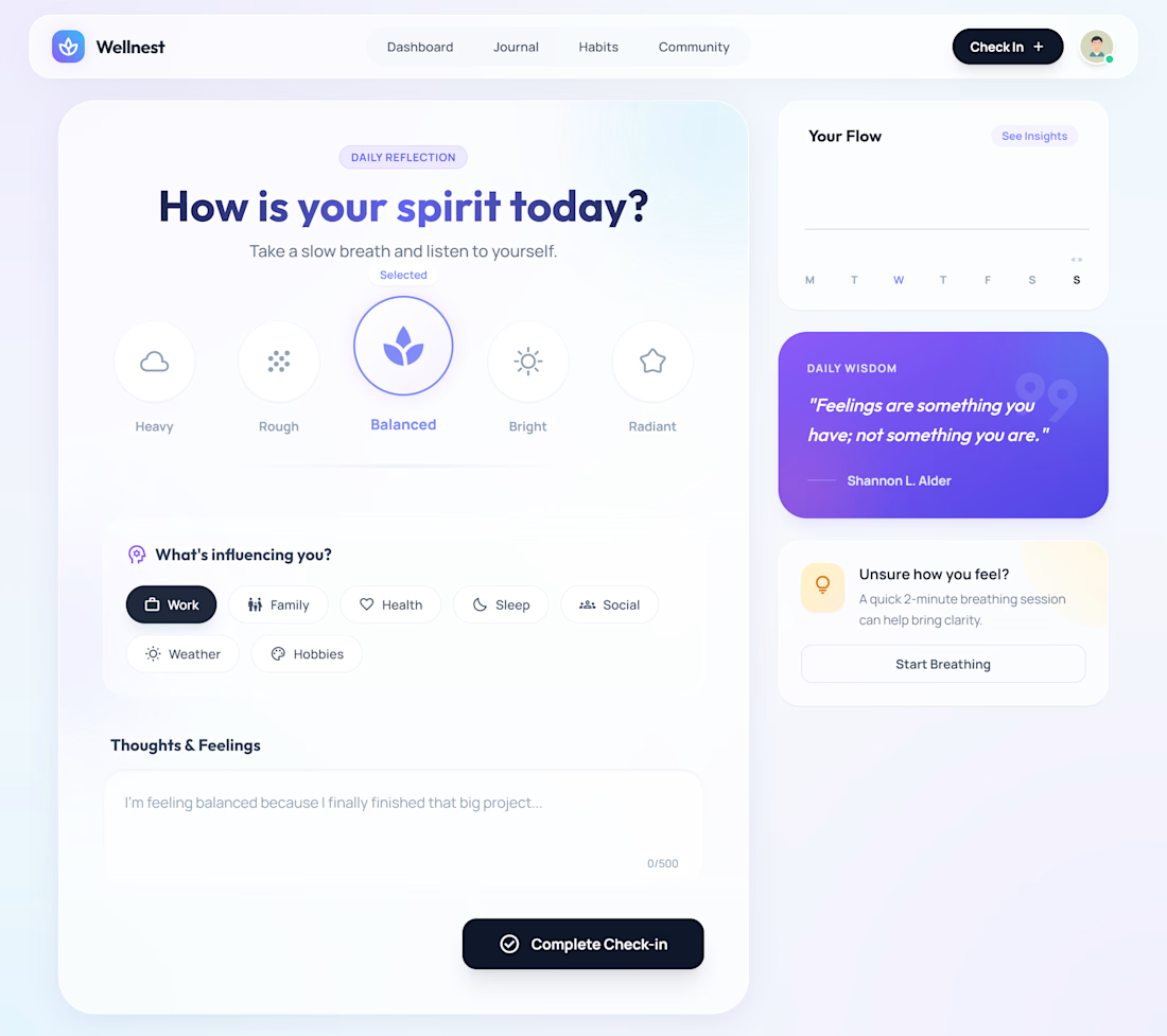
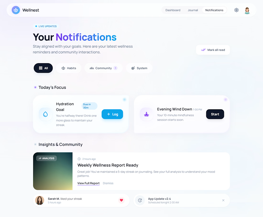
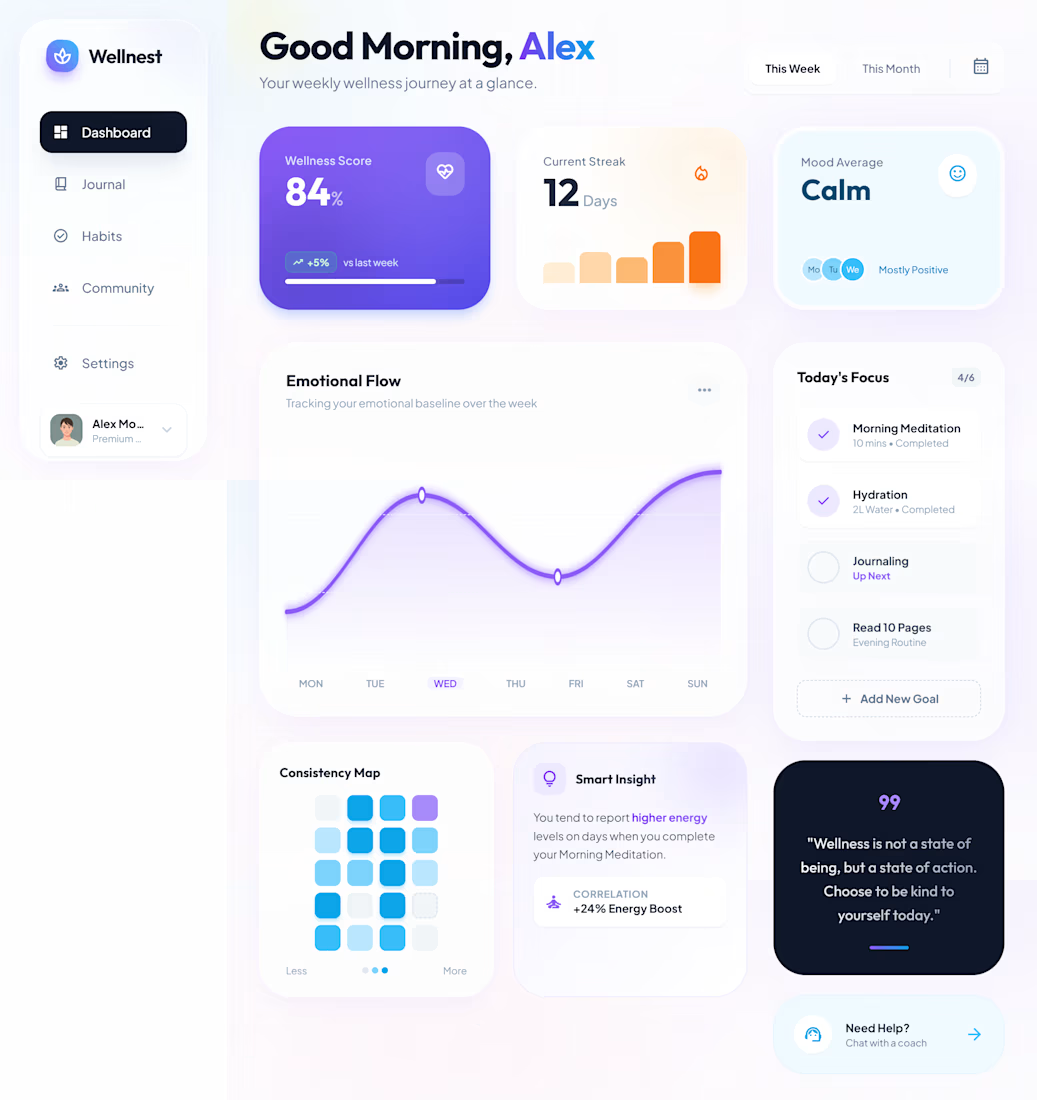
Most health apps feel like a chore. I built one that feels like a breath of fresh air.
Want to share Wellnest, a health and habit tracker designed and under developed from the ground up.
This focuses on the human side of wellness balancing habit tracking.
Handling the full lifecycle of this product from the initial UI/UX strategy in Figma to the final responsive deployment. Focused on soft gradients and clean "glassmorphism" to ensure the interface stays out of the user’s way.
#fullstack #UIUX #BuildInPublic


The network for creativity
Join 1.25M professional creatives like you
Connect with clients, get discovered, and run your business 100% commission-free
Creatives on Contra have earned over $150M and we are just getting started





Related posts

I’ve always liked products that solve a very specific problem instead of trying to do everything.
So for the Lovable Challenge, I picked a simple question that event-tent rental businesses hear all the time:
“Can I book a tent for my wedding?”
The problem is… a tent can’t really be booked until you know if the whole event will work.
How many guests?
How much usable space?
Tables? Dance floor? Bar? Stage?
Will the layout actually fit?
Can the crew set it up and pick it up on time?
Usually, the owner has to figure all of that out manually through messages, calls and calendar checking.
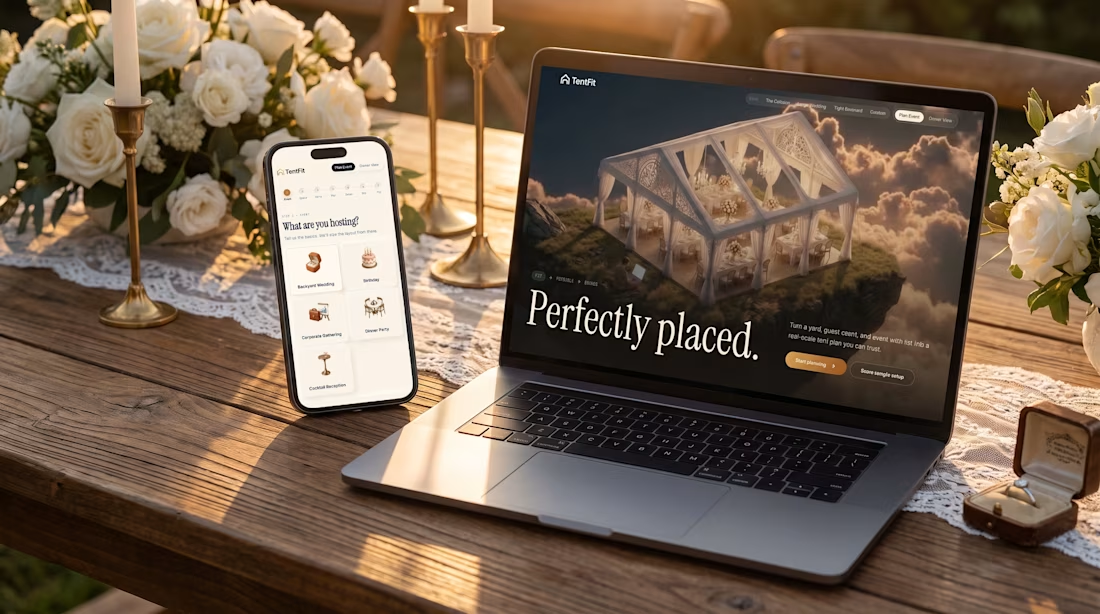
So I built TentFit — a spatial booking experience for event tent rentals.
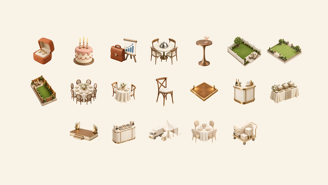
The customer starts by planning the event, then maps out the space and everything they want inside it. TentFit checks the layout and highlights conflicts.
And instead of just saying “doesn’t fit,” it helps solve the problem:
Switch the tent. Move the layout. Remove an element.
Once everything works, TentFit checks the logistics and turns the final setup into a booking.
The goal was simple:
Make the customer’s decision easier, and make the owner’s job easier.
The flow is basically:
FIT → FEASIBLE → BOOKED
I had a lot of fun building the spatial planning part of this one.
X/Twitter post: https://x.com/brjanov/status/2105630218492731501?s=20
Built with @Lovable
#LovableChallenge #ProductDesign #UXDesign #NoCode #SaaS #WebDesign



Nice stuff!


This is Mikuna. From WhatsApp chaos to a confirmed lesson.
Small language studios shouldn't have to manage every student through WhatsApp.
Mikuna started from a simple problem: a student wants to book a lesson, but the process quickly becomes a chain of messages about language, goals, tutors, availability, payment, changes and confirmations.
So I designed a system where the student handles the coordination themselves, while the tutor gets a ready-to-teach agenda.
The student can:
→ Choose a language and learning goal
→ Find the right tutor
→ Pick an available time
→ Purchase credits
→ Book the lesson
→ See their upcoming lessons and remaining credits
The tutor gets:
→ An organized agenda
→ Upcoming and past lessons
→ Relevant student context
→ One-click access to the lesson
Behind the interface, the system also handles tutor availability, booking conflicts, credits, payments and cancellation rules.
The idea was simple:
From managing conversations to managing lessons.
Mikuna was built for the Contra × Lovable Challenge, starting from an existing brand identity created at SUR Studio and reimagining it as a complete appointment-based product.

Love this! Such a clean solution to a very real problem for language studios. The shift from WhatsApp chaos to a seamless booking experience is brilliant.