The network for creativity
Join 1.25M professional creatives like you
Connect with clients, get discovered, and run your business 100% commission-free
Creatives on Contra have earned over $150M and we are just getting started
Back to feedPost

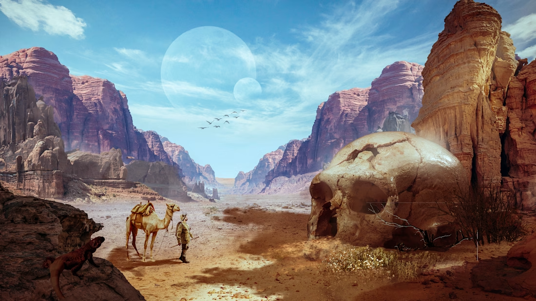
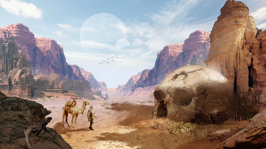
Ventured into image manipulation, combining multiple assets to craft a cohesive, cinematic world through visual storytelling. First image: my color grade. Second image: the original. Which one are you going for? 👀


The network for creativity
Join 1.25M professional creatives like you
Connect with clients, get discovered, and run your business 100% commission-free
Creatives on Contra have earned over $150M and we are just getting started







Related posts

So, what is ROSI?
A few cans.
Five colours.
One very simple fish.
A ridiculously large wordmark.
And hopefully proof that everyday products don’t have to look everyday.

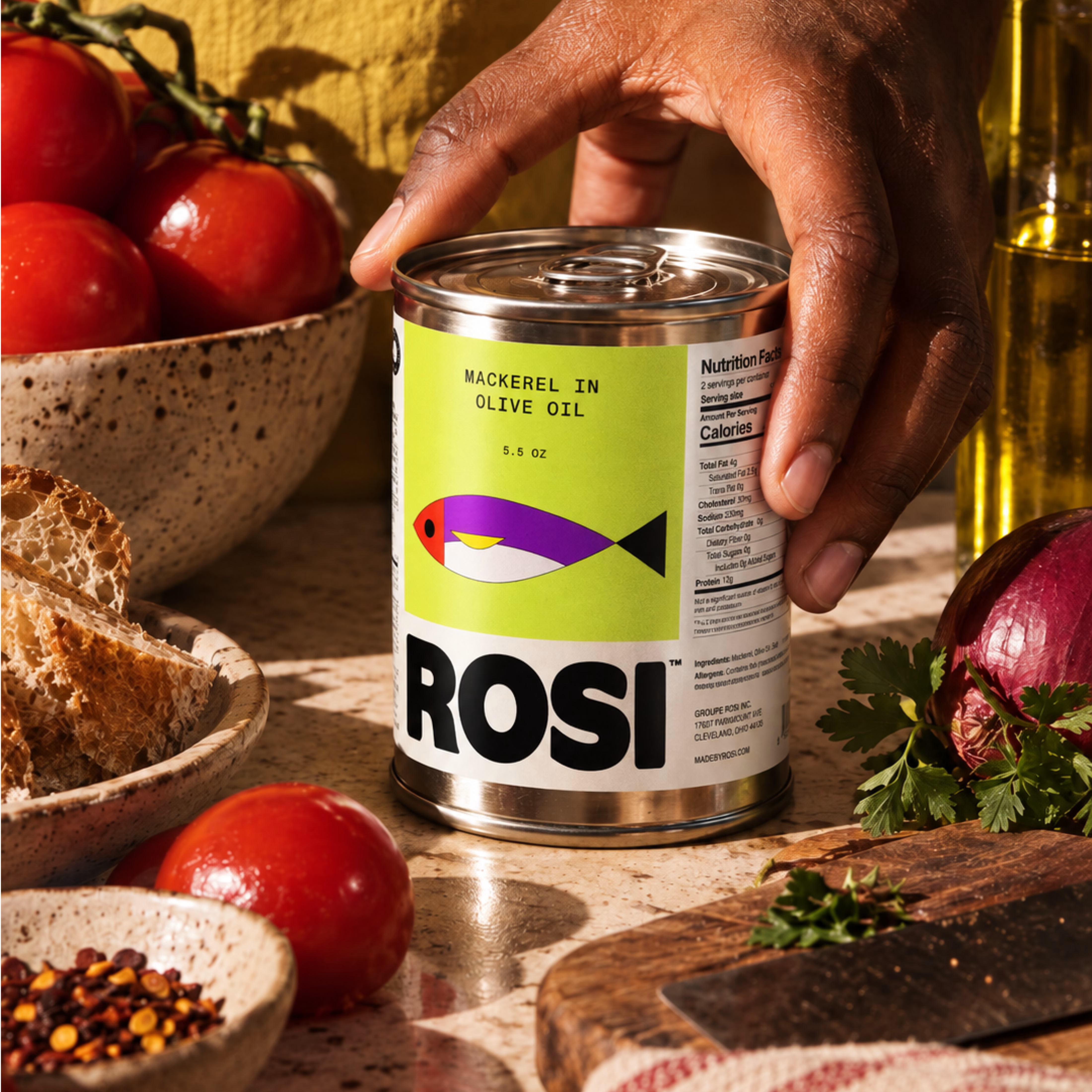
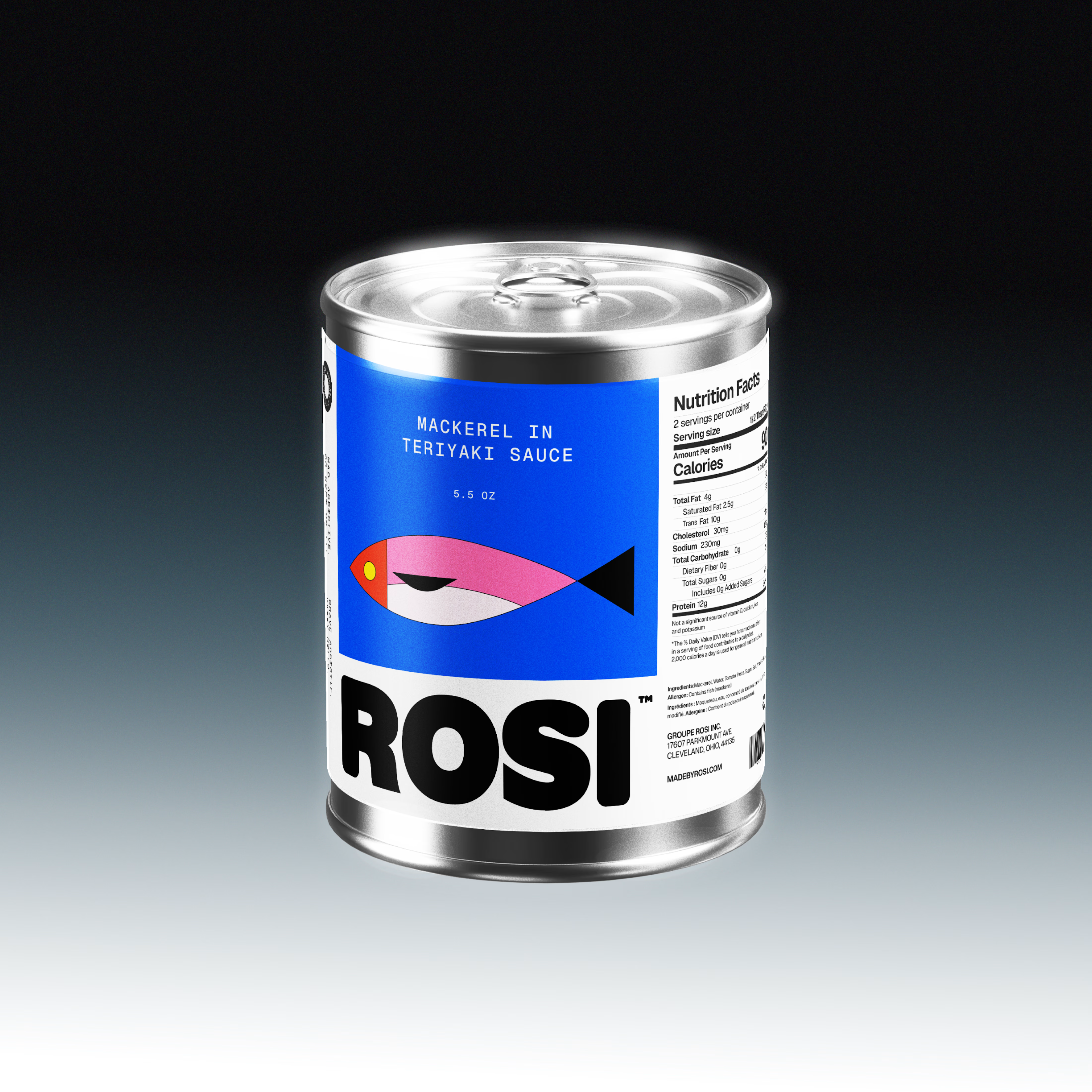
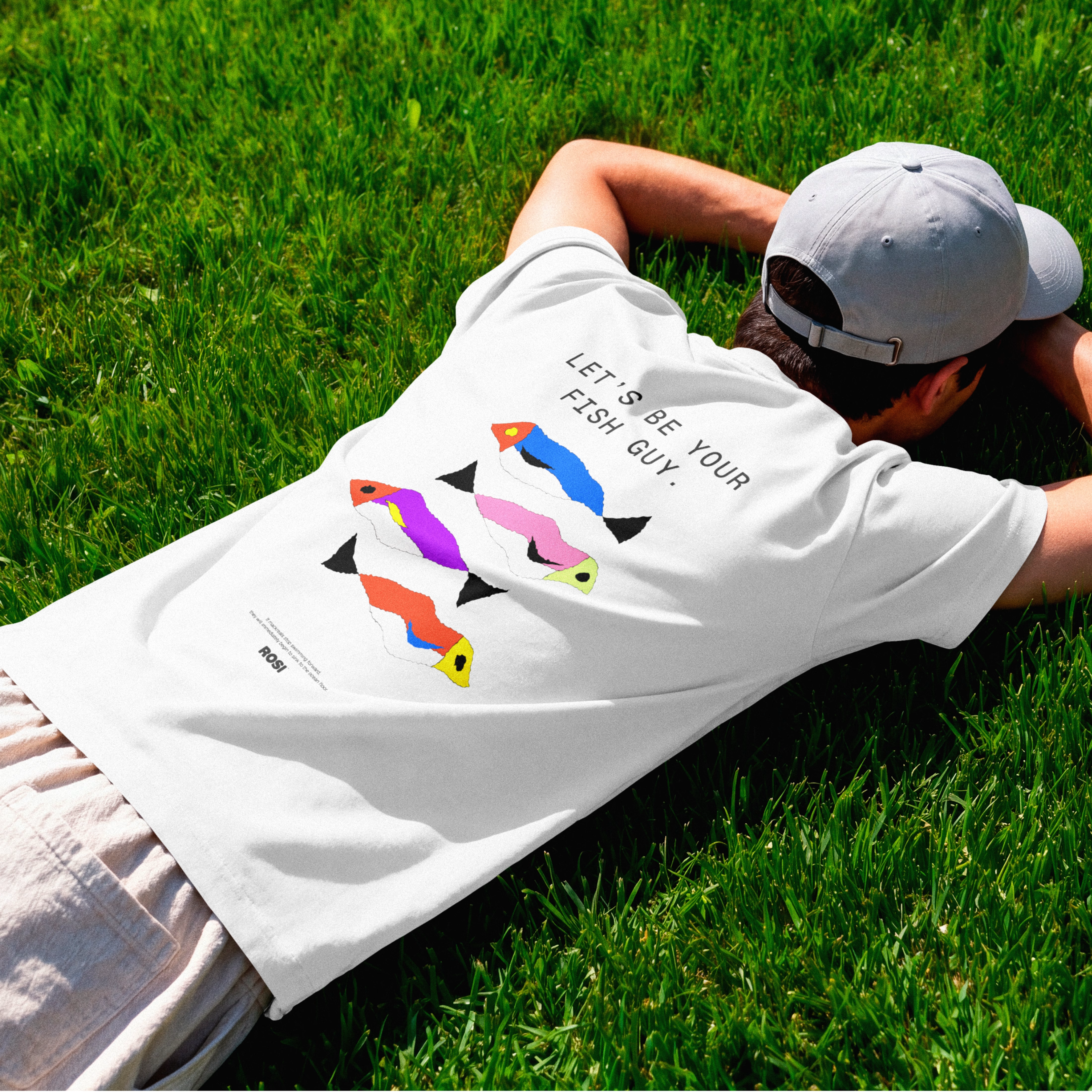

The ridiculously large wordmark is the entire personality, tinned fish has never strutted like this. Proof that confidence is a design decision, not a budget line.

Ventox — Hypercar Landing Page 🏎️🔥
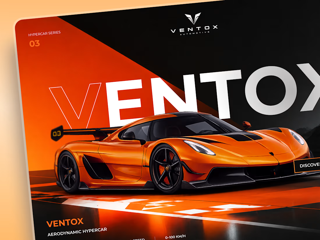
Ventox is a high-performance automotive landing page concept built around speed, exclusivity, and bold visual storytelling.
The design combines a striking orange hypercar, oversized typography, and a dramatic black-and-orange palette to create an immersive digital experience.
Special attention was given to:
A cinematic hero composition that puts the hypercar in the spotlight.
Oversized typography that reinforces the brand's identity.
Sharp geometric shapes and high-contrast colors inspired by speed.
Performance specifications presented in a clean, structured layout.
A prominent CTA that directs attention to the vehicle.
Responsive mobile layouts with simplified content and intuitive navigation.
The result is a bold automotive experience that brings together premium aesthetics, performance-focused storytelling, and clear navigation.
Looking to create a distinctive website for your automotive or luxury brand? Let's build something extraordinary. ⚡

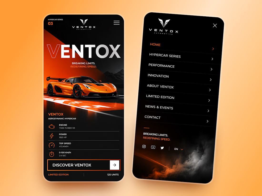

Designers, a client is buying into your taste, not just your ability to execute.
This project was about extending an existing brand into a new tech product, without losing the visual DNA that already made it distinctive.
The moodboard became part of the sell: proof that I understood the brand, but also that my own aesthetic judgment was refined enough to carry that legacy forward.
I can’t share the full moodboard yet as the project is not public, but this part of the process reflected an important part of my design philosophy. And I wanted to share it with you.
Because, that’s what I believe moodboards really do in design bussiness. They make taste visible, and show what to preserve, what to evolve, and how far to push.
As execution becomes faster, taste and creative judgment only become more valuable.
#BrandDesign #CreativeDirection #VisualIdentity #BrandStrategy #ArtDirection


The idea of making taste visible through the moodboard really lands here—the restrained type and orange mark feel like a clear bridge between legacy and future. I especially like how the motion piece turns that visual DNA into a living system.