The network for creativity
Join 1.25M professional creatives like you
Connect with clients, get discovered, and run your business 100% commission-free
Creatives on Contra have earned over $150M and we are just getting started
Back to feedPost
Taste Test

CVR rose 8%, but contribution profit per visitor fell 6%. The result is statistically significant. What should the team do?
1 voted
50%

1 voted
50%

2 votes
Closed


I’d reject it. Higher conversion doesn’t mean much if each visitor is generating less profit.
Yeah that makes sense. Looking at the actual profit instead of just conversion rate is the better way to judge it. Curious what the next test shows.
The network for creativity
Join 1.25M professional creatives like you
Connect with clients, get discovered, and run your business 100% commission-free
Creatives on Contra have earned over $150M and we are just getting started





Related posts

Holographic is back, so I built the same concert ticket two ways in code. Which one would you keep after the show?
Foil: the rainbow shifts as it tilts. Silver: embossed type, one clean light sweep.
Vote, and tell me what you'd print on yours.
46 voted
82%
10 voted
18%
56 votes
Closed

Silver make it feel more real then Foil,,, good design in both

Which 3 seconds would sell you the lens?
Same lens, two ways in. I built FOCAL, a launch page for a 50 mm lens that doesn't exist. Everything you see is live 3D running in the browser, not renders or video.
Left: it comes apart into seven pieces of glass, and light traces through every one to a single point.
Right: nine blades close to f/16, then you dive straight through the iris.
If the page only had room for one, which one makes you want to buy? Vote, then tell me why in the comments. The full page is live at https://focal-lens.netlify.app

23 voted
72%
9 voted
28%
32 votes
Closed

Inside the glass is league ahead in term of clarity and helping us understand the structure of the lens. Win by K.O 😂 Not even close.

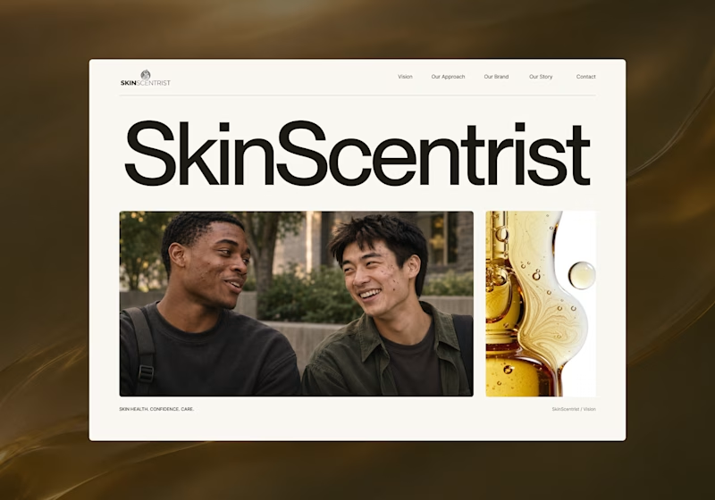
I’m exploring two homepage hero directions for SkinScentrist, a skincare brand focused on helping young men feel more confident in their skin.
Both concepts use the same imagery but take very different approaches to storytelling and visual hierarchy.
Direction 1 feels more emotional, immersive, and lifestyle-driven. The full-screen photography and bold messaging create a stronger connection to confidence and self-care.
Direction 2 feels more minimal, editorial, and brand-focused. The oversized typography, clean layout, and product imagery give it a more refined, contemporary skincare feel.
Direction 1: immersive, personal, emotional
Direction 2: minimal, editorial, premium
Which direction feels stronger for a modern skincare brand?

14 voted
93%

1 voted
7%
15 votes
Closed

Direction one — the full-screen photo feels warmer.