The network for creativity
Join 1.25M professional creatives like you
Connect with clients, get discovered, and run your business 100% commission-free
Creatives on Contra have earned over $150M and we are just getting started
Back to feedPost


branding assets
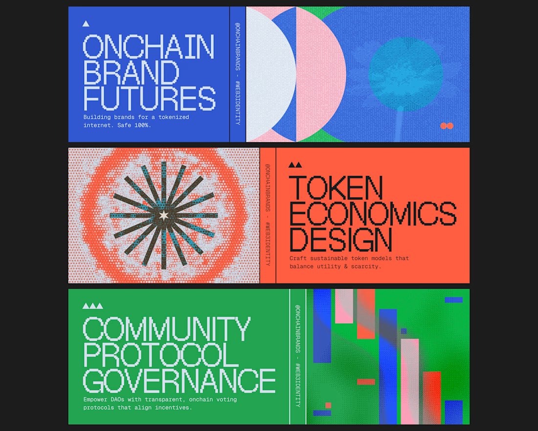

The color coding across the three sections (blue, orange, green) does a lot of work here, makes a dense topic like tokenomics feel navigable at a glance. Is this for a real client launch or more of a template system you're building out?

creative

Onchain branding usually blurs into the same neon-gradient soup, so this halftone editorial poster approach stands out immediately. Treating Token Economics Design like a magazine spread is a great call. Confident, grown-up system.

The simple geometric forms and futuristic patterns create such a bold, cohesive brand system. Great work!

This is a masterpiece

Nice
The network for creativity
Join 1.25M professional creatives like you
Connect with clients, get discovered, and run your business 100% commission-free
Creatives on Contra have earned over $150M and we are just getting started







Related posts
branding assets
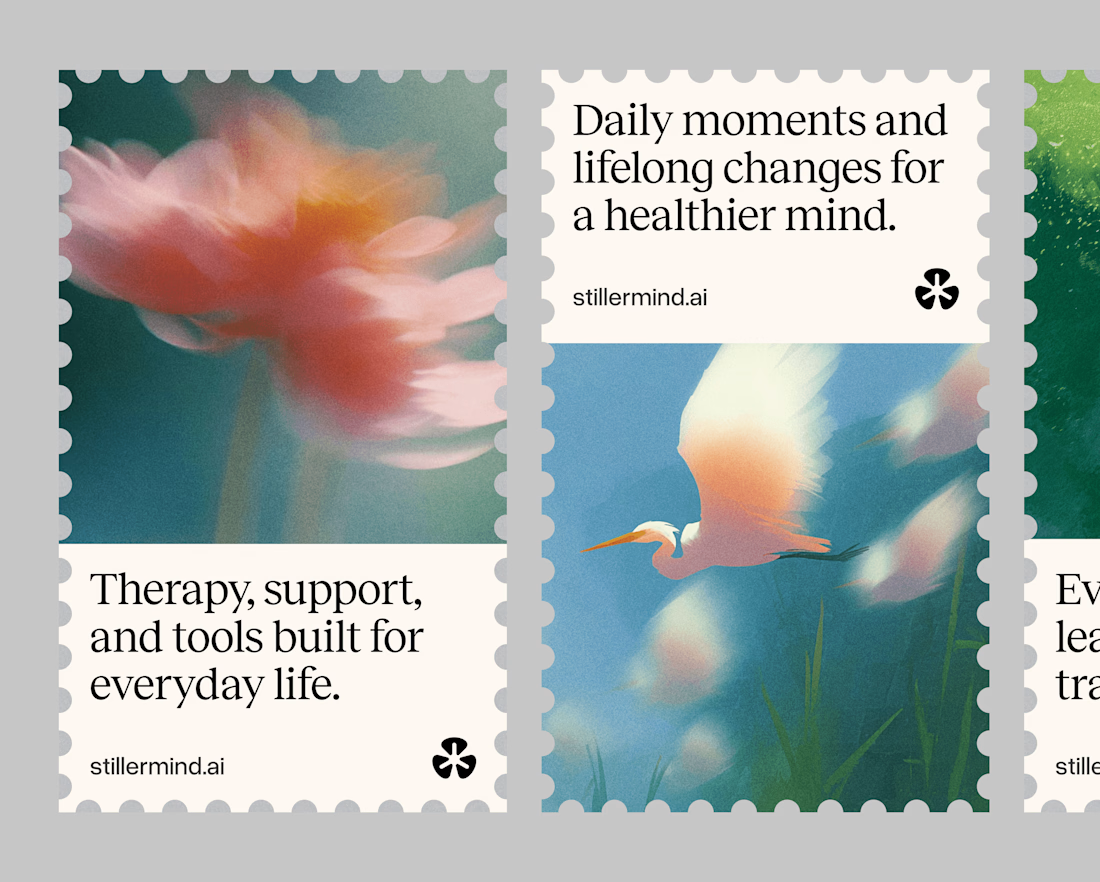
branding assets exploration


snippet of the brand identity I worked on for a brand.
loved every moment of creating it🤭🧡

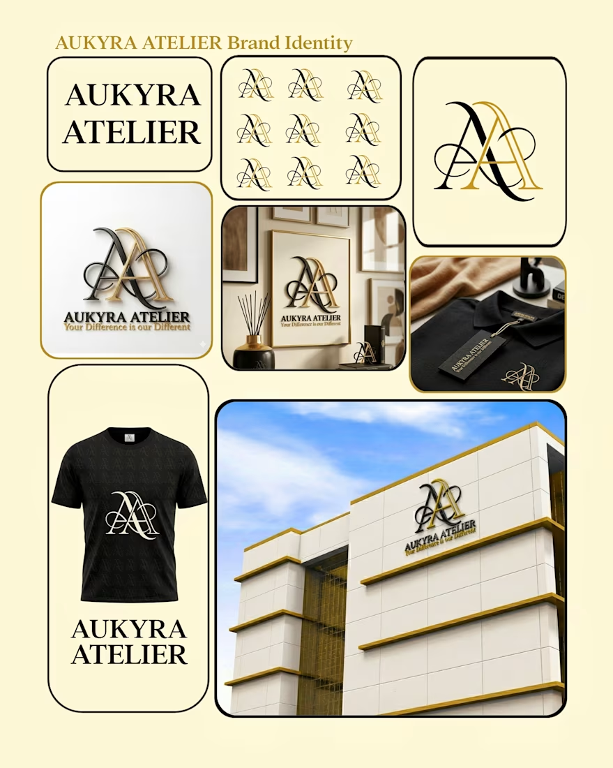

I really enjoyed your work! Great job, I especially liked the overall style and execution.