The network for creativity
Join 1.25M professional creatives like you
Connect with clients, get discovered, and run your business 100% commission-free
Creatives on Contra have earned over $150M and we are just getting started
Back to feedPost
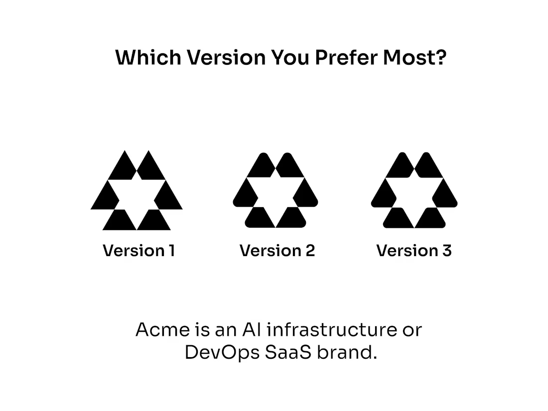
We're building Acme, an AI infrastructure and DevOps platform, and we're debating one final detail of our logo symbol.
All three versions share the same concept—interconnected nodes surrounding an intelligent core—but each creates a different impression:
Version 1: Sharp, precise, and deeply technical.
Version 2: Refined and balanced with subtle rounding.
Version 3: Softer, friendlier, and more modern SaaS.
If you were choosing a platform for critical infrastructure, which mark would inspire the most confidence?
1, 2, or 3 — and why?
👇 We'd love your feedback.
The network for creativity
Join 1.25M professional creatives like you
Connect with clients, get discovered, and run your business 100% commission-free
Creatives on Contra have earned over $150M and we are just getting started
Related posts
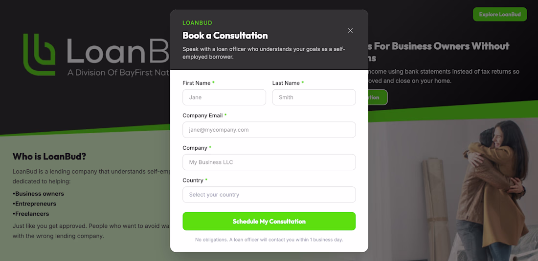
A modern SaaS-inspired landing page concept created for an enterprise Loanbud. The original was a printable pdf.
This redesign reimagines the original multi-page download experience as a streamlined lead-generation flow featuring a modal-based form, clear content hierarchy, and enterprise-focused trust signals.
The project explores:
• Landing page optimization for gated content
• Lead capture modal design
• Enterprise SaaS visual design patterns
• Conversion-focused content structure
• Customer logo social proof integration
• Form design and user experience improvements
The goal was to reduce friction in the download process while keeping users engaged on a single page, allowing them to understand the guide's value before completing the form.
Designed in Figma as a UX/UI exploration and landing page redesign concept.
Hi there! Don't forget to include a walkthrough video in your entry and share it on social media. You can review the submission guidelines here. Best of luck!


Challenges
View allTrending
Claude
Claude has entered the design space. How are you using Claude Design?
Contra University
Learn from expert creatives how to earn more using next-gen AI tools.
MagicPath
The canvas is infinite, and exploration is becoming the workflow. How are you using MagicPath?
creativeaiflow
Creative AI workflows are evolving. What tools do you use, and what are their strengths and weaknesses?
freelancerlife
Freelancer life is wins, pivots, and everything in between. What’s yours right now?