The network for creativity
Join 1.25M professional creatives like you
Connect with clients, get discovered, and run your business 100% commission-free
Creatives on Contra have earned over $150M and we are just getting started
Back to feedPost

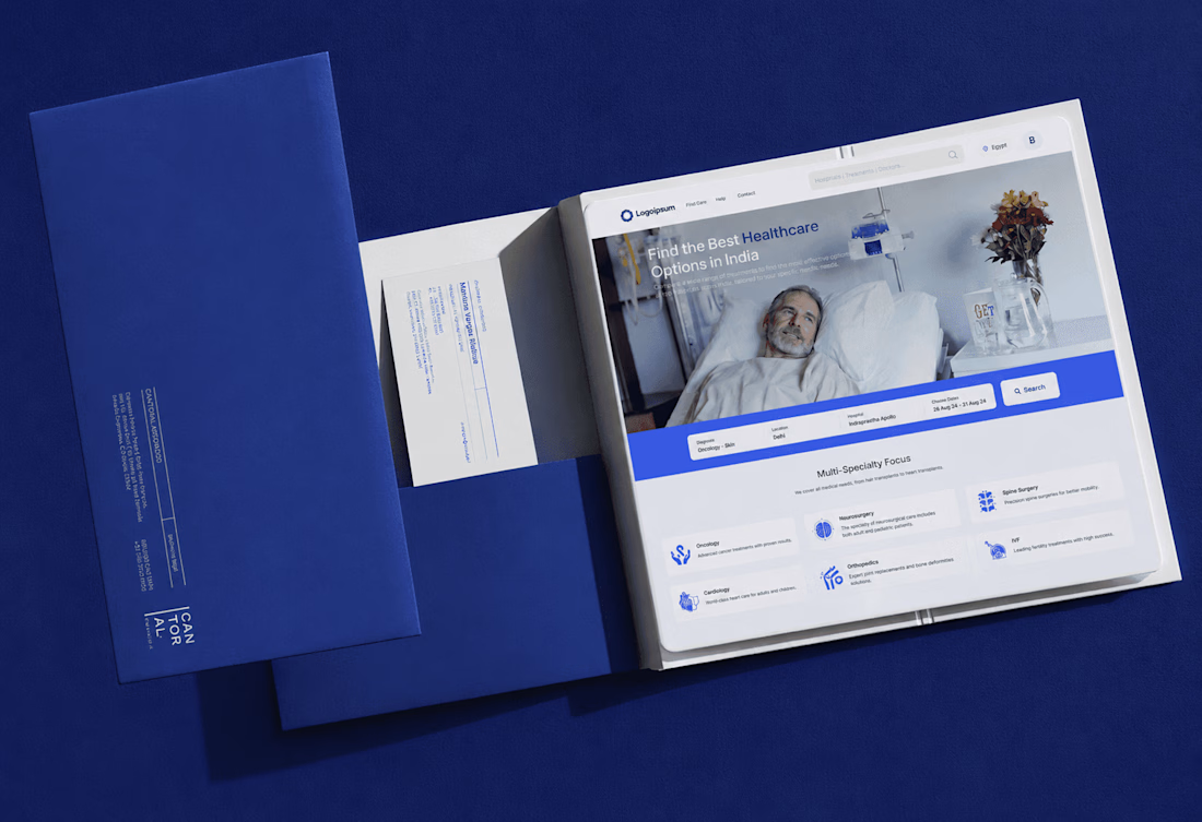
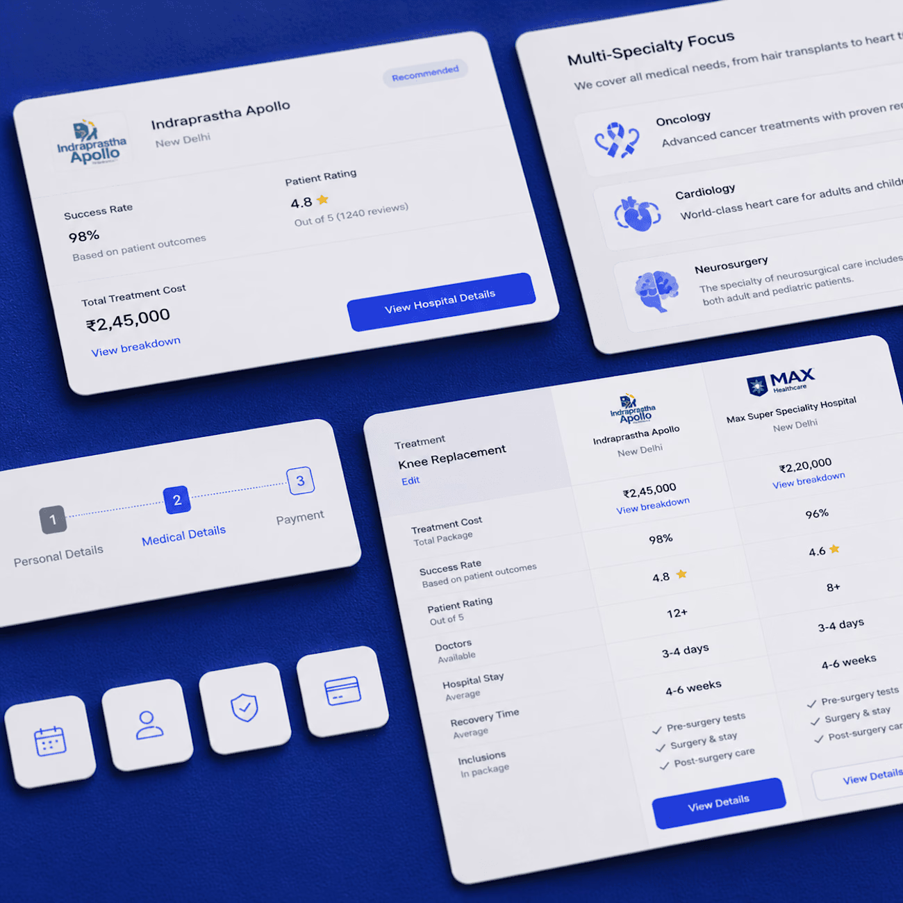
Healthcare decisions are some of the biggest a person makes, and the tools for making them look like the ones you use to pick a restaurant. MedCompare compares doctors, hospitals and treatments, and the brief was compression, not aesthetics. Every screen puts the three things a patient actually weighs first: credibility, accessibility and outcome fit, with the detail one tap behind. Filter, shortlist, compare, instead of fourteen attributes at once. The design system holds whether a profile has two data points or twenty.
Work with Evenark: evenark.com/contact
The network for creativity
Join 1.25M professional creatives like you
Connect with clients, get discovered, and run your business 100% commission-free
Creatives on Contra have earned over $150M and we are just getting started
Related posts

Landing page design for Lumo — banking for freelance life
Banks sell control — dashboards, charts, a card floating at fifteen degrees. Freelancers don't want control over their money. They want to stop thinking about it in the gap between sending an invoice and the money landing.
That gap is what the page is built on. The product sits in a meadow instead of on a dark grid, because the promise isn't "manage your finances better" — it's "we handle the part that keeps you up." And the strongest line on the page isn't a feature: no waiting for Monday. Freelancers don't lose weekends to fees. They lose them to timing.
The proof follows the same rule. One freelancer, one number — 4% lost on every international payment. A percentage someone can check against their own account beats any adjective.


great visuals 🙌


I design websites, build them in Framer, and also do branding
Here’s some of my recent work
See more at dhirajingle.com
DM me or book a call 🤝