The network for creativity
Join 1.25M professional creatives like you
Connect with clients, get discovered, and run your business 100% commission-free
Creatives on Contra have earned over $150M and we are just getting started
Back to feedPost
Taste Test

Illustrated both of these digitally and experimented with AI animation. Which one feels closer to skincare rooted in Latina culture? 👀

43 voted
55%
35 voted
45%
78 votes
Closed

thank you Maria! I do feel the same about warm but I also like the vibrancy of the other one. Let's seeee😊

Both are beautiful, Chantal! but Warmth feels particularly resonant.
thank you!! 🔥

Warmth
thank you!

Hard to pick one. It’s like choosing between a chocolate croissant and a chocolate pastry. Not an easy choice at all.
Haha, that’s the best kind of dilemma. I’ll consider it a win either way 😄

both versions are gorgeous Chantal but there is something so warm and rich about the second one. the whole vibe just feels so authentic and beautiful!
thank you Faith! It’s interesting to notice the different reactions people have to these illustrations.

The blooming theme is much more of a vibe for this.
I do feel there is a vibe too... something more related to skincare maybeee?
yess!

Awesome
thank you!

wow
🙌

I leaned toward Warmth as well.
The earthier tones feel more culturally grounded and emotionally connected. It carries a sense of heritage and natural beauty, which aligns strongly with skincare rooted in Latina culture.
Blooming feels beautiful and modern, but Warmth tells a deeper story.
I love this approach. You are right, there is something about warmer tones that connects directly to the sense of heritage. Thank you!
The network for creativity
Join 1.25M professional creatives like you
Connect with clients, get discovered, and run your business 100% commission-free
Creatives on Contra have earned over $150M and we are just getting started



Related posts

These designs were made by the AI in my upcoming design tool for designers.
I don't know which is better, help me decide.
For those wondering where the remaining designs are, I'll drop it in my next post.
2 voted
40%
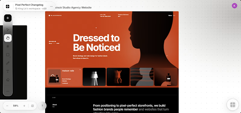
3 voted
60%
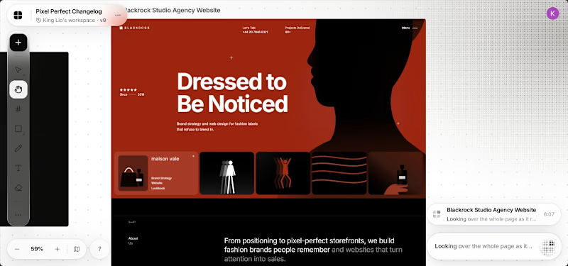
5 votes
Closed

It's the red one for me... Passed the message a lot better than the Orange

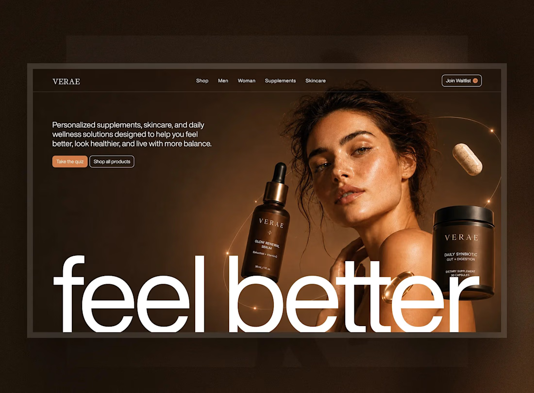
Introducing VERAÉ — a premium wellness and skincare eCommerce experience.
Designed to blend luxury aesthetics with intuitive shopping, featuring elegant product visuals, responsive layouts, and a seamless user experience.
From UI/UX design to React development, the focus was on creating a refined digital experience that connects product storytelling with effortless shopping.
Design & Development: Figma, Adobe Photoshop, React.
#Wellness #Skincare #EcommerceDesign #UIDesign #UXDesign #WebDesign #ReactDevelopment #LandingPageDesign #Figma #ProductDesign


Lovely direction for a skincare site.

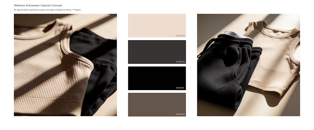
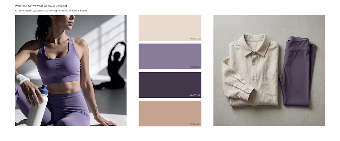
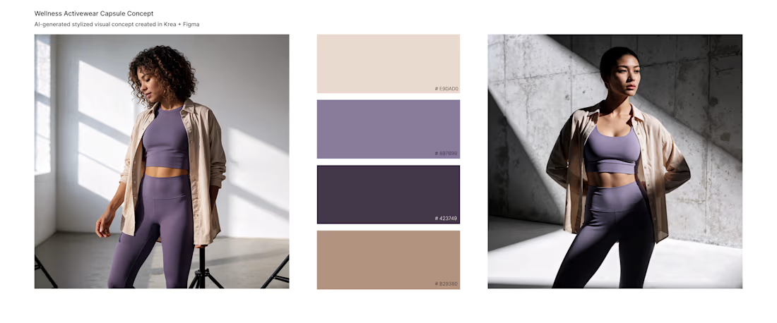
Expanding the Color Identity: Wellness Activewear & AI Art Direction
Testing how a single concept can evolve into different brand moods. After the initial sage palette, I explored two new color capsules - Muted Lavender & Cream and Nude & Night Black.
• Generated lifestyle concepts via Krea AI to capture the right wellness atmosphere.
• Extracted and structured the color swatches in Figma to test contrast ratios and UI flexibility.
Which color story fits a wellness app best?
#AI, #UIUX, #Figma #ArtDirection