The network for creativity
Join 1.25M professional creatives like you
Connect with clients, get discovered, and run your business 100% commission-free
Creatives on Contra have earned over $150M and we are just getting started
Back to feedPost

Sigrid Satō - Website Design & Development
Sigrid Satō is a solo architect who works with two to three home owners at a time. The brief was to design and develop a brand and website, for one purpose, to reinforce and confirm the initial impression made by the person referring her work.
The website is a home to not only showcase her work, but her thinking, her approach and execution. It's a digital flag planted in the ground quietly but firmly stating who she is and who she works with.
I kept the design minimal using one font with multiple weights - Eiko for the H1 display title and Fraktion Sans for the body. Both fonts are from Pangram Pangram Foundry and a minimal color pallet to create an editorial look and feel.
Disclaimer; This is a self-initiated project to sharpen my craft across physical and digital assets. I used Claude to provide the copy and lummi.ai to generate the images.

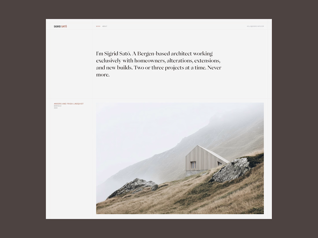

The restraint in the type system and palette really lets the architecture carry the story—especially that quiet hero image. The editorial rhythm feels very considered.


I love the vibe Mauro!! 😊

One family with weight variation instead of a font pairing is the disciplined choice, it's what actually makes the "quietly but firmly" line true instead of just copy on the page.
The network for creativity
Join 1.25M professional creatives like you
Connect with clients, get discovered, and run your business 100% commission-free
Creatives on Contra have earned over $150M and we are just getting started

Challenges
View all


Related posts

What should a platform for tokenized private equity look like?
Probably not like another traditional bank.
For ICME, the client wanted a visual direction that felt modern, disruptive, and native to a new kind of financial market.
The challenge was finding the balance: make the experience bold enough to feel different, while keeping a complex product understandable and credible.
I developed a digital-brutalist direction with retrofuturist touches - oversized typography, hard contrast, pixel textures, raw layouts, blue gradients, and controlled motion.
I worked with Arash Attar and the ICME team across the landing page and parts of the wider product interface. This video focuses specifically on the landing-page experience.
The goal was to:
— Explain tokenized private-company equity more clearly
— Create a memorable visual identity for the product
— Speak to both investors and founders
— Make financial technology feel ambitious rather than conventional
Would this visual direction make you want to explore the product - or should financial platforms feel more restrained?


This is amazing, man.
Good job!

VYRO — redefining essentials through a bold, minimal digital experience.


Nice work!

Loved seeing what Vision Engine can create. Designed this final CTA section using Vision Engine, the results turned out beautifully! ✨
Hope you like it :)


