
pro
Mauro Nappolini
Brand, strategy, web design & development — no handoffs
Ready for work
Mauro is ready for their next project!


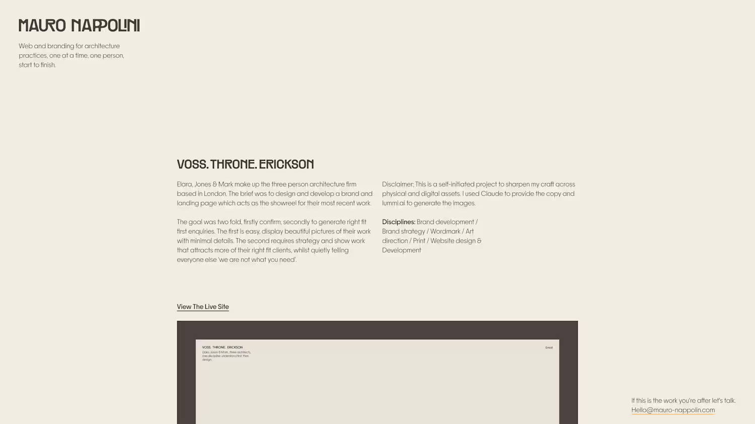
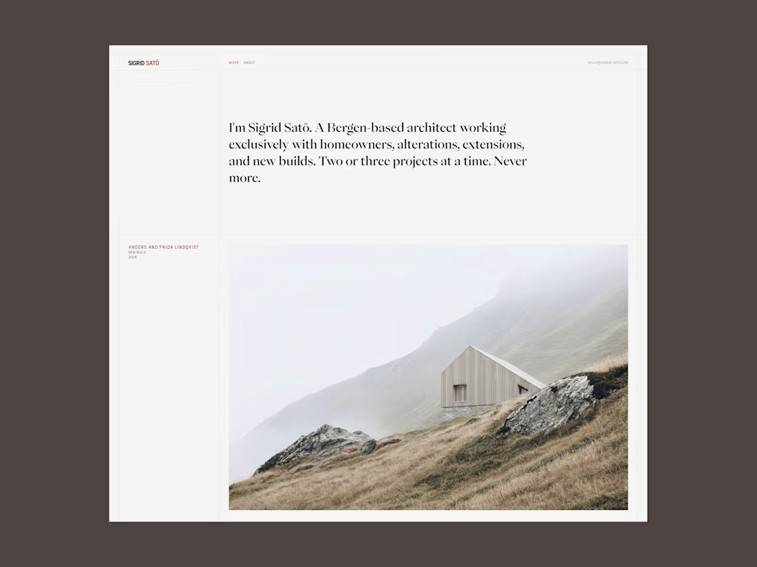
Sigrid Satō - Website Design & Development
Sigrid Satō is a solo architect who works with two to three home owners at a time. The brief was to design and develop a brand and website, for one purpose, to reinforce and confirm the initial impression made by the person referring her work.
The website is a home to not only showcase her work, but her thinking, her approach and execution. It's a digital flag planted in the ground quietly but firmly stating who she is and who she works with.
I kept the design minimal using one font with multiple weights - Eiko for the H1 display title and Fraktion Sans for the body. Both fonts are from Pangram Pangram Foundry and a minimal color pallet to create an editorial look and feel.
Live site (https://sigrid-sato.framer.website/)
Disclaimer; This is a self-initiated project to sharpen my craft across physical and digital assets. I used Claude to provide the copy and lummi.ai (http://lummi.ai) to generate the images.
4
10
147
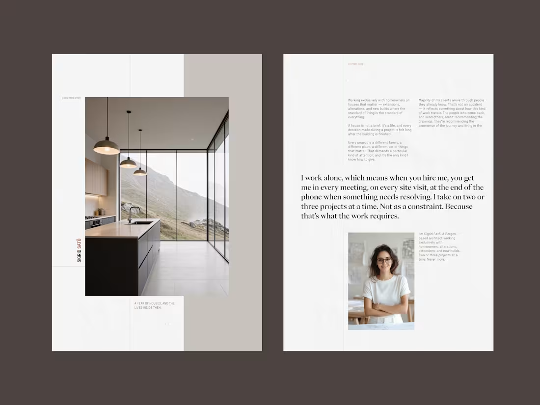
Sigrid Satō - Look book (01)
A self initiated project. The look book is project specific, it goes beyond the website case studies, detailing the steps taken, her decisions, challenges and important information for the client to consider in moving forward. The prospective client receives the look book after the first call, thus allowing Sigird to match the provided look book to the clients project.
1
5
104
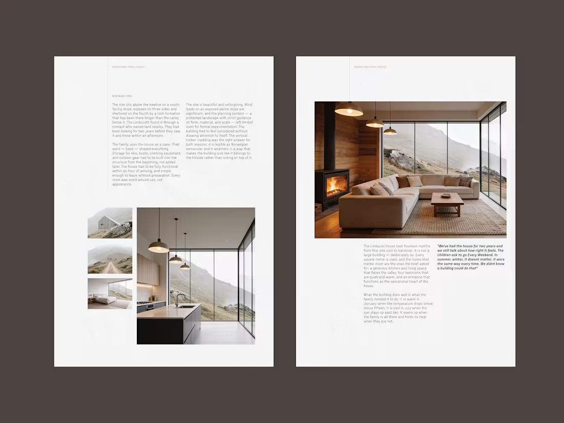
Sigrid Satō - Look book (02)
A self initiated project. The look book is project specific, it goes beyond the website case studies, detailing the steps taken, her decisions, challenges and important information for the client to consider in moving forward. The prospective client receives the look book after the first call, thus allowing Sigird to match the provided look book to the clients project.
0
31
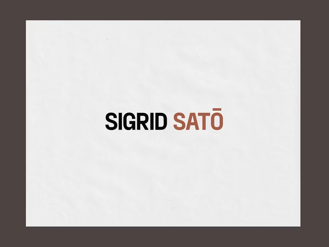
Sigrid Satō - Wordmark
The wordmark is the name, set in full caps. No symbol, no monogram. A practice that arrives by referral doesn't need a device to announce itself — the name is already known before the mark is seen, so the mark's job is to confirm, not to introduce. Full caps is where the letterforms turn architectural — squared proportions, compact capitals, a steady cadence that reads as precise rather than decorative. The macron on SATŌ is set, not dropped — the accent is part of the name, and a practice built on detail doesn't lose one at the first small reproduction.
1
224