The network for creativity
Join 1.25M professional creatives like you
Connect with clients, get discovered, and run your business 100% commission-free
Creatives on Contra have earned over $150M and we are just getting started
Back to feedPost
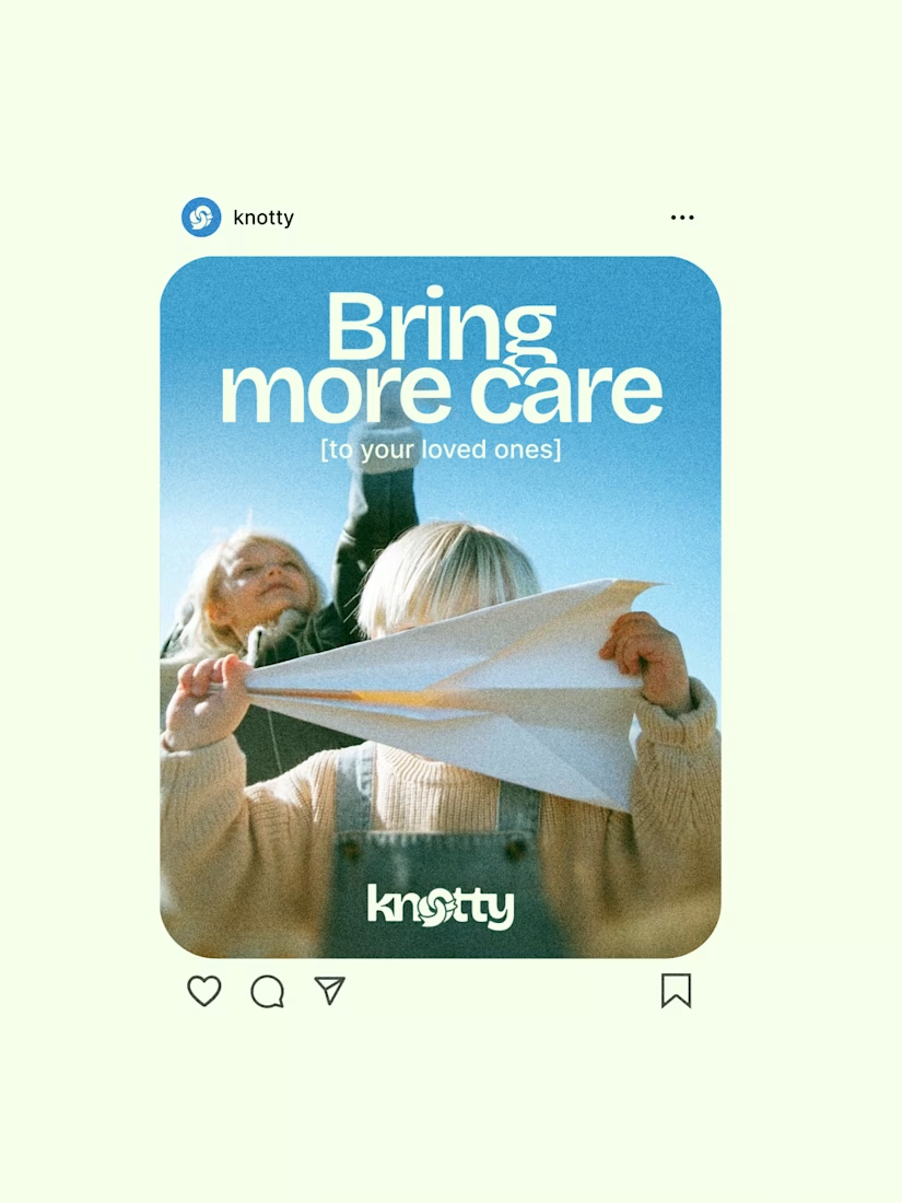
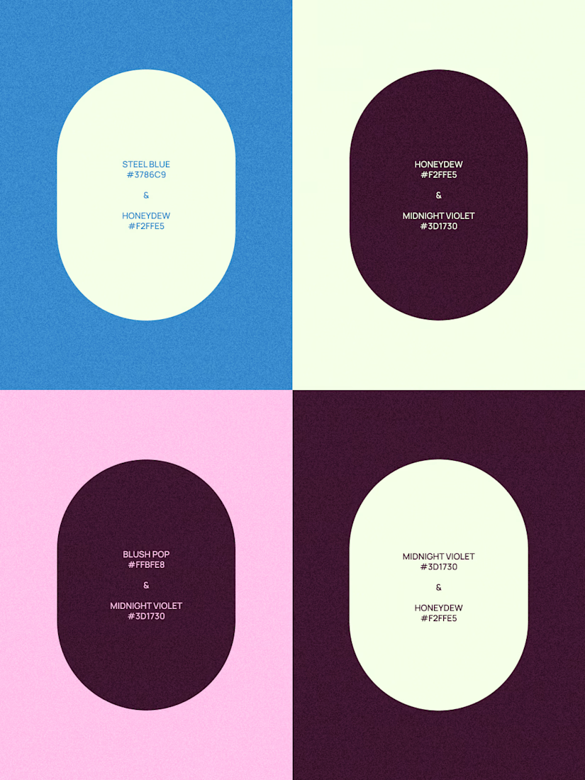
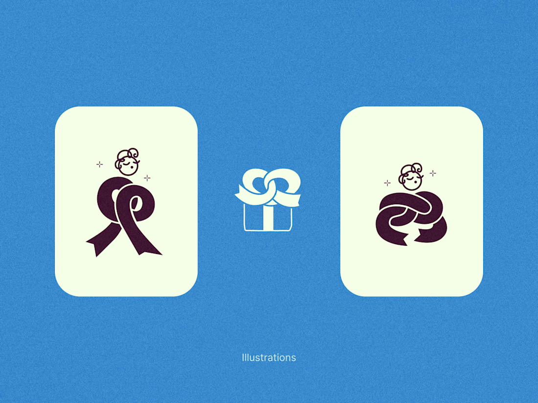
A few snippets from a project I’ve been working on recently.
Knotty is a modern gift shop that focuses on warmth and connection. The goal was to balance a clean and geometric layout with deeply human elements.
The main goal was to create a versatile and scalable identity system that represents the concept of connection (symbolized by the ribbon and the "knot") without creating visual clutter.
Fellow designers and strategists, what do you think of this visual direction?


Thank you!!

Great design! The animation really pushed it over the edge and the color palette is lovely
I appreciate it! 😍

Very nice.
Thank you so much!

Loveeee!
So glad you vibed with it! ✨

Amazing!
Glad you like how it turned out!😊


Amazing work👏🔥
Thanks a lot! Much appreciated, man!


Love the color palette choice across this identity block.
Thanks so much, Sahil! I spent a lot of time experimenting with different combinations to get that balance just right, so I’m thrilled to hear the palette resonated with you!

Such an engaging combination of color and shapes; Love it! 💯
Thanks a lot!! Glad you like it ☺️

Awesome😍

Nice work, love the lettering to logo animation🔥🔥
Thank you! The animation was actually my favorite part to work on 🥰

Wow this is nice work!
The network for creativity
Join 1.25M professional creatives like you
Connect with clients, get discovered, and run your business 100% commission-free
Creatives on Contra have earned over $150M and we are just getting started





Related posts


Good logo

Reroll Brand Identity
A full visual identity created for Reroll, built around the idea of turning the “O” into a die.
The project includes logo design, social media identity, motion, graphics and a custom playing card back.
Creative direction: Dmitry Lepisov
Identity design + motion: Arthur Skripnik
3D + motion created with Spline


That mint card-back pattern is such a fun extra, and the chunky Anton headers keep the whole system feeling punchy.

What's your pick??
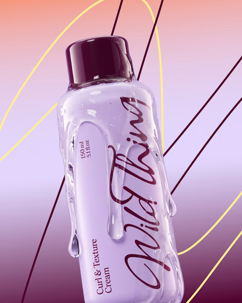
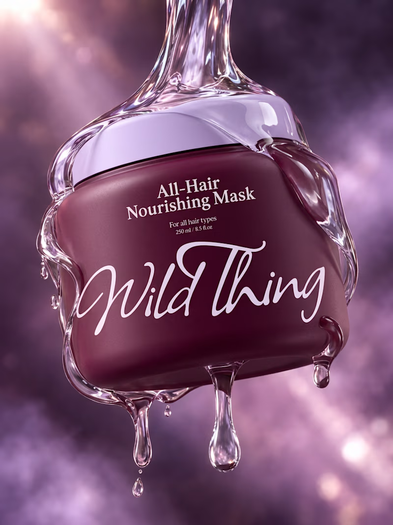
Wild thing is a haircare brand that celebrates every type of hair.
Check the full project here.
3 voted
75%
1 voted
25%
4 votes
Closed
