The network for creativity
Join 1.25M professional creatives like you
Connect with clients, get discovered, and run your business 100% commission-free
Creatives on Contra have earned over $150M and we are just getting started
Back to feedPost
Taste Test

AUREL VOSS
The art of leaving an impression.
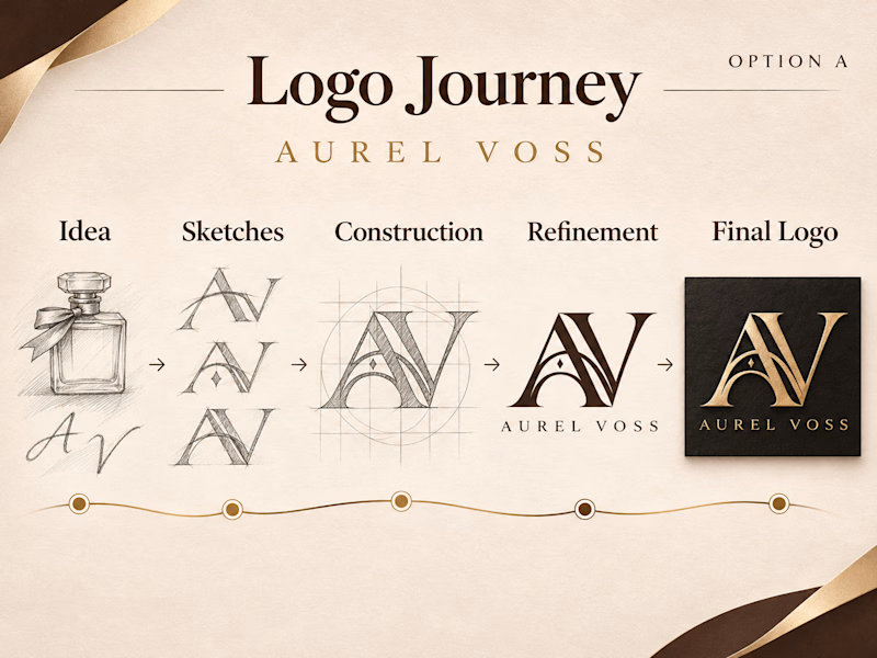
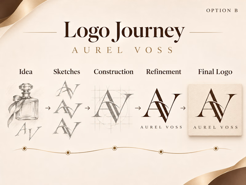
Aurel Voss is a fictional luxury fragrance house. I Have explored two AV monogram directions, from rough pencil sketches and construction grids to finished logo mockups. Option A pairs a sculptural mark with champagne gold foil on charcoal, while Option B uses interlocking serifs in espresso ink on warm ivory.
Which do you like A or B ?
2 votes
Ends in 18h
The network for creativity
Join 1.25M professional creatives like you
Connect with clients, get discovered, and run your business 100% commission-free
Creatives on Contra have earned over $150M and we are just getting started






Related posts

A system makes it work. A brand makes it matter.
Through Adora Garden, we explore how a structured visual system can evolve into a cohesive brand identity — bringing consistency, character, and a more meaningful visual experience to every touchpoint.
Because branding isn't just about how a brand looks. It's about how it feels, speaks, and connects.
6 voted
27%
16 voted
73%
22 votes
Closed

Identity 💯

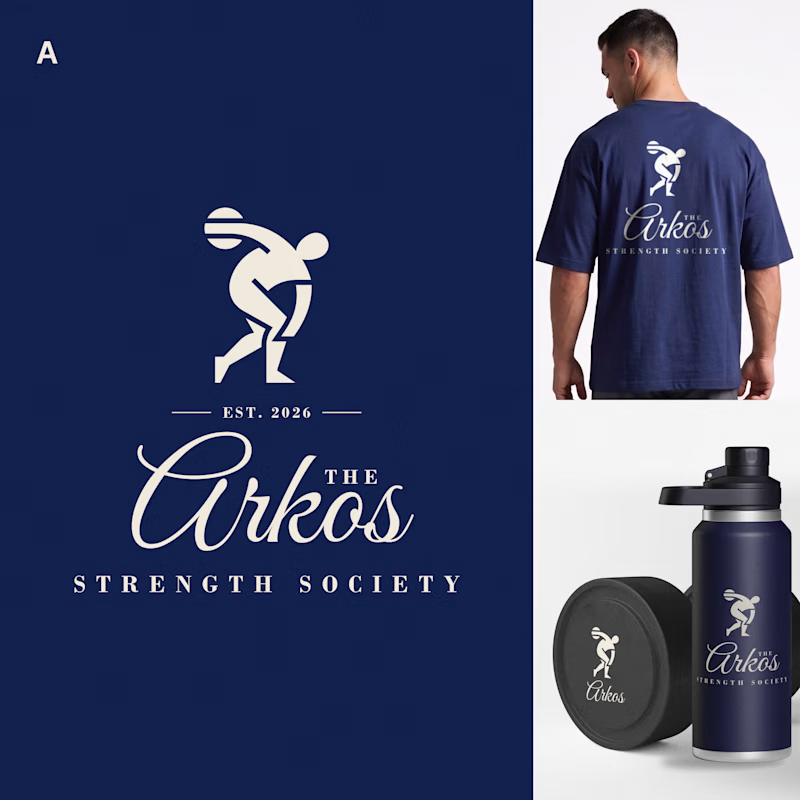
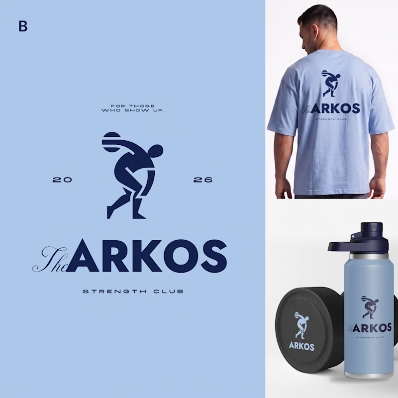
Most gyms follow a pretty similar approach to branding. I wanted to see what a strength club could look like if it drew more inspiration from a private-membership club vibe, since that's really trending right now.
Designed two directions for Arkos using the same mark. A is more refined and traditional, while B takes a bolder, more modern approach.
Which direction would you go with?
11 voted
50%
11 voted
50%
22 votes
Closed

The darker one is the best for me, but both are really good, man


Should a personal brand hero lead with the name or the promise?
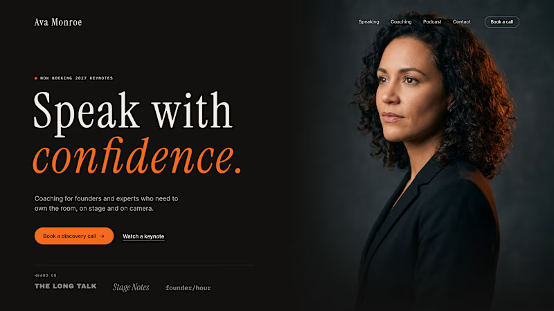
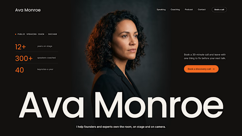
A client of ours is a speaking coach. People find her by name: podcasts, stages, word of mouth. Yet her first hero hid that name in the top-left corner.
We tested two directions:
The promise first. "Speak with confidence" in big type, the name small in the nav. Clear, but it could be any coach on the internet.
The name first. Her name at billboard scale, the promise in one line above it, her face right behind. Someone arriving from a podcast knows instantly they're in the right place.
When people search for you, your name is the headline.
Which one would you ship for a personal brand?
43 voted
51%
42 voted
49%
85 votes
Closed

Name first — podcast listeners arrive looking for her.