The network for creativity
Join 1.25M professional creatives like you
Connect with clients, get discovered, and run your business 100% commission-free
Creatives on Contra have earned over $150M and we are just getting started
Back to feedPost
Taste Test
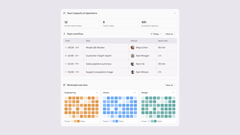
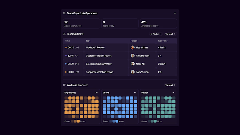
Team Capacity & Operations UI — dark & light.
A clearer view of who’s active, what’s moving today, and where capacity is available — with workload patterns by team.

3 votes
Ends in 1d

This capacity view is exactly what ops teams need! The workload heatmap by team is super smart — instant clarity on who's overloaded.
I'm building something similar for clinics — Team Capacity but for doctors/nurses shifts with HIPAA compliance. Your dark mode execution here is...

Thanks, Sagar!
A capacity view for doctors and nurses sounds like a great use case, especially with shift constraints and HIPAA compliance in mind.
The capacity scale is designed to be auto-calculated from assigned workload versus each team’s available hours. A manual override...
The network for creativity
Join 1.25M professional creatives like you
Connect with clients, get discovered, and run your business 100% commission-free
Creatives on Contra have earned over $150M and we are just getting started



Related posts

Which ORBIT pulls you in: the quiet one or the loud one? ✨
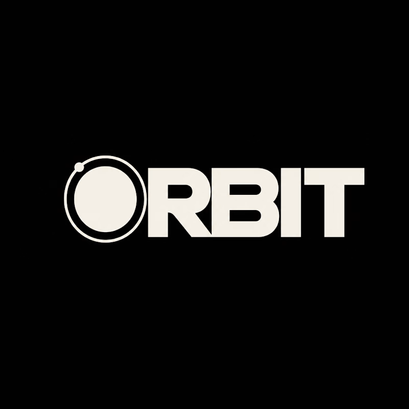
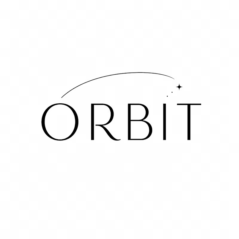
One name, two directions. Same idea, an object in motion around a center.
A → Heavy extended sans on black. The orbit is built into the O, a ring with a single satellite. Compact, graphic, impossible to ignore.
B → Light, high-contrast serif with a hairline arc and a tiny spark. The orbit is a gesture, a trail you almost miss. Elegant, airy, a little mysterious.
If you ask me, I'd pick A.

36 voted
80%
9 voted
20%
45 votes
Closed

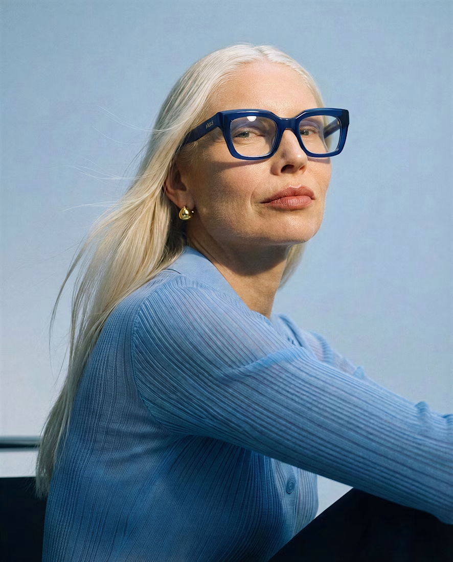
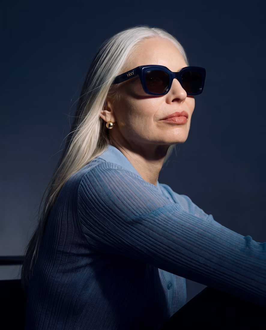
What happens when you give an old piece a dark mode and a pair of sunglasses? 🕶️
I took a piece from my portfolio and ran it through Krea 3 to see how far I could push it while keeping the original composition.
Before → light and daytime.
After → dark mode, with sunglasses.
Where it helped: quick edits that kept the composition intact, making it easy to explore a different mood.
Where I’d still go by hand: final color balance, lens reflections, and those tiny details that make everything feel intentional.
Before or after? Tell me which one you’d keep and what you’d edit next 👇


Beautiful


🧪 TASTY TEST: WHICH ONE MAKES NEXT WEEK FEEL SORTED?
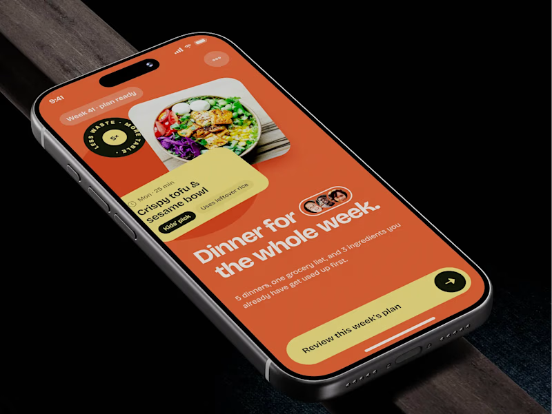
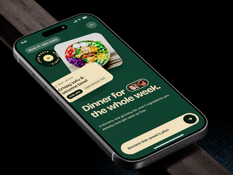
Meal planner mobile app design. Same UX, two palettes.
🍊 A · Citrus Energy
Orange + buttery yellow. Appetite first.
🌿 B · Forest Calm
Deep green + cream. A calmer weekly ritual.
💡 GROWTH THINKING
Users want dinner handled, not another planning task.
My hypothesis: orange could win the first tap; green could signal less effort. I’d test plan-open rate AND grocery-list completion. More taps mean little if people abandon the next step.
🗳️ A OR B — WHICH WOULD YOU TRUST WITH NEXT WEEK’S DINNERS?
Vote and tell me why.
📩 BUILDING A MOBILE APP? LET’S FIND WHAT’S HOLDING GROWTH BACK.
https://calendly.com/asol_design/demo
#MobileAppDesign #AsolDesign
15 voted
68%
7 voted
32%
22 votes
Closed