The network for creativity
Join 1.25M professional creatives like you
Connect with clients, get discovered, and run your business 100% commission-free
Creatives on Contra have earned over $150M and we are just getting started
Back to feedPost

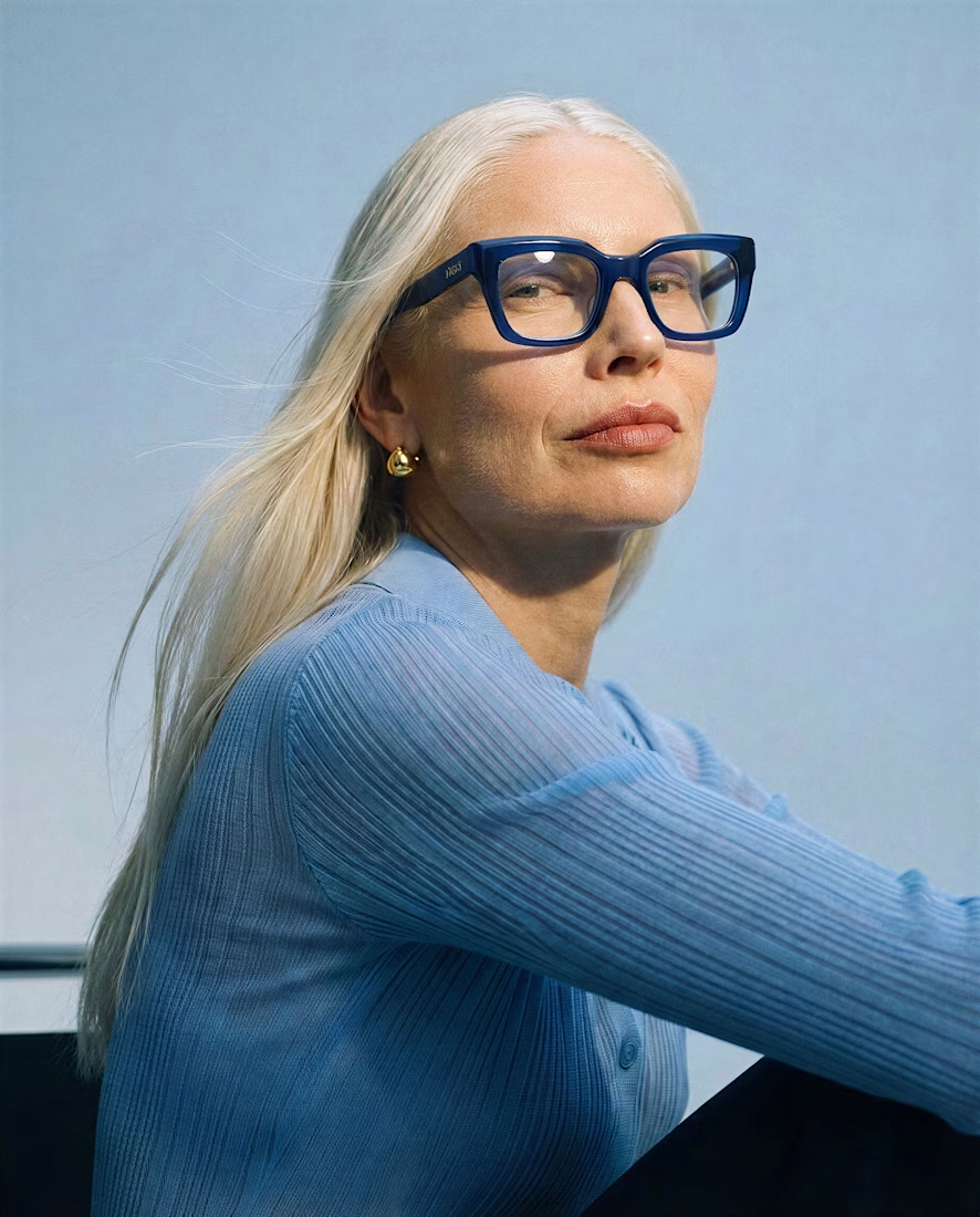
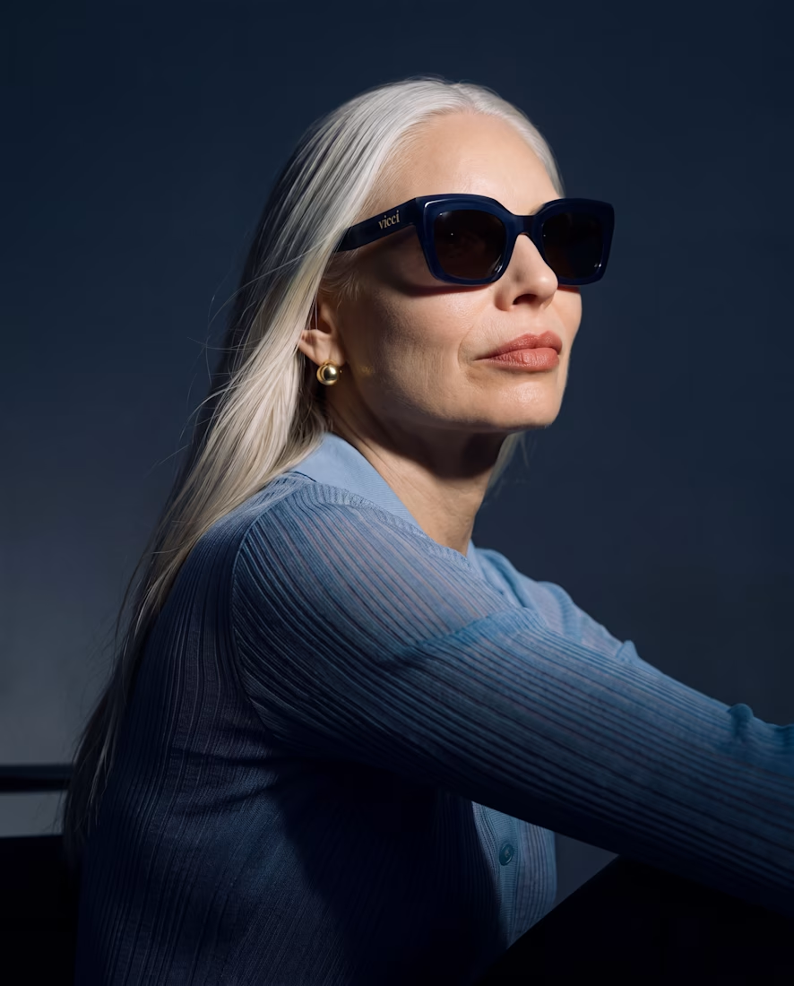
What happens when you give an old piece a dark mode and a pair of sunglasses? 🕶️
I took a piece from my portfolio and ran it through Krea 3 to see how far I could push it while keeping the original composition.
Before → light and daytime.
After → dark mode, with sunglasses.
Where it helped: quick edits that kept the composition intact, making it easy to explore a different mood.
Where I’d still go by hand: final color balance, lens reflections, and those tiny details that make everything feel intentional.
Before or after? Tell me which one you’d keep and what you’d edit next 👇



Nice Work Julia, The dark mode gives it such a cool new vibe!😊

Nice

Dark mode give you more composed look .. and that too look classy

Beautiful

I'd keep the dark one. The light reflections in the lenses sell it, I'd just push the skin tones a bit warmer.

Great work, but I will still go with the "before" one.

The dark one looks better with sunglasses on.


Yes , darker one looks premium


It looks good, better and nice

this is lovely
The network for creativity
Join 1.25M professional creatives like you
Connect with clients, get discovered, and run your business 100% commission-free
Creatives on Contra have earned over $150M and we are just getting started





Related posts


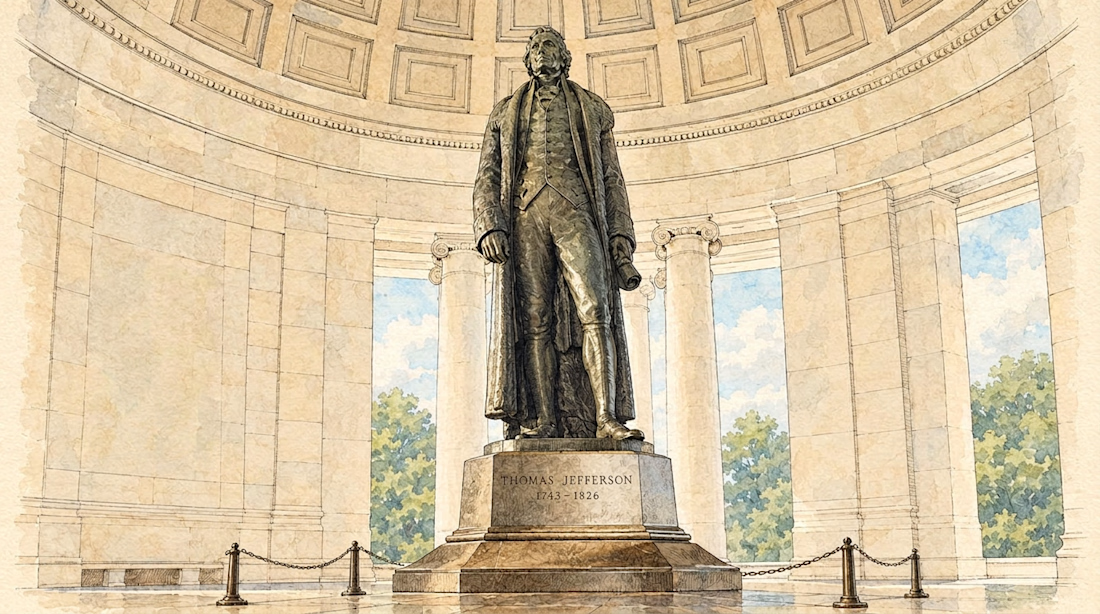
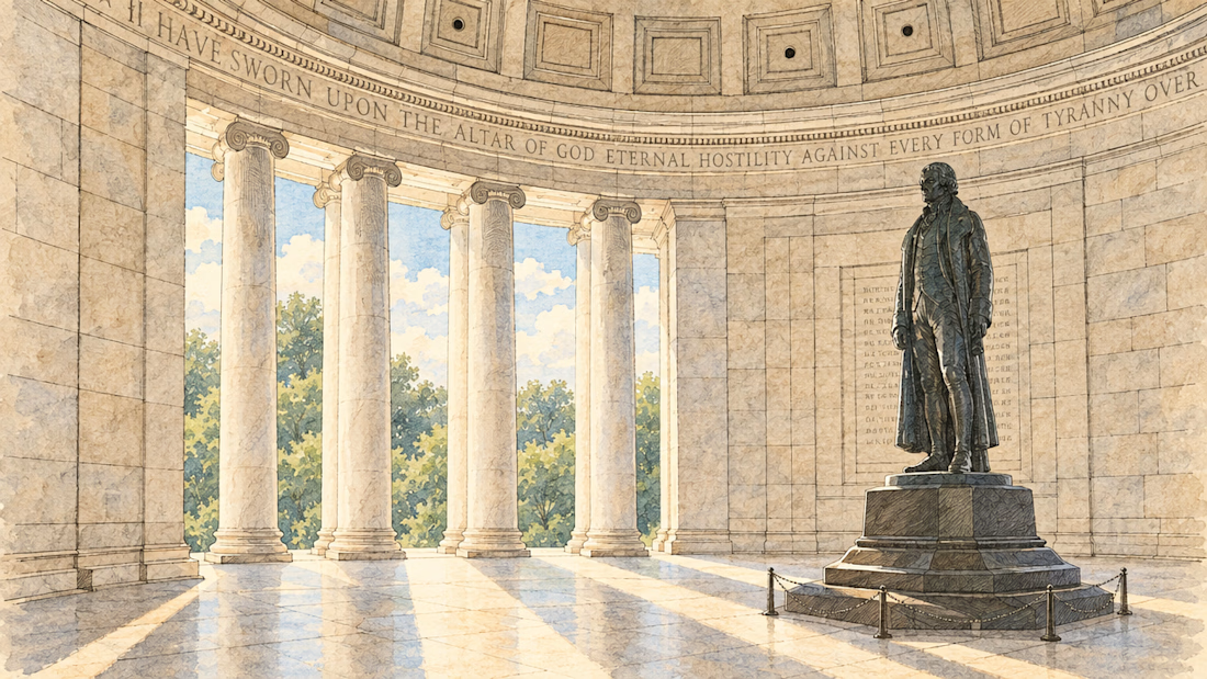
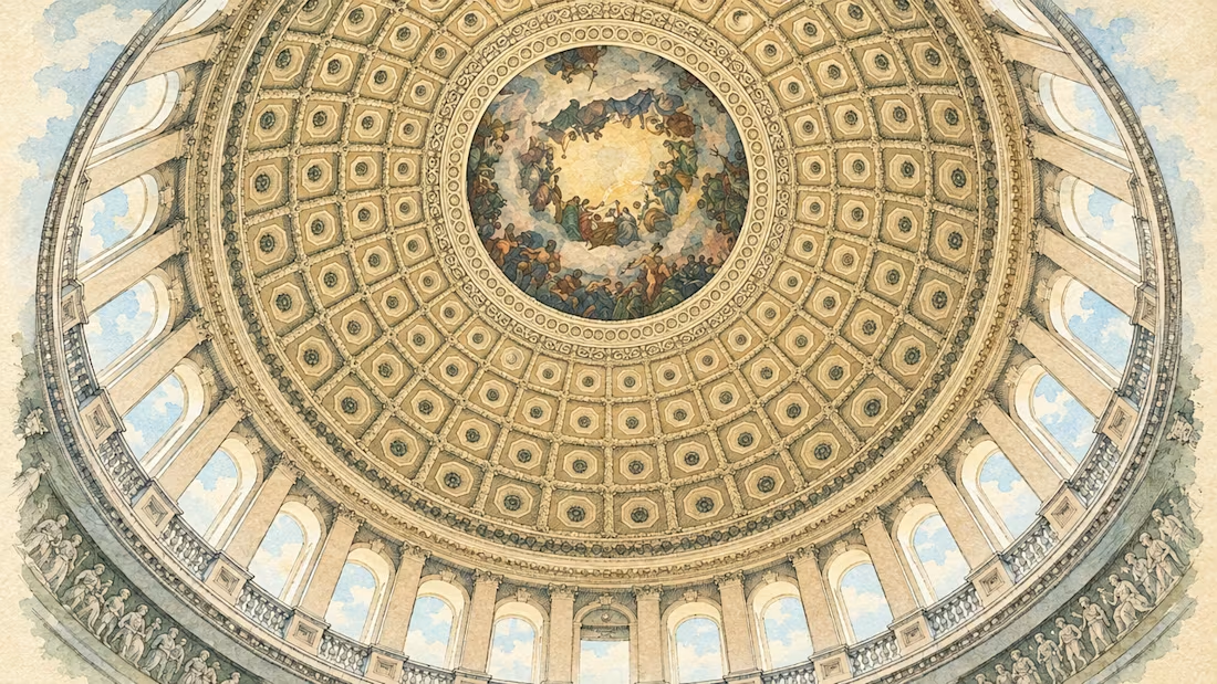
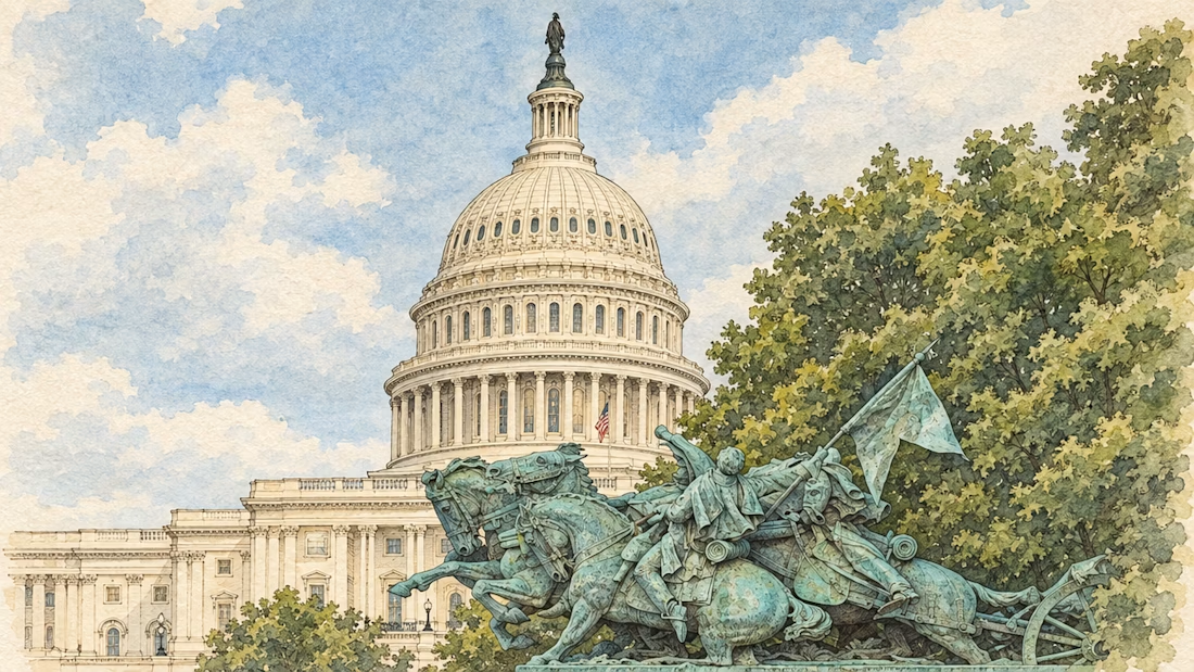
Image illustrations based on real photos for NextStage. Consistency and batch generation built with @floraai

Just got featured on the Contra homepage 🔥 🚀
This is an ongoing work in progress. Version 1.1 of a spec work demo reel for HyperFilms, an AI video studio I've been working on launching this year.
Accelerated Storytelling: human taste and craft combined with AI-powered workflows.


Human taste plus AI workflow — reel moves beautifully.

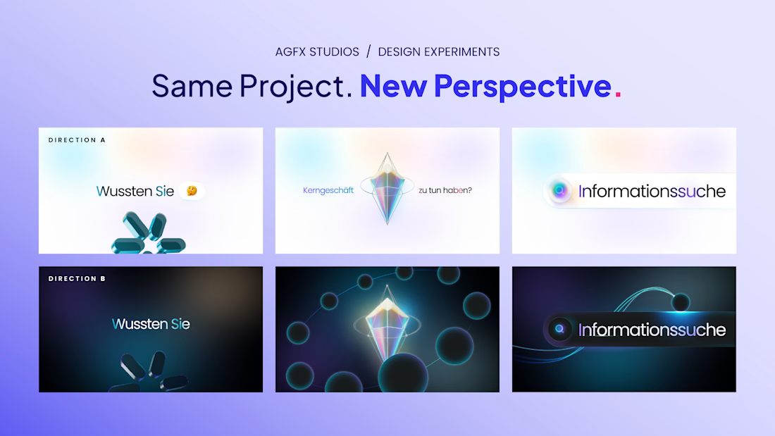
We wanted to see how differently the same project could feel with a change in visual direction.
So we explored two approaches: one light and minimal, the other darker and more atmospheric. The core visuals stay the same, but the mood shifts quite a bit.
That’s what makes exploring design directions so interesting. Small choices in colour, lighting and composition can change how an entire story feels.
Looking at both, which direction would you take forward A or B? And what makes you lean that way?
#Creativity #Design #GraphicDesign #MotionDesign


Changing the mood makes such a difference.


