The network for creativity
Join 1.25M professional creatives like you
Connect with clients, get discovered, and run your business 100% commission-free
Creatives on Contra have earned over $150M and we are just getting started
Back to feedPost

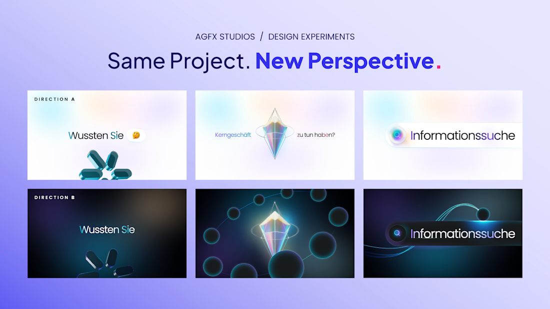
We wanted to see how differently the same project could feel with a change in visual direction.
So we explored two approaches: one light and minimal, the other darker and more atmospheric. The core visuals stay the same, but the mood shifts quite a bit.
That’s what makes exploring design directions so interesting. Small choices in colour, lighting and composition can change how an entire story feels.
Looking at both, which direction would you take forward A or B? And what makes you lean that way?
#Creativity #Design #GraphicDesign #MotionDesign


Changing the mood makes such a difference.
True!
The network for creativity
Join 1.25M professional creatives like you
Connect with clients, get discovered, and run your business 100% commission-free
Creatives on Contra have earned over $150M and we are just getting started





Related posts

Holographic is back, so I built the same concert ticket two ways in code. Which one would you keep after the show?
Foil: the rainbow shifts as it tilts. Silver: embossed type, one clean light sweep.
Vote, and tell me what you'd print on yours.
46 voted
82%
10 voted
18%
56 votes
Closed

Silver make it feel more real then Foil,,, good design in both

Lime Cream or Peach Fuzz? 🍋🟩🍑
Two animated isometric sets — same system, different mood. Cast your vote 👇
68 voted
78%
19 voted
22%
87 votes
Closed

Lime Cream. The dark linework pops more on it.


The color palette works so well here 🪙