The network for creativity
Join 1.25M professional creatives like you
Connect with clients, get discovered, and run your business 100% commission-free
Creatives on Contra have earned over $150M and we are just getting started
Back to feedPost

L'Inédit — Luxury Fragrance
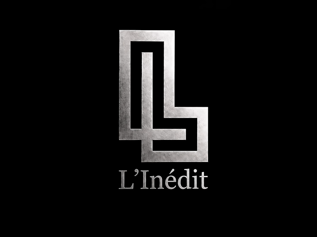
Introducing the foundational identity for "L'Inédit", an ultra-premium fragrance house conceptualized around timeless elegance and exclusivity.
The centerpiece of the brand is this geometric, interlocking double 'L' monogram. The design balances architectural precision with a sophisticated modernist feel. It is meant to be realized in tactile materials, specifically high-shine silver foil stamping against deep matte textures, serving as a seal of quality on the bottle and packaging.
This shot focuses on the pure form of the mark before its application to the physical product.


The network for creativity
Join 1.25M professional creatives like you
Connect with clients, get discovered, and run your business 100% commission-free
Creatives on Contra have earned over $150M and we are just getting started

Challenges
View all


Related posts

More visuals from the rejected brand direction I shared earlier.
Really good to see this direction resonating with so many of you. It was one of our favourite explorations to build, from the narrative behind it to the visual world that brought it to life.
Great work doesn’t always make the final cut, and sometimes the reason has little to do with the quality of the direction.
Curious why this one was rejected? I’ve shared the story in the first comment✨


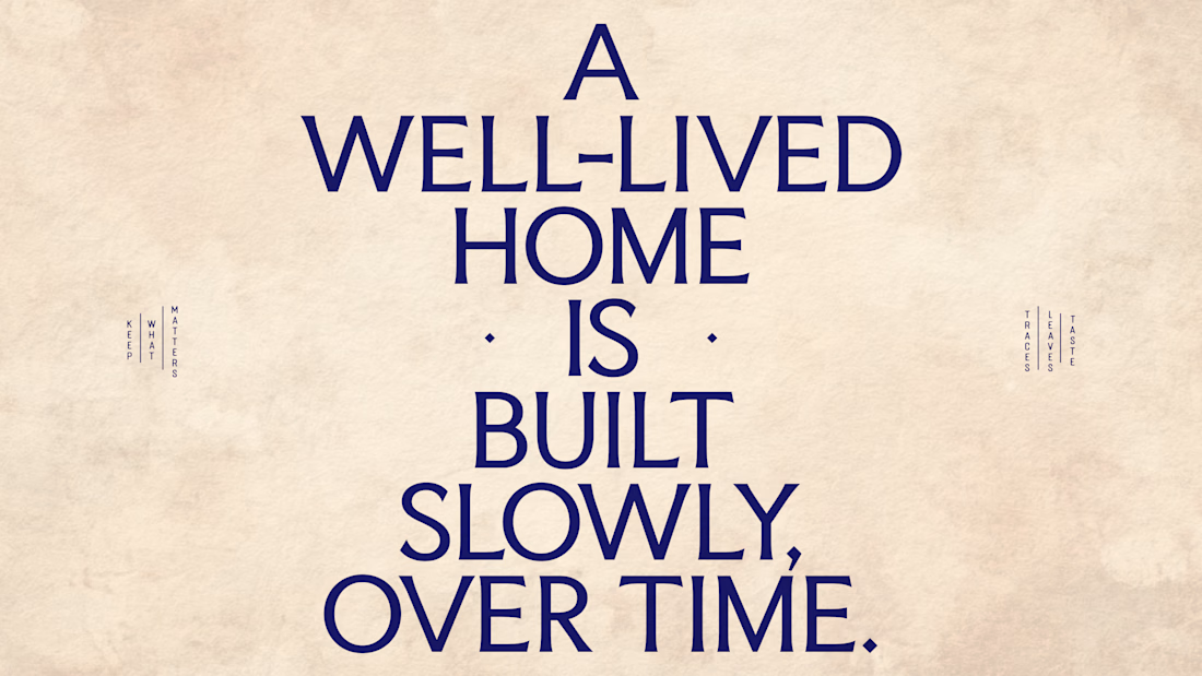
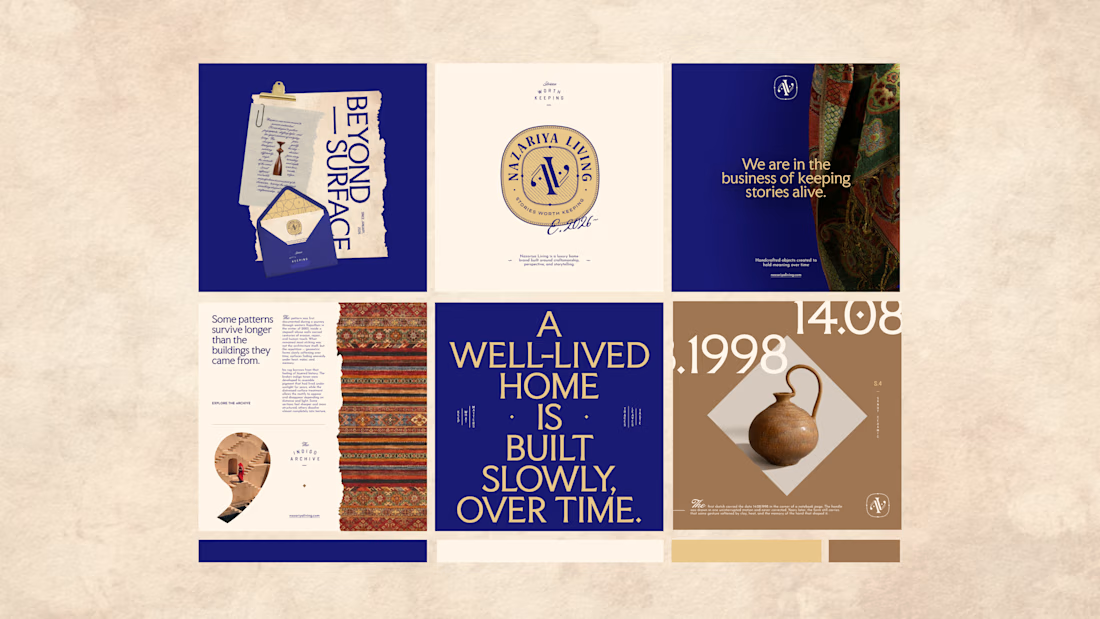
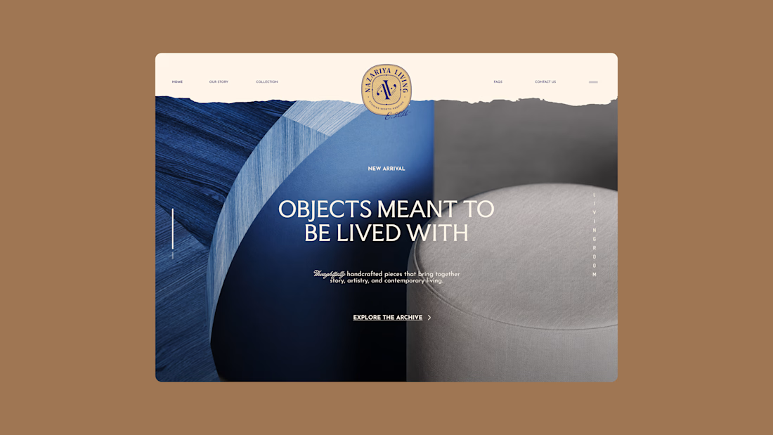
Nazariya Living is a premium carpet and home décor brand shaped by craftsmanship, culture and the stories objects carry into our homes.
This direction brought that idea to life through a seal-inspired logo, archival textures, unexpected colours and editorial typography, creating...

Brand identity design for Adventum Fitness, a fitness and personal development brand built around physical performance, mental fitness, and personal growth.
The challenge was to create a visual identity that could bring strength, movement, discipline, and personal development together without falling into the usual fitness branding clichés.
The identity was developed as a cohesive visual system across logo design, typography, color, graphic elements, and supporting brand assets, giving Adventum a distinctive and consistent presence across digital and marketing applications.
Full case study available on my Contra profile.
#BrandIdentity #BrandDesign #FitnessBranding #VisualIdentity #LogoDesign #BrandStrategy #GraphicDesign #BrandDesigner #FitnessBrand #PersonalDevelopment


Beam App — Official Promo & Motion Walkthrough
A high-tempo product promo designed for the social platform Beam. The project translates the platform's multi-layered ecosystem—visual curation, private threads, collections, and live voice spaces—into a seamless, rhythm-driven motion piece.
Executed dynamic UI animations, kinetic typography, and fluid camera choreography synchronized with voiceover pacing to turn complex app features into a clear, high-retention visual narrative.
Role: Motion Design • UI Animation • Art Direction
Tools: After Effects, Premiere Pro, Figma

