The network for creativity
Join 1.25M professional creatives like you
Connect with clients, get discovered, and run your business 100% commission-free
Creatives on Contra have earned over $150M and we are just getting started
Back to feedPost
How Design Changes Lives: The HokoHoko Case - A Social Marketplace for Refugees 🌍
Technology should solve real problems. Our UX/UI design project, the HokoHoko mobile app, was exactly that kind of challenge. It’s not just a marketplace, it’s a social tool designed to help people forced to flee their homes find a source of income and integrate into new communities.
The Challenge: To create a safe, intuitive environment where refugees can offer their products and services, and supporters can easily find and help them. We needed to blend classic marketplace functionality with unique social mechanics.
What the team did during the process:
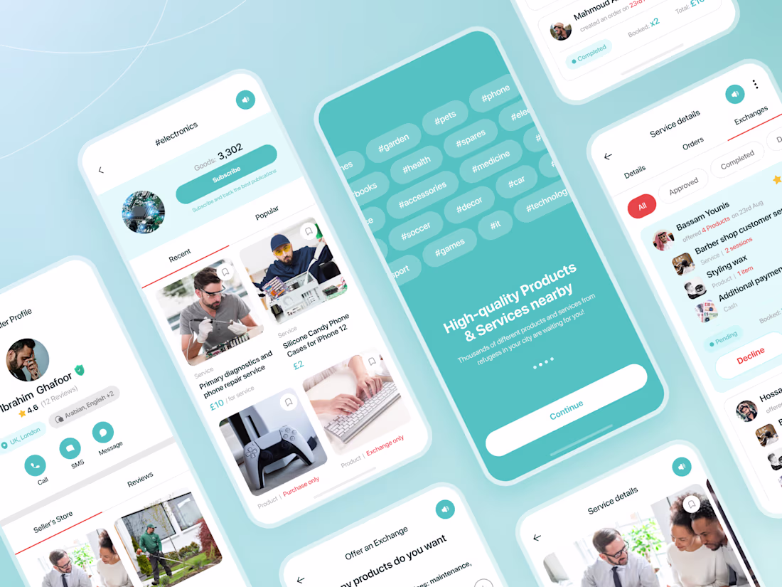
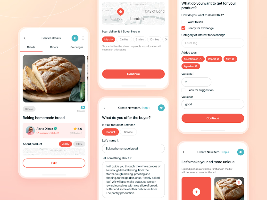
1️⃣ Empathetic UX Research: We dove deep into the user context, accounting for language barriers, cultural differences, and technical constraints. Since most refugees primarily use Android devices, we prioritized the Android experience to ensure maximum accessibility.
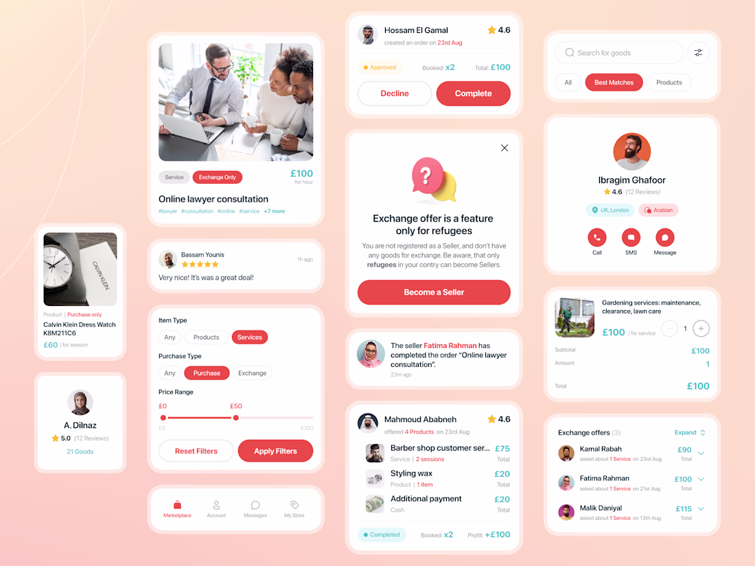
2️⃣ Audience Segmentation & Verification: To maintain the social mission, we built a system where anyone can buy, but only verified refugees can sell. We implemented a document verification flow to keep the platform’s purpose front and center.
3️⃣ Safety Without In-App Transactions: Since the app doesn't handle direct payments, one of our biggest tasks was building a "trust loop." We designed a double-verification system for orders and feedback to ensure a safe environment for all participants.
4️⃣ The Barter Feature: We developed a unique exchange option specifically for refugees. If a user needs a service but can't pay, they can offer their own goods or skills in exchange. Our UX helps users evaluate and place relevant bids.
5️⃣ Scalable UI Design System: Inspired by the client's love for "Moana," we used a clean palette of mint and red. Calm mint and demanding red clearly delineate the different stages of the user journey. Fun fact: "HokoHoko" means "Good deal" in Maori!
Project by the numbers:
🌟 267 screens designed.
🌟 204 hours of intensive work.
🌟 2 specialists who built the product from scratch to dev-ready handoff.
The Outcome: We didn’t just design an app; we bridged the gap between those who want to help and those who need a fresh start. Here, design isn't just about aesthetics - it's about navigation through difficult life circumstances.


Good job

Thank you 🙌
Thank you, Rasel!
The network for creativity
Join 1.25M professional creatives like you
Connect with clients, get discovered, and run your business 100% commission-free
Creatives on Contra have earned over $150M and we are just getting started
Related posts


Check it out
At the end of last year Contra engaged me for some exploratory work into what could be a Contra App. A strategic foundation for their native roadmap. Product differentiation criteria established.


Wow this is insane, @Ralph Jones | Novatur Design
Love this project man. Curious what do you use for the screen's b-roll.


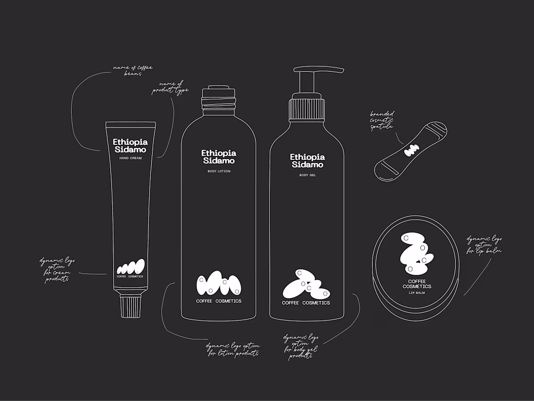
What if minimalism isn’t less — but more intentional?
This is COCO — a finished packaging system built on restraint.
Clean hierarchy, deliberate typography, purposeful whitespace,reduced elements.
But the key shift is here:
→ material becomes the design.
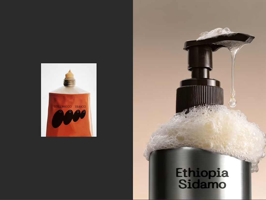
→ The aluminum isn’t just a container
it defines the color, the light, the presence.
A few intentional decisions:
1. Removing everything that didn’t carry meaning
2. letting hierarchy guide instead of decorate
3. treating material as the primary visual layer
For me, minimalism is not less design —
it’s more attention to every detail.


Great!!


Trending


Notion
Notion isn’t just where you work, it’s starting to work for you. What agents are you building?
portfolioreview
The best portfolios tell a story, not just show a grid. Share yours for feedback.
brandguidelines
Brand guidelines are becoming living systems, not static documents. What are you building for your clients?
aivideo
AI video tools are moving at warp speed. Which ones are you experimenting with?
freelancerlife
Freelancer life is wins, pivots, and everything in between. What’s yours right now?