The network for creativity
Join 1.25M professional creatives like you
Connect with clients, get discovered, and run your business 100% commission-free
Creatives on Contra have earned over $150M and we are just getting started
Back to feedPost

𝐔𝐩𝐬𝐭𝐚𝐠𝐞 𝐅𝐨𝐨𝐭𝐰𝐞𝐚𝐫 - 𝐖𝐨𝐫𝐝𝐏𝐫𝐞𝐬𝐬 𝐖𝐞𝐛𝐬𝐢𝐭𝐞 𝐂𝐚𝐬𝐞 𝐒𝐭𝐮𝐝𝐲
Upstage Footwear is an online footwear store specializing in dance shoes for men and women along with accessories, exclusive products and sale items.
𝐓𝐡𝐞 𝐂𝐡𝐚𝐥𝐥𝐞𝐧𝐠𝐞
The existing website had become difficult to maintain and was no longer performing as it should.
It was built on an older theme using the Redux Framework which had become outdated and was no longer receiving the updates needed to keep the setup reliable. Over time, this contributed to performance issues, lagging and problems with the website's overall structure.
Rather than continuing to patch the same issues, I recommended replacing the outdated theme with a cleaner and more flexible foundation.
𝐖𝐡𝐚𝐭 𝐈 𝐃𝐢𝐝
After reviewing the existing setup, I recommended rebuilding the website using Hello Elementor theme and Elementor page builder.
The client approved the approach and I redesigned and rebuilt the website around the store's existing e-commerce requirements.
𝐖𝐞𝐛𝐬𝐢𝐭𝐞 𝐑𝐞𝐝𝐞𝐬𝐢𝐠𝐧
Reworked the website structure and redesigned key pages and sections to create a cleaner and more modern experience for the e-commerce store.
𝐓𝐡𝐞𝐦𝐞 𝐑𝐞𝐛𝐮𝐢𝐥𝐝
Replaced the outdated Redux Framework-based theme with Hello Elementor giving the website a more flexible foundation for future development.
𝐖𝐨𝐫𝐝𝐏𝐫𝐞𝐬𝐬 & 𝐖𝐨𝐨𝐂𝐨𝐦𝐦𝐞𝐫𝐜𝐞 𝐃𝐞𝐯𝐞𝐥𝐨𝐩𝐦𝐞𝐧𝐭
Rebuilt the website while maintaining the existing product structure and core e-commerce functionality required to run the store.
𝐖𝐞𝐛𝐬𝐢𝐭𝐞 𝐎𝐩𝐭𝐢𝐦𝐢𝐳𝐚𝐭𝐢𝐨𝐧
Addressed issues associated with the outdated setup and improved the overall website structure, usability and maintainability.
𝐑𝐞𝐬𝐩𝐨𝐧𝐬𝐢𝐯𝐞 𝐃𝐞𝐯𝐞𝐥𝐨𝐩𝐦𝐞𝐧𝐭
Reworked the website across desktop, tablet and mobile to provide a more consistent experience on different screen sizes.
𝐅𝐥𝐞𝐱𝐢𝐛𝐥𝐞 𝐖𝐞𝐛𝐬𝐢𝐭𝐞 𝐅𝐨𝐮𝐧𝐝𝐚𝐭𝐢𝐨𝐧
The new setup made it easier for the client to manage the website, make changes and continue improving the store without being tied to the limitations of the old theme.
𝐑𝐞𝐬𝐮𝐥𝐭𝐬
- Outdated Theme Replaced
- Cleaner WordPress Foundation
- Improved Website Structure
- Better Conversions
- Better Maintainability
- More Enquiries
The client was very happy with the result.
What started as a website that had become difficult to maintain turned into a cleaner, more flexible WordPress and WooCommerce setup that gave Upstage Footwear a stronger foundation for the future.



The network for creativity
Join 1.25M professional creatives like you
Connect with clients, get discovered, and run your business 100% commission-free
Creatives on Contra have earned over $150M and we are just getting started

Challenges
View all


Related posts

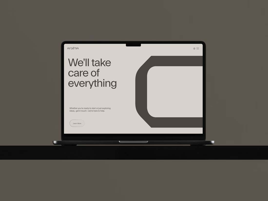
What if construction felt as clear as the space it creates?
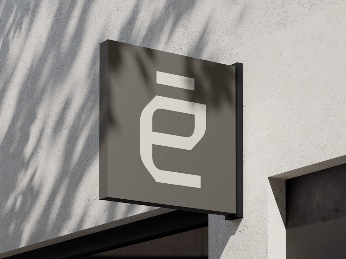
For Arqētia, we built a visual identity around one of the industry's most important client needs: transparency. A direct response to the uncertainty often associated with construction, from unclear processes and budgets to timelines and decision-making.
The concept makes transparency tangible, translating it into a visual system that feels open, structured and precise.
check it out



Very clean identity work


Should a flower shop ever go black and white?
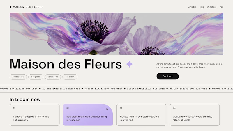
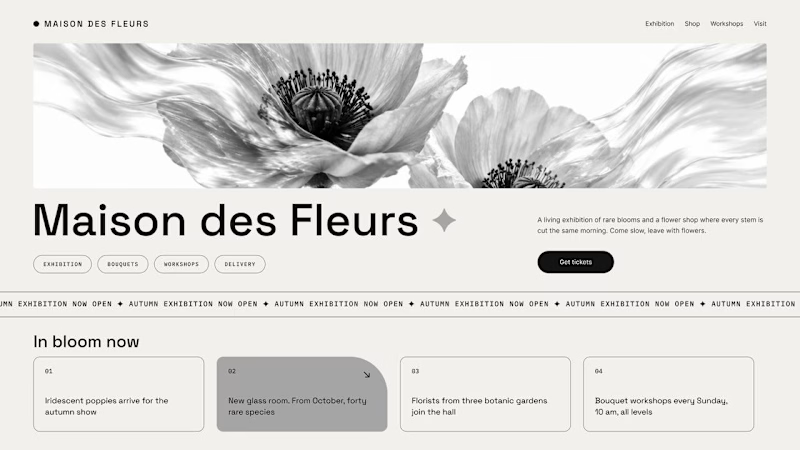
Same flower house, same layout. We only took the color out.
1. Full color. The iridescent petals do the selling: lilac, pink, a little shimmer. The photo is the brand, and every accent on the page borrows from it.
2. Monochrome. No color at all. Shape, texture and typography have to carry everything, and the page suddenly reads like a gallery catalogue.
Color sells the flower. Monochrome sells the exhibition.
Which one would get you through the door?
67 voted
91%
7 voted
9%
74 votes
Closed

The problem with monochrome is that, throughout computer history, it has conditioned users to associate gray and monochrome with being disabled, dysfunctional, or something to ignore and avoid.

Hi :) This is a journey through asteroids into the heart of a star. Built with Three.js, React Three Fiber, and custom GLSL shaders. Liquid images, interactive particle typography, and a core that opens under your cursor.


Man... this is cool. 😍