The network for creativity
Join 1.25M professional creatives like you
Connect with clients, get discovered, and run your business 100% commission-free
Creatives on Contra have earned over $150M and we are just getting started
Back to feedPost

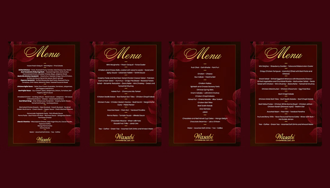
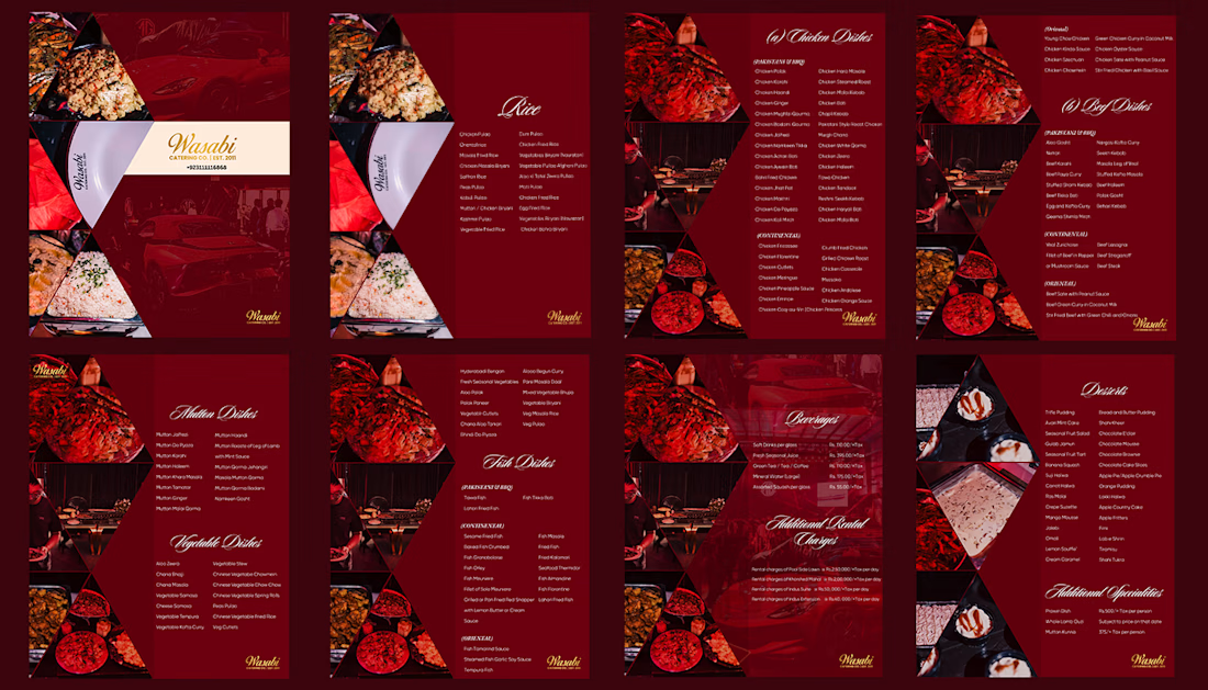
Menu flyers for Wasabi Catering Co. 🔥
A well-known catering company that has a premium, bold and vibrant brand identity and that is exactly what I have done for them!
Integrated all the past event visuals to gain the customer's trust of quality service


The network for creativity
Join 1.25M professional creatives like you
Connect with clients, get discovered, and run your business 100% commission-free
Creatives on Contra have earned over $150M and we are just getting started








Related posts


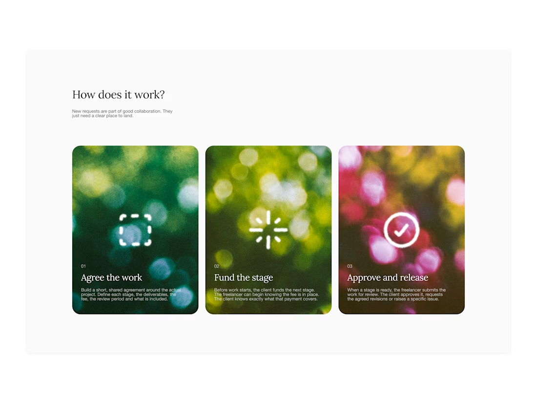

Your web sections always have such strong art direction. Great to see the brand carried right into the layout.

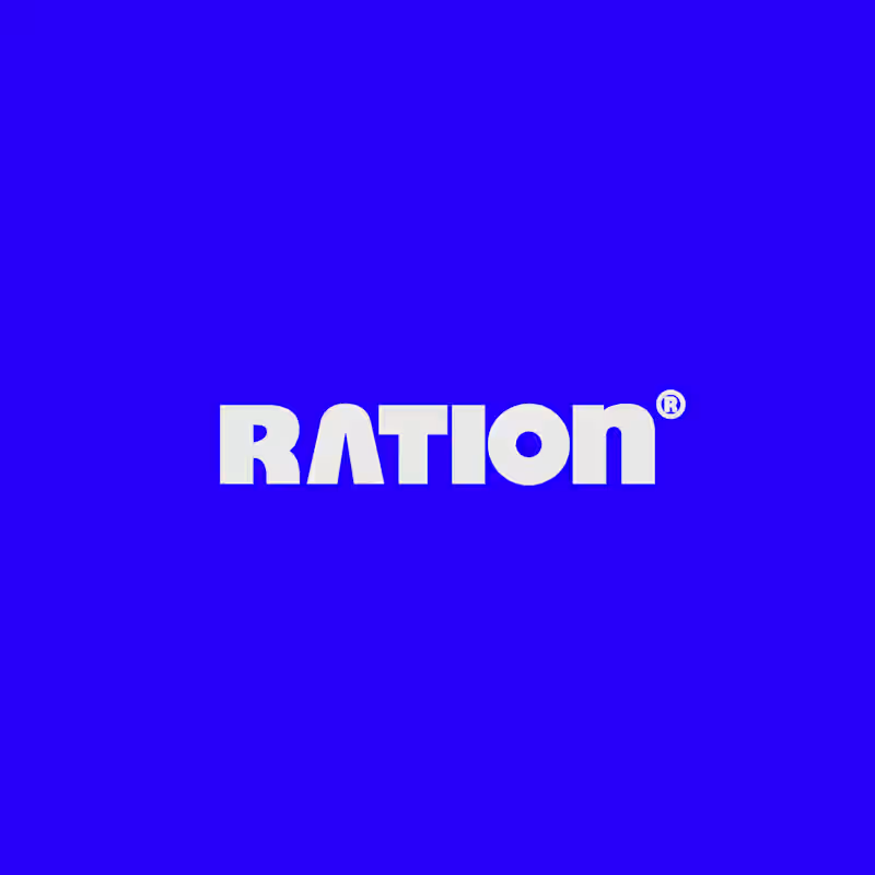
I’ve been working on a bold, modern-retro logotype and can’t decide between these two options.
🆘 Which one feels more aesthetically pleasing to you?
11 voted
26%
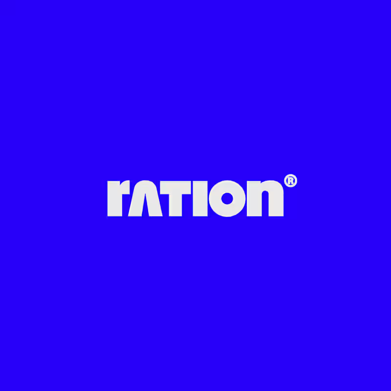
31 voted
74%
42 votes
Closed

CAPITAL is great but SMALL is unique great job Nawras 🔥🔥

Hi Brand Designer and Inpirees,
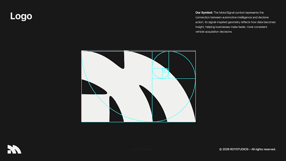
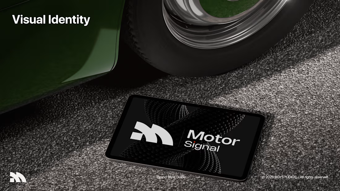
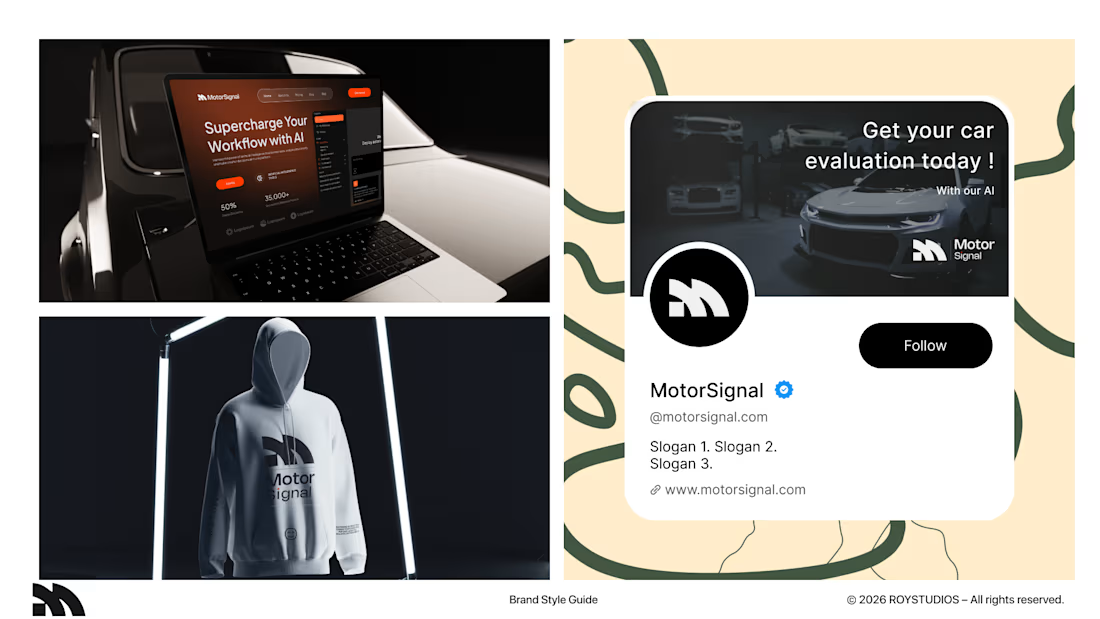
I just finished designing an AI automative B2B SaaS branding.
This is a self-made project that I challenged myself to test the skills of my newly unlocked branding skills. 🤞
Motor Signal is an AI-powered vehicle quotation software that helps businesses to evaluate their user's motor vehicles easily and faster.
This was a very niche industry that I chose to do a project on.
I want you guys to be the judge for this project, and give me your wisdom on this project and how you guys would design this project if it were you. 🤏
That's really great specially 3D t-shirt show and business card🔥🔥
Nice job Sahil❤️❤️