The network for creativity
Join 1.25M professional creatives like you
Connect with clients, get discovered, and run your business 100% commission-free
Creatives on Contra have earned over $150M and we are just getting started
Back to feedPost

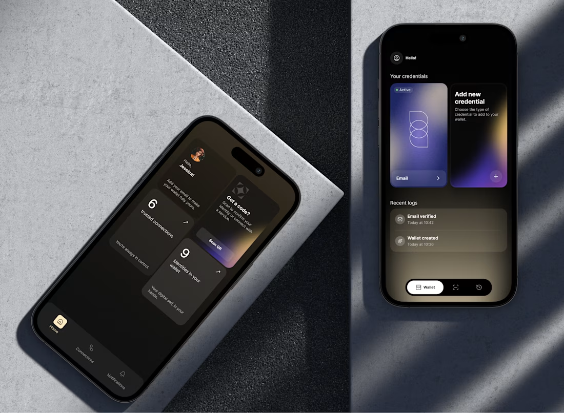
The wallet vote closed. 8% picked counts up front, 92% picked cards.
I promised the reasoning either way, so here it is.
The old home screen showed your credentials directly. You saw the card, you tapped it, done, plus a log of what just happened. A few people made that case in the comments, and they are right that taking it away costs a step.
The reason I took it anyway: the card row only works while the wallet is small. At twenty or thirty documents a horizontal swipe stops being access and turns into a search problem, and the card you need is never the one on screen. So the home screen stopped trying to be the wallet. It became a summary, with the real list one tap down where it can be sorted and filtered, and Scan QR moved to the top because scanning a code is what people open this app to do.
The outside signal we had was weak, and I want to be straight about that. The product sits in a regulated space under NDA, so no open user testing. We ran internal sessions and demoed both versions at industry events, where 88% of partners and investors picked the counts version and kept using the word premium. That tells me it reads as credible to the buying side. It does not tell me how it feels on the tenth open of the month. Different questions.
What would change my mind: if people turn out to open a specific credential often, pinning one or two to the home screen is the cheap fix. I would rather add that later than start from a layout that breaks at scale.
Thanks to everyone who argued with me. That was the point.
cc. @Agadon Creative @Maty Sandoval @Mark Barliet @Leena | Product Design, UX/UI & Web


The network for creativity
Join 1.25M professional creatives like you
Connect with clients, get discovered, and run your business 100% commission-free
Creatives on Contra have earned over $150M and we are just getting started









Related posts

sentences
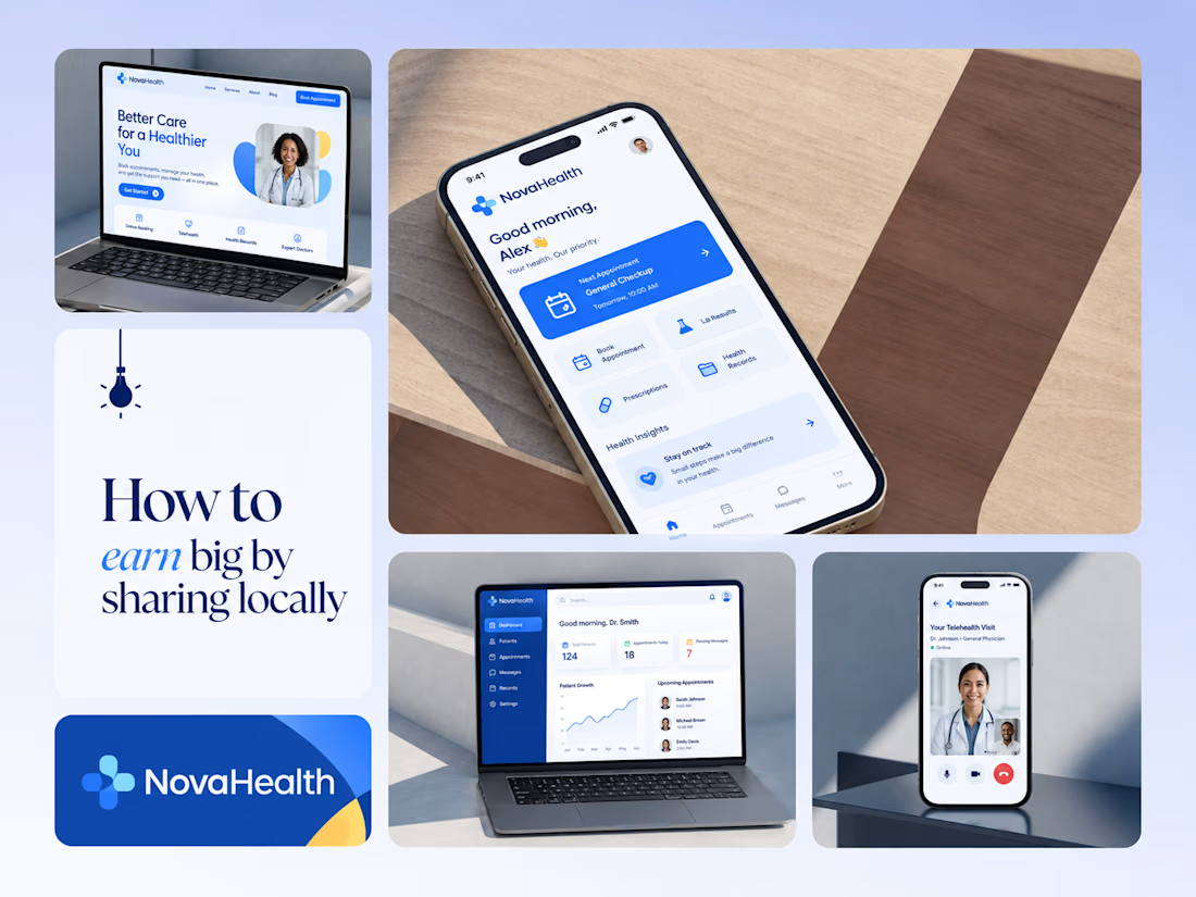
One brand, three screens: patient, doctor, and the video call between them.
NovaHealth is a healthcare brand and product system I designed from logo to apps. Healthcare software tends to feel either cold and clinical or too cluttered to open. I wanted something calm for a worried patient and quick for a doctor between appointments.
The logo breaks the classic medical cross into soft, rounded blocks in two blues, so it reads as “health” without feeling sterile.
The patient app opens with one thing: a solid blue card showing your next appointment. It’s the only fully saturated block on the screen, so nothing competes with it.
The doctor dashboard is built for a glance. Total patients, today’s appointments, and pending messages come first, in the same blue and rounded style as the patient app.
The telehealth screen has almost no UI. The doctor’s face fills the screen, with just three controls: mic, camera, and a red end-call button, the only red in the whole system.
One rule ties it together: blue means action, white space means calm, and yellow is a small spark of warmth.
Which screen should I break down next? 👇


Great medical brand design specially the phone app UI and top left laptop dashboard 🔥🔥🔥
great job Joshua ❤️🎉

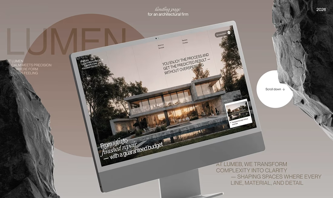
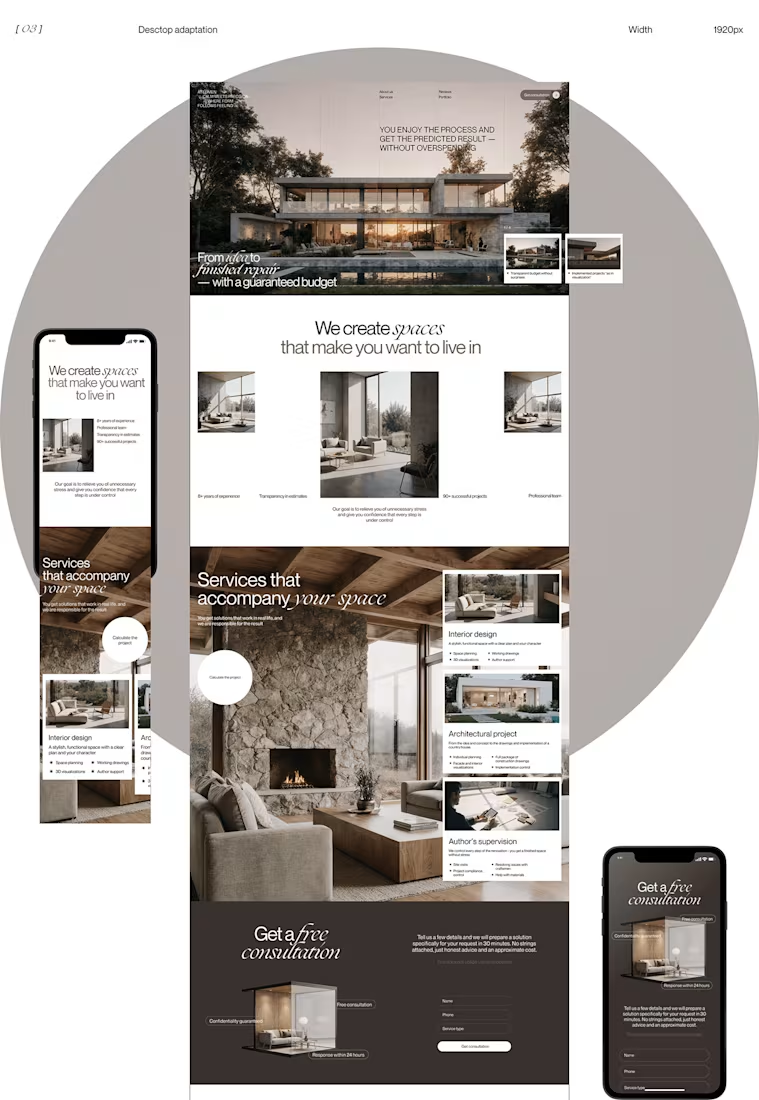
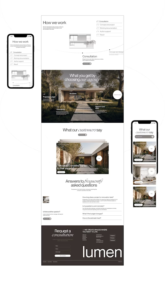
Lumen — UX/UI Design for a Premium Architecture Studio
Sometimes, the smallest details are what give a design its personality.
For Lumen, I found myself exploring how typography, architectural photography, colour, and layout could work together to tell a story before someone even starts reading.
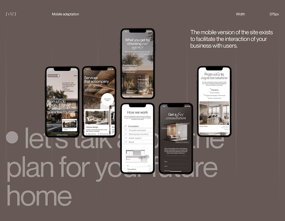
I played with oversized text, warm brown tones, editorial layouts, and a mobile experience that carries the same visual character as the desktop design.
I especially enjoyed putting the mobile screens together. Seeing the different sections come to life on a smaller screen made the whole concept feel more complete.
It's always interesting to see how different creative decisions can change the way people experience a brand.
What's one design detail that can make you appreciate a website even before you've explored everything?
#WebDesign #CreativeDesign #UIUXDesign #Architecture


i love this soooo wellllll, i just said welll with 4 l's thats how good this is

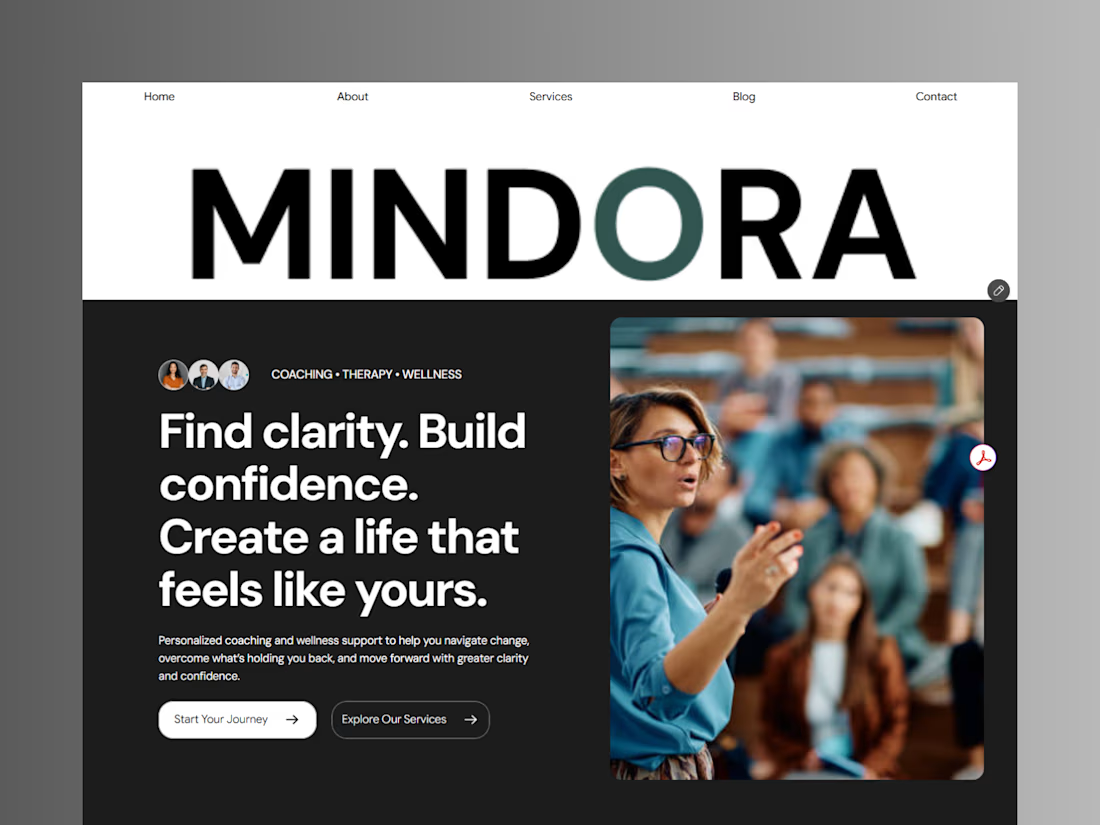
Introducing Mindora — a Life Coaching & Wellness Framer Template.
I designed Mindora for life coaches, wellness professionals, and personal growth brands looking for a calm, modern, and welcoming online presence.
Inspired by clarity, confidence, and meaningful growth, Mindora features a thoughtful layout, dedicated service sections, a blog for sharing valuable insights, and a clean visual style designed to help brands connect with their audience.
Built with Framer, it's a customizable starting point for creating a professional coaching or wellness website.
Explore Mindora and bring your next website idea to life.
Kindly check it out the template: https://www.framer.com/marketplace/templates/mindora-life-coach/



Great work