The network for creativity
Join 1.25M professional creatives like you
Connect with clients, get discovered, and run your business 100% commission-free
Creatives on Contra have earned over $150M and we are just getting started
Back to feedPost


Neuropathic pain science is hard to explain. Mechanical allodynia, hyperalgesia...
That was the main focus behind a recent brand refresh and landing page built for Allothera. Make the complex simple.
The page doesn't skip the science, it just doesn't lead with it. One warm palette, one recurring illustration of the pain pathway through the body, copy that leads with the patient's experience.
Nothing about the science changed, we just told it in a different order with some clean visuals.


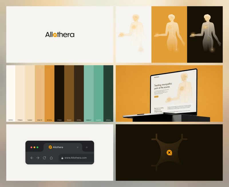

The recurring pain-pathway illustration doing double duty as both explainer and brand mark is the real trick here — it means the science stays visible without ever being the headline.


You executed this perfectly!

Love this!


Nice work!

this color palette is stunning!


leading with the patient instead of the science, smart


the warm palette makes the science easier to follow. the body path is a nice touch.

I love this color palletteee, great job Harry!! 💯

"We just told it in a different order" undersells what's actually hard about medical communication design. Sequencing empathy before mechanism is the whole skill, most brands in this space lead with the clinical language out of habit.

Love the simplicity here, it gives the brand such a nice feel

Excellent job! 💎

Very nice!

This is nice

That recurring body illustration doing the explaining instead of a wall of medical copy is smart, it lets the science stay accurate without asking a scared patient to parse it. The warm palette against a topic this clinical is a good contrast too, most pain-related healthcare sites go cold and sterile.


Turning neuropathic pain terminology into something a patient could actually sit with, without dumbing it down, is a genuinely hard brief. Was the harder part nailing the visual language for a body that feels pain differently, or getting the tone of voice right in the copy itself?
The network for creativity
Join 1.25M professional creatives like you
Connect with clients, get discovered, and run your business 100% commission-free
Creatives on Contra have earned over $150M and we are just getting started
Challenges
View all


Related posts

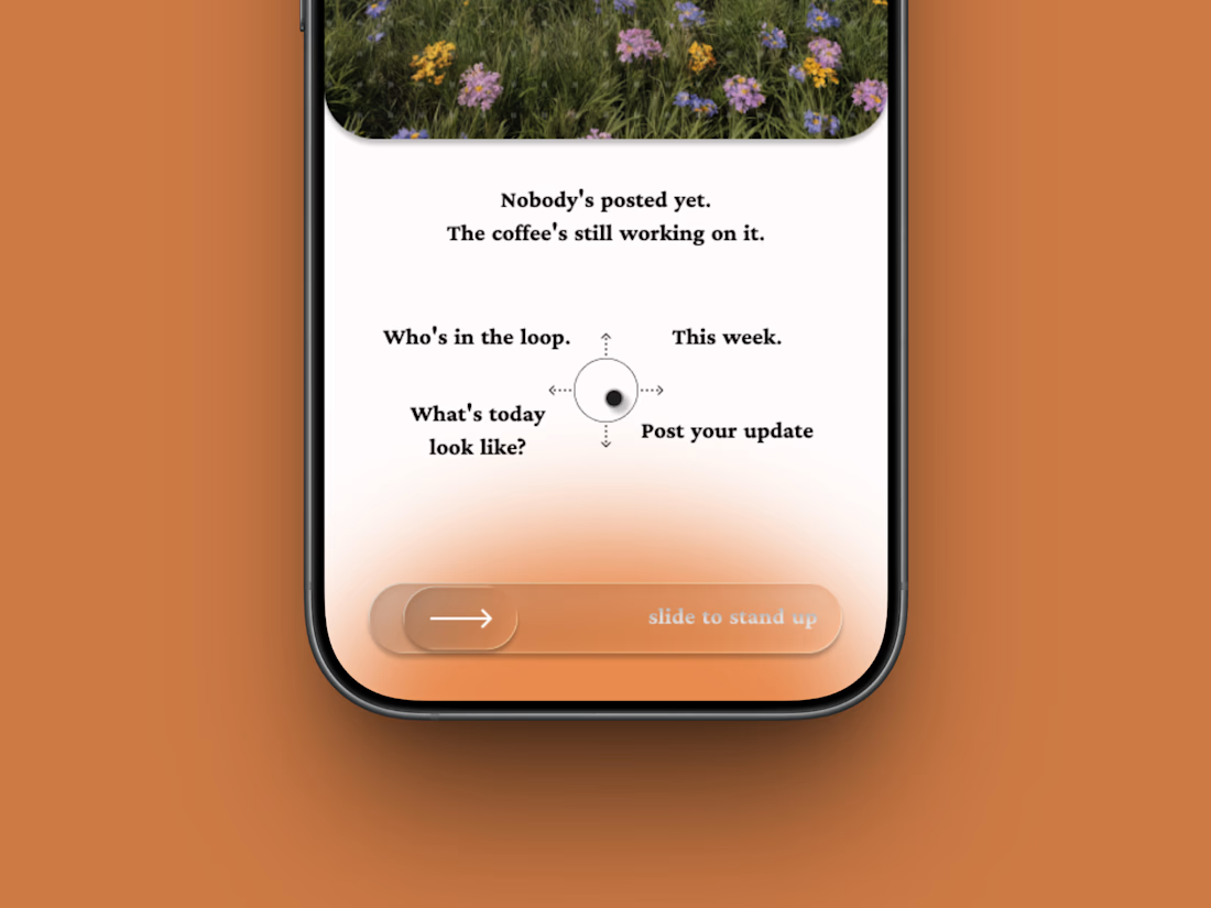
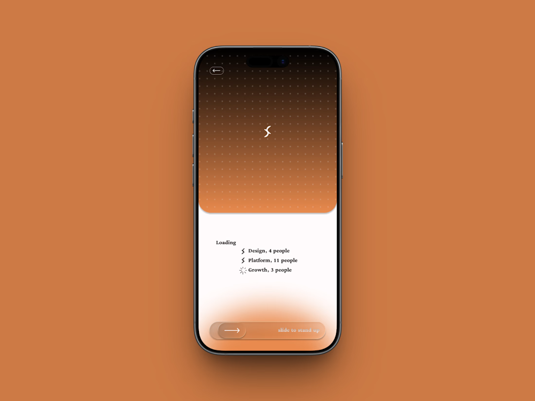
Friday app: Loopin
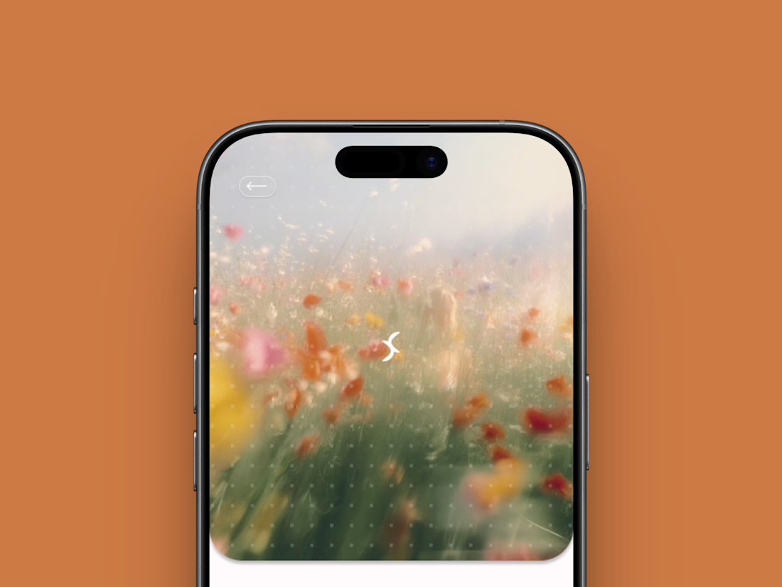
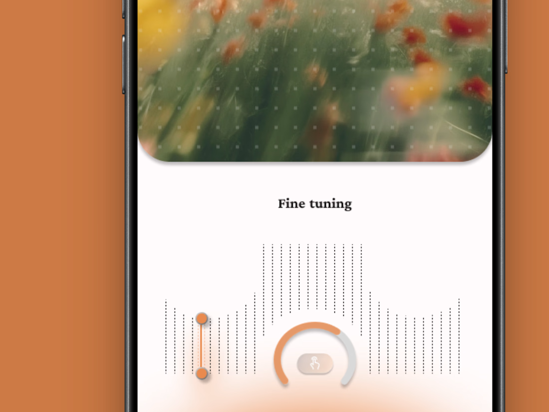
A fictional async standup app where the meeting is one gesture: slide to stand up.
Film-photo window up top, a four-way compass below, and a loading state that resolves your team one row at a time.
Concept project.


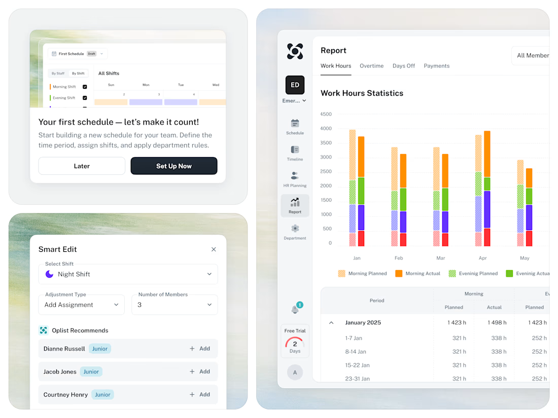
🚀 From Excel chaos to a clear SaaS workflow for staff scheduling.



GoTeacher found our Sunbeam template and asked us to make it theirs.
GoTeacher is backed by Harvard Innovation Labs and helps 100+ K-12 school districts see every app they pay for and whether it's safe for student data.
We kept Sunbeam's structure and animations and built the rest: GoBot the 3D mascot, shader clouds, real product dashboards and five product pages. Live in one week.
Full case study on my profile. Want one of our templates turned into your own site? Message me.


The work is interesting


