The network for creativity
Join 1.25M professional creatives like you
Connect with clients, get discovered, and run your business 100% commission-free
Creatives on Contra have earned over $150M and we are just getting started
Back to feedPost
Taste Test

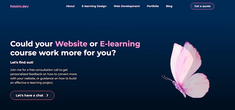
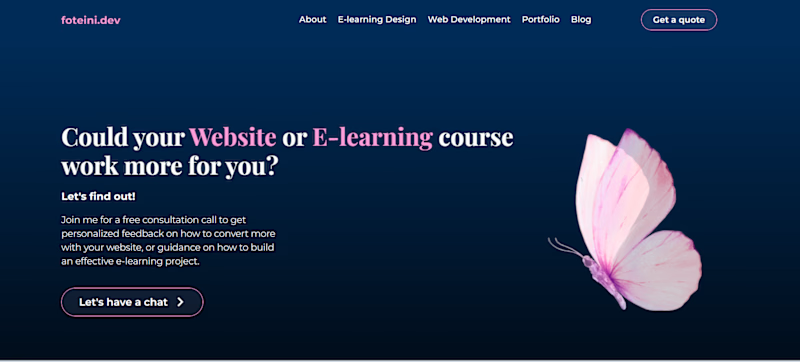

i love second design due to font

The Montserrat version feels a bit more accessible and clean for an e-learning context. It strikes a nice balance between professional and friendly.

The first one is easier to read but if you want to keep the elegance, you may want to balance the H1 like on the Montserrat version and its all good. Love the butterfly and "Let's find out!" 😊
The network for creativity
Join 1.25M professional creatives like you
Connect with clients, get discovered, and run your business 100% commission-free
Creatives on Contra have earned over $150M and we are just getting started





Related posts


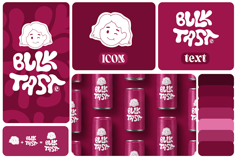
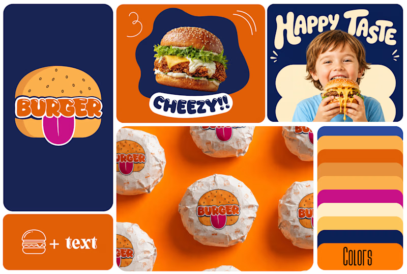
Which One Brand Identity Is looing good? A or B..
7 voted
50%
7 voted
50%
14 votes
Closed

Both look good, but I’d go with B. The colors and playful visuals feel more energetic. 🔥

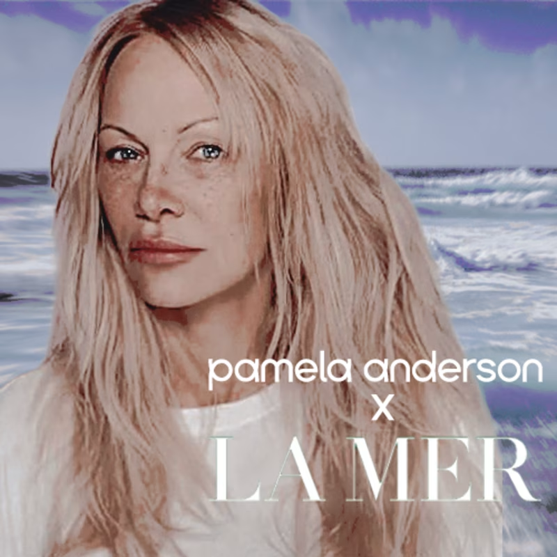
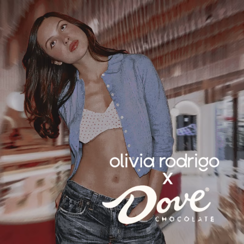
speculative marketing campaign ideas have been HITTING me lately. which would you rather see first? (second of two, we're gonna bracket vote these down. vote on the first here!)
happy to answer any questions or hear any takes you might have below!
2 voted
50%
2 voted
50%
4 votes
Closed


Both of them are great but the bottom one is better because it's visibility great job 🎉🎉🔥🔥