The network for creativity
Join 1.25M professional creatives like you
Connect with clients, get discovered, and run your business 100% commission-free
Creatives on Contra have earned over $150M and we are just getting started
Back to feedPost
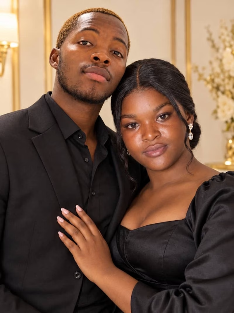
Taste Test

hello what is missing here

0 votes
Ends in 1d
The network for creativity
Join 1.25M professional creatives like you
Connect with clients, get discovered, and run your business 100% commission-free
Creatives on Contra have earned over $150M and we are just getting started
Related posts

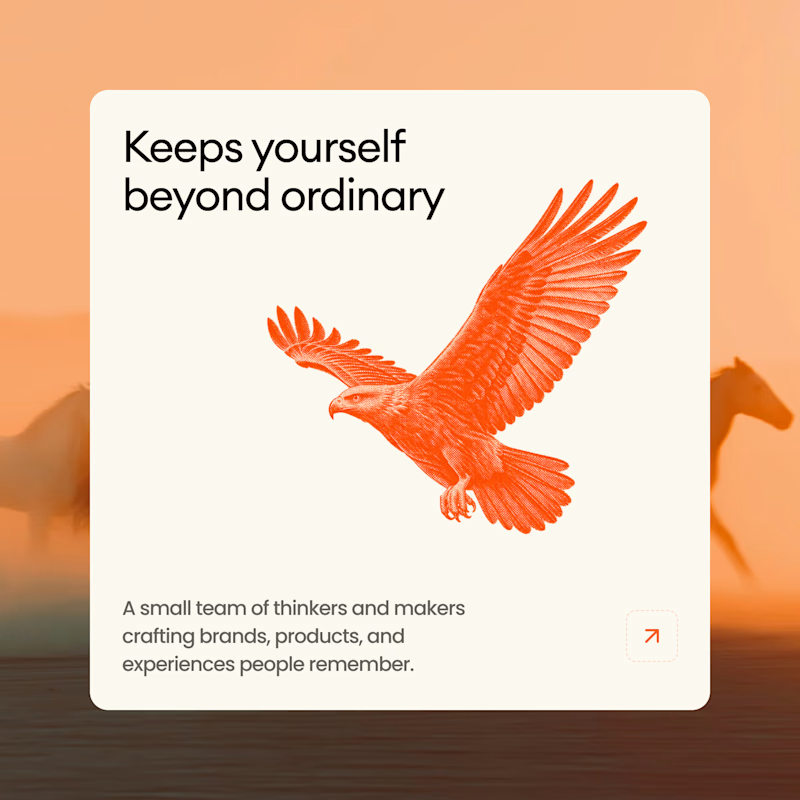
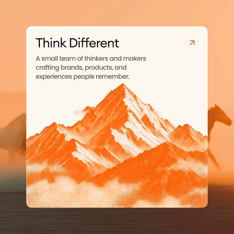
A or B? 🥭
10 voted
38%
16 voted
62%
26 votes
Closed

B all the way! Keeps yourself beyond ordinary with that bold orange eagle - super striking! That color contrast + message hits hard! Option 2 feels more memorable!

🎨 NOCTURNE — Design Taste Test | Cyberpunk vs. Minimalist
Two visual directions. One creative concept. Which style makes the stronger impact?
⚡ Version A: Cyberpunk — Futuristic visuals, bold contrasts, and an energetic digital atmosphere.
◼️ Version B: Minimalist — Clean composition, refined typography, and a focused visual identity.
This taste test explores how different design styles influence perception, mood, and visual appeal. Your feedback will help determine which direction communicates the concept most effectively.
Which version wins your vote — A or B? Drop your choice in the comments and share what made it stand out!
3 voted
50%
3 voted
50%
6 votes
Closed


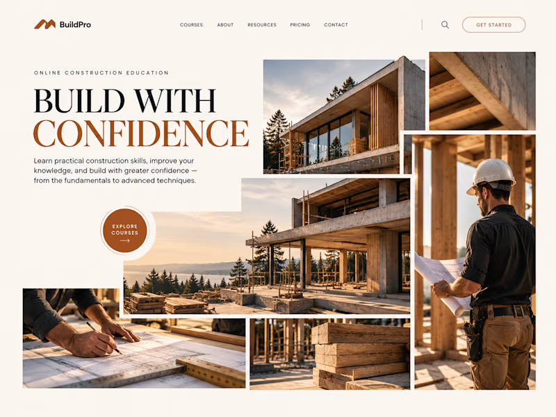
Same course. Same content.
But two completely different feelings ✨
Which version would you choose?

18 voted
31%
40 voted
69%

58 votes
Closed

option 2 feels a bit more cinematic, the confident feeling is embedded into the layout!