The network for creativity
Join 1.25M professional creatives like you
Connect with clients, get discovered, and run your business 100% commission-free
Creatives on Contra have earned over $150M and we are just getting started
Back to feedPost

CLARITY SHAPES ATTRACTION
In my Work section, I have shared through my writing “why I decided to build Manjot Kaur Writes” and mentioned that I have not followed the path of cold DMs to find clients.
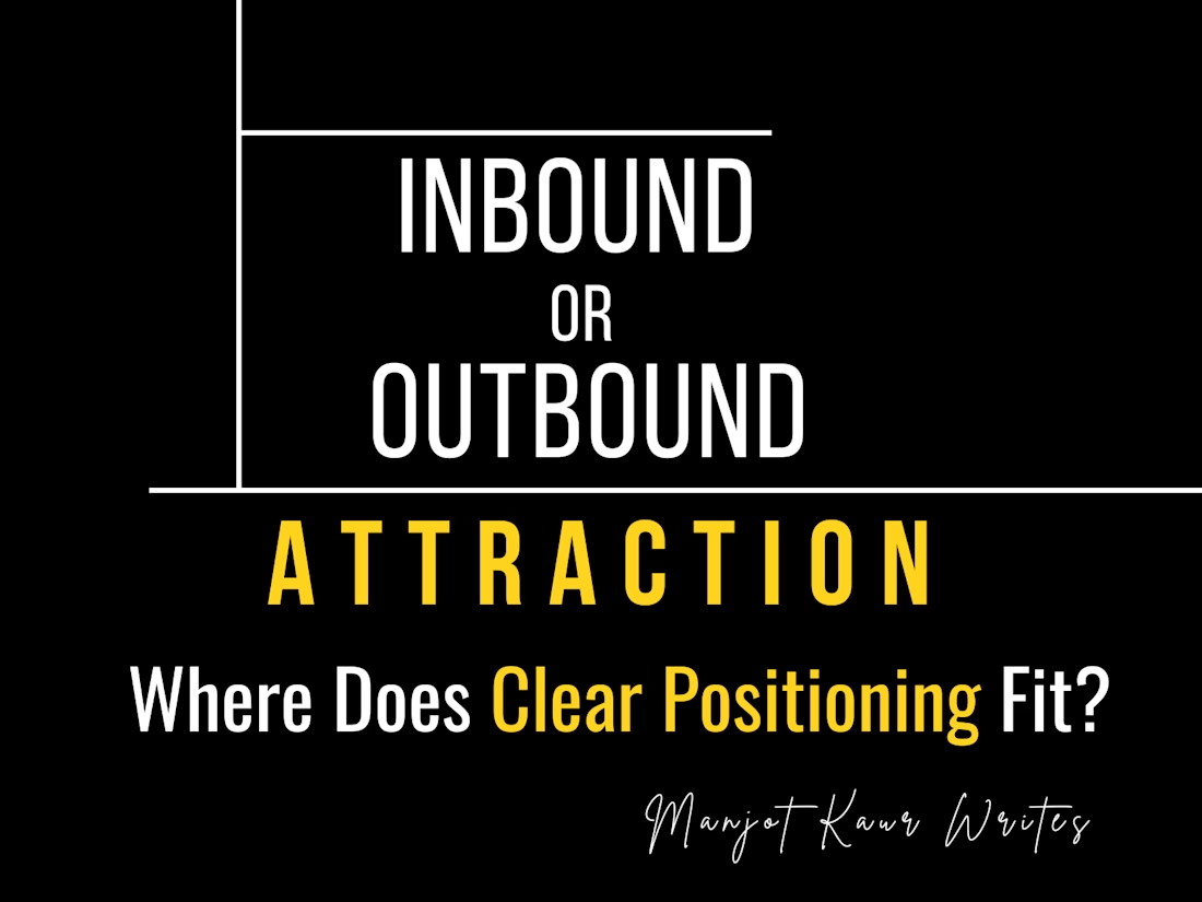
This made me think about INBOUND and OUTBOUND ATTRACTION.
Because some people believe INBOUND ATTRACTION does not work and that OUTBOUND ATTRACTION is necessary to find clients.
But I feel there is something worth looking at from a different perspective.
“Both approaches are FOCUSED on moving the work forward, without making the chase the centre of the process.”
Instead of MAKING ONE the winner of the race, I feel we should make decisions with a BALANCED APPROACH.
“Every journey is different.”
“Every mindset is different.”
“We all have different perspectives.”
For me, the bigger question is:
(Where does CLEAR POSITIONING fit into both?)
Whether it is INBOUND or OUTBOUND, the approach is different.
In INBOUND,
A founder or a client may visit our profile themselves.
In OUTBOUND,
We may take our profile and work to them.
But in both cases, THE CLIENT should understand from our side:
“What can I actually help them with?”
I feel this is where POSITIONING BECOMES IMPORTANT.
If the POSITIONING IS UNCLEAR,
Someone may visit the profile but leave without understanding the relevance of the work.
Similarly, someone may receive the DM
But still not understand WHY THE WORK is relevant to their problem.
So, for me:
Attraction may bring attention.
But clear positioning helps to turn that attention into understanding.
I do not see INBOUND and OUTBOUND ATTRACTION as competitors.
ONE FOCUSES on how people reach us.
The OTHER FOCUSES on how we reach people.
The approach may be different, but the clarity around our work still matters.
Would love to know different perspectives on this.
#BrandPositioning #ContentStrategy #InboundMarketing
#OutboundMarketing #PersonalBranding #ContentWriting
The network for creativity
Join 1.25M professional creatives like you
Connect with clients, get discovered, and run your business 100% commission-free
Creatives on Contra have earned over $150M and we are just getting started











Related posts


New LinkedIn banner designs, built around one goal: making the value clear at a glance.
From YouTube creators to healthcare businesses and SaaS brands, every banner needs a clear message, the right visual direction, and a reason for the audience to care.
My approach is simple: understand the audience, lead with the outcome, use visuals that support the message, and make the next step obvious.
Good design should look great, but it should also communicate with purpose.
Open to 2 more LinkedIn branding projects this week. 💜

Good call building each banner around one clear message.

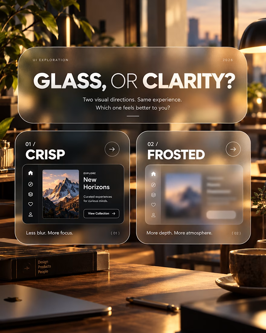
Glass, or Clarity?
An exploration of visual depth, contrast and interface clarity.
This concept explores two approaches to presenting the same interface: a crisp, sharply defined layout and a frosted-glass treatment.
The intention was to examine how surface treatments influence the overall character of a digital product, and where visual atmosphere begins to compete with usability.
Design considerations
Visual hierarchy and content legibility
Transparency, blur and depth
Contrast across layered surfaces
Choosing visual treatments that serve the product
The takeaway
Visual effects are most effective when they have a purpose. Aesthetic refinement matters, but it should never come at the expense of understanding or usability.
An ongoing exploration of the relationship between visual expression and functional design.
Which direction would you explore further, and why?