The network for creativity
Join 1.25M professional creatives like you
Connect with clients, get discovered, and run your business 100% commission-free
Creatives on Contra have earned over $150M and we are just getting started
Back to feedPost
One page makes every design decision count.
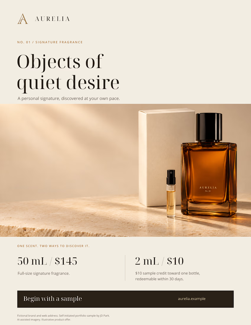
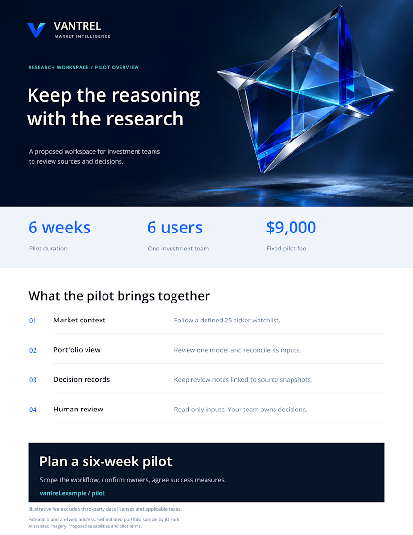
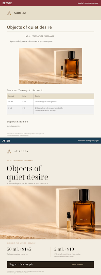
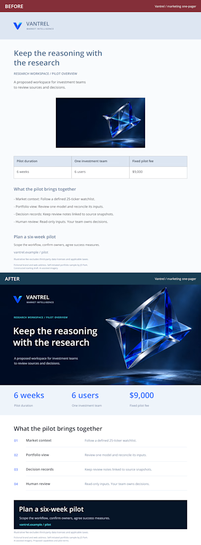
I adapted two fictional brand concepts into marketing one-pagers: an Aurelia fragrance product sheet and a Vantrel business sales sheet.
The constructed starting drafts and finished versions carry the same offer and facts. The redesign focuses on reading order, typography, imagery and a clear next step.
These are self-initiated, AI-assisted portfolio studies. The full case includes a downloadable PDF with both BEFORE and AFTER pages.
What catches your attention first in the AFTER versions, and does it help you understand the offer?
Have a rough marketing page? Send the page, audience and deadline for a scoped redesign quote.
https://contra.com/s/rve3lr7Y-marketing-one-pager-redesign
The network for creativity
Join 1.25M professional creatives like you
Connect with clients, get discovered, and run your business 100% commission-free
Creatives on Contra have earned over $150M and we are just getting started



Related posts


Niceee

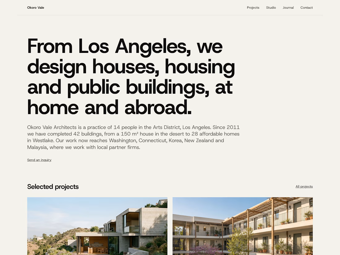
How I designed Parti, my architecture template for Framer, and the phone review that changed its hierarchy.


Your material-page revision gives the phone layout its own reading sequence. The change to thumbnail rows with full-row links seems particularly useful for showing that a material entry opens another page. How did you distinguish those clickable rows from the non-interactive project facts?

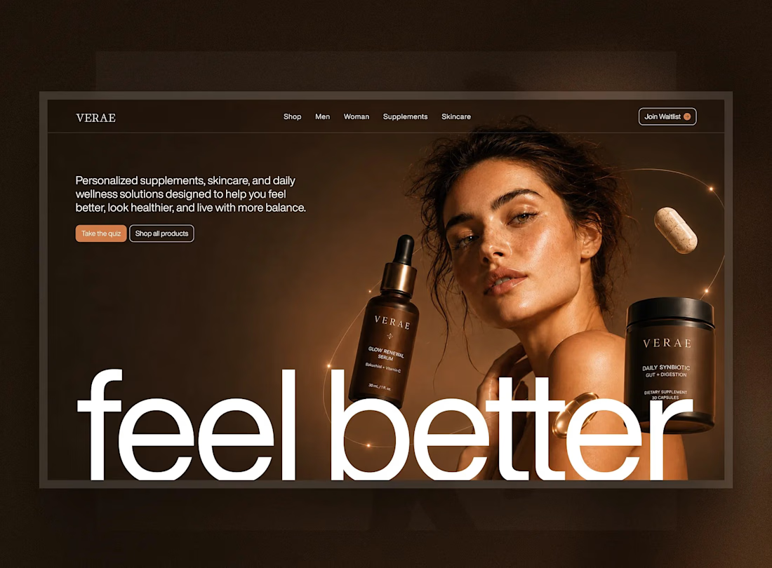
Introducing VERAÉ — a premium wellness and skincare eCommerce experience.
Designed to blend luxury aesthetics with intuitive shopping, featuring elegant product visuals, responsive layouts, and a seamless user experience.
From UI/UX design to React development, the focus was on creating a refined digital experience that connects product storytelling with effortless shopping.
Design & Development: Figma, Adobe Photoshop, React.
#Wellness #Skincare #EcommerceDesign #UIDesign #UXDesign #WebDesign #ReactDevelopment #LandingPageDesign #Figma #ProductDesign


Lovely direction for a skincare site.