The network for creativity
Join 1.25M professional creatives like you
Connect with clients, get discovered, and run your business 100% commission-free
Creatives on Contra have earned over $150M and we are just getting started
Back to feedPost


A late logo revision needs a pass through the written guidelines too. The SVG can be current while the clear-space diagram still describes the old mark. I'd check the files against the instructions before signing off the handoff.

True.
The network for creativity
Join 1.25M professional creatives like you
Connect with clients, get discovered, and run your business 100% commission-free
Creatives on Contra have earned over $150M and we are just getting started







Related posts

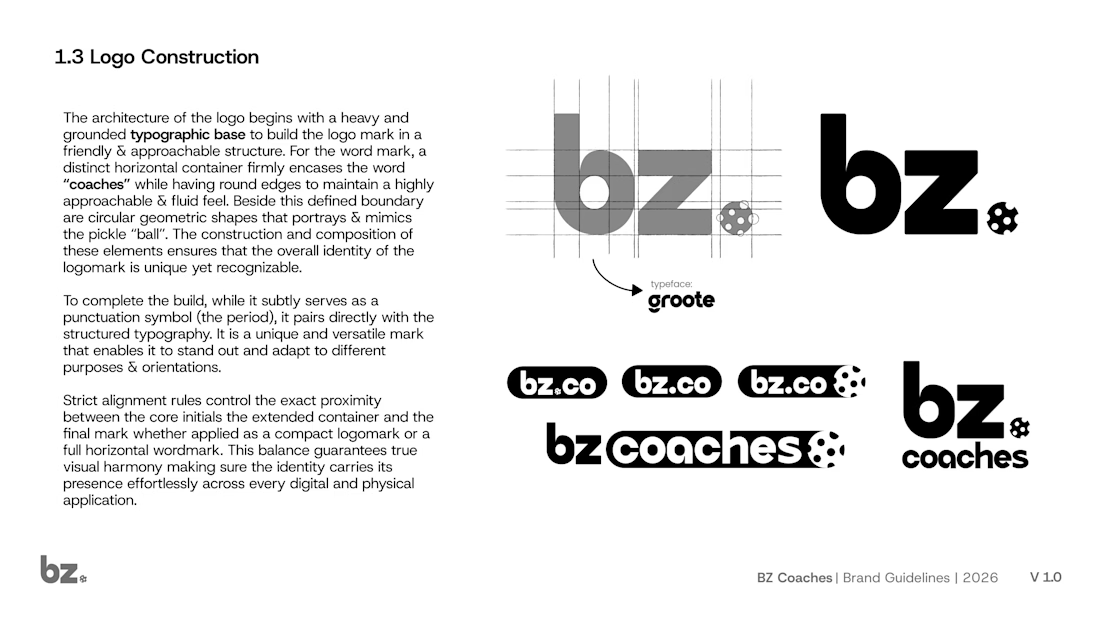
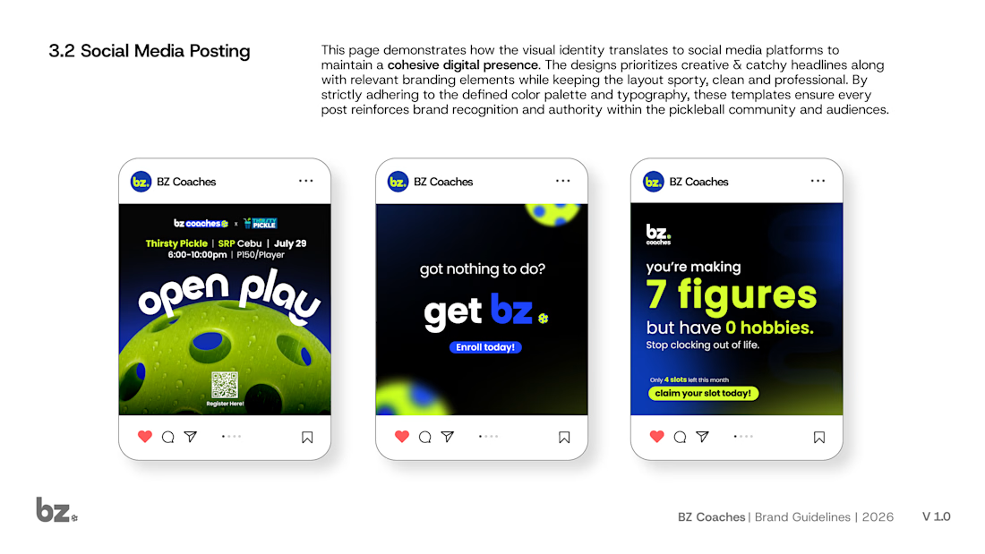
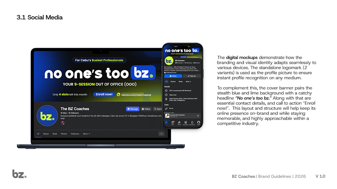
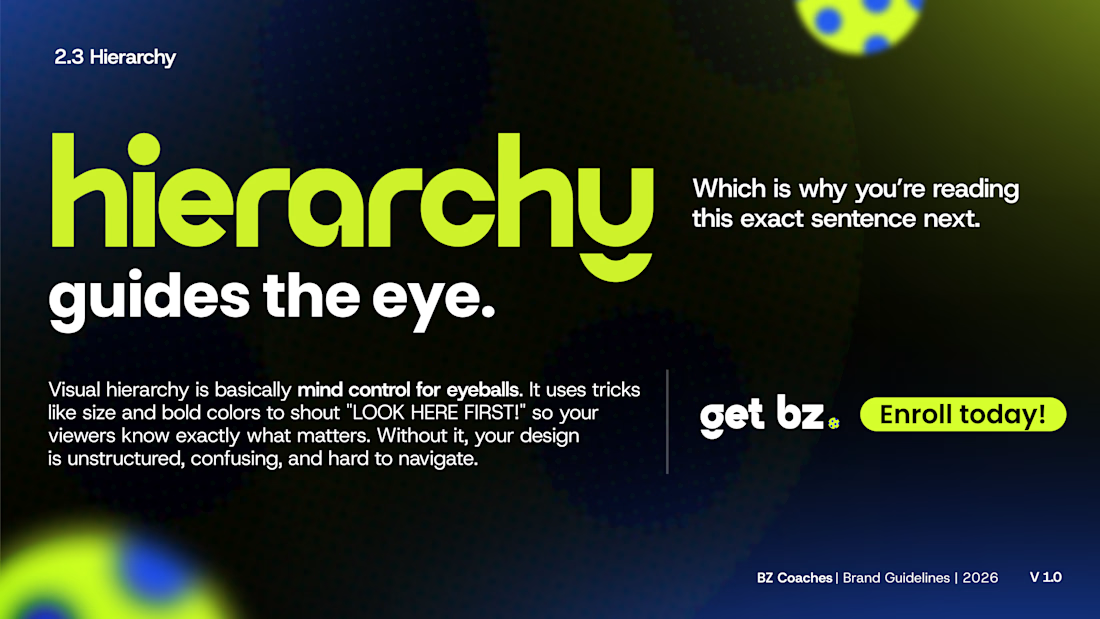
Dropping a sneak peek at a 20+ page brand guideline document I recently built for BZ Coaches. 🎾✨
The goal was to create a structured but highly approachable identity in the local space. The logo pairs a grounded typographic base with a circular mark that mimics a pickleball and cleverly doubles as a punctuation symbol. I focused heavily on visual hierarchy to make sure the messaging instantly grabs attention. You can see how the stealth blue and lime color palette translates to their social media presence, keeping the brand looking sporty and professional while highlighting their catchy headlines.
How detailed do you usually get with your client handoffs? Are we doing 5 pages or 50? Let's talk process in the comments. 👇
#BrandIdentity #BrandGuidelines #LogoDesign #GraphicDesign #FreelanceDesigner #ContraDesign #SportsBranding
typographybrandinggraphicdesignLogo DesignBrand DesignGraphic DesignAdobe IllustratorAdobe PhotoshopFigma






A new visual identity for Reroll.
We turned the O in the name into a die and built the wider brand language around that simple idea.
The project includes:
• Logo design
• Social media identity
• Logo animation
• Custom playing card back
• 3D visual assets
Creative direction: Dmitry Lepisov
Identity design + motion: Arthur Skripnik
Created by Lepisov Branding
Some of the 3D visuals and animation were made in Spline.


