The network for creativity
Join 1.25M professional creatives like you
Connect with clients, get discovered, and run your business 100% commission-free
Creatives on Contra have earned over $150M and we are just getting started
Back to feedPost


Portugal's FA shipped a new logo mid world cup.
by the end of the week: it will never appear on the shirt. institutional use only. players keep the old crest.
an identity is proven by the surfaces it's allowed on. exempt the highest-stakes one and you've admitted the brand can't carry you.
b2b runs the same retreat quietly. new site ships, sales keeps the old deck "until the quarter closes," product waits for the redesign. two brands in market, and the old one owns every surface where money changes hands.
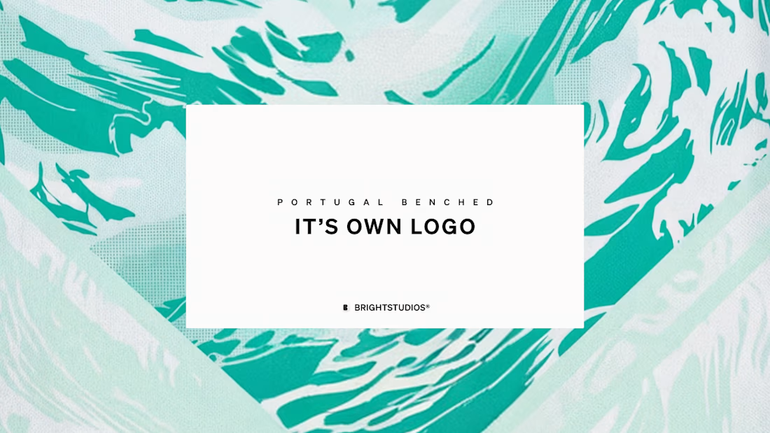

Looks Like portugal's jersey..haha!
Because it is :)

What do you think about the new logo? Is it too cluttered and messy, or do you think it works?
I think it's horrendous


That line about the sales team quietly keeping the old deck 'until the quarter closes' is such a brilliant, overlooked observation. It’s so true—we often talk about branding at a high level, but the real test is always in those small, practical corners where revenue actually...

This even extends beyond branding.
Whenever teams hesitate to use the new version in high-stakes situations, it's often a signal that trust hasn't caught up with the strategy yet.

"The exemption is the confession" is such a sharp way to put it. I've seen the same slow-walk happen with sales decks more times than I can count. Have you found any way to actually force that handoff faster, or does it always take someone drawing a hard deadline?

Nice job 👍

i've never been able to wrap my head around why a rebrand is done without applying it everywhere.
It's because they only understood it's bad after the fact and for the backlash it got.

Great balance between aesthetics and usability.

Amazing 😎
Dude, thank you.

One of the best designs I’ve seen today. Really solid work 👏 It’s all about how brand vectors behave on a live web canvas.
The network for creativity
Join 1.25M professional creatives like you
Connect with clients, get discovered, and run your business 100% commission-free
Creatives on Contra have earned over $150M and we are just getting started
Related posts

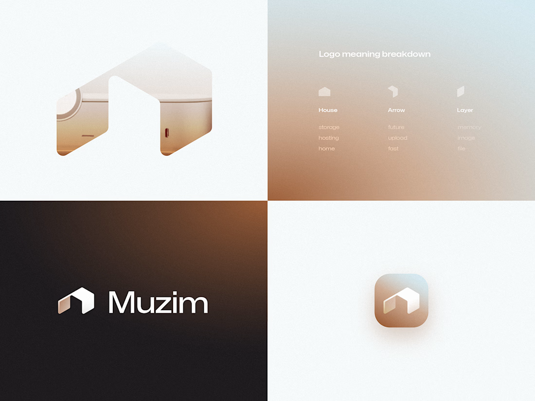
One of the unused logo concepts from a recent branding project.
I like this one because it shows how much meaning can fit into a simple mark.
House + upload arrow + memory layer—all combined into a single symbol, with a silhouette designed to reinforce technology and forward motion.
Even when a concept isn't selected, it's part of the exploration that leads to a stronger brand.


This came together really well.

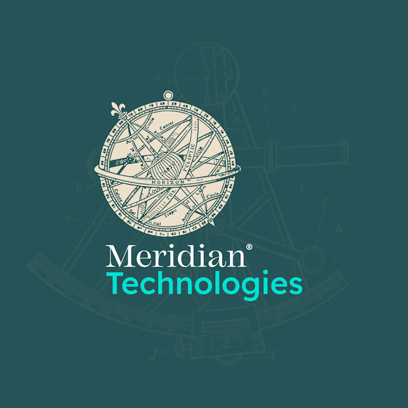
Option A — Full Logo vs. Option B — Compact Version
Two sides of the same brand. 🪙
I've been working on a concept brand identity for MeriTech, and here's a sneak peek at the logo system: the full version and the compact mark, side by side.
The full logo carries the complete brand presence, while the compact version is built to work in tighter spaces without losing the identity.
This is part of a bigger case study I'm putting together — covering the full brand direction, visual system, and the thinking behind every decision.
Stay tuned, the full project drops soon. 👀
#Contra #ContraCreator #FreelanceDesigner
1 voted
17%
5 voted
83%

6 votes
Closed

Compact looks cleaner. More memorable. Love it

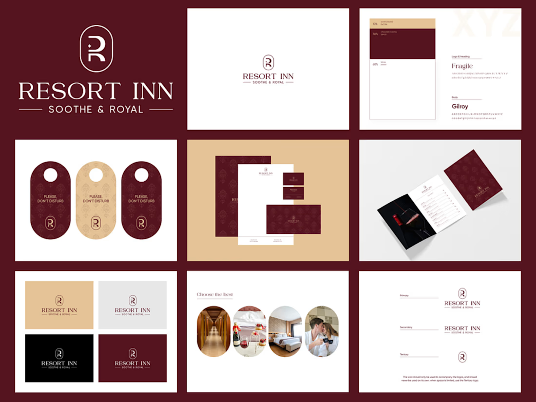
Luxury Hotel Brand Identity Design | Resort Inn
Resort Inn is a luxury hospitality branding project created to establish a sophisticated and memorable visual identity for a premium hotel. The goal was to design a cohesive brand system that communicates elegance, comfort, and professionalism while remaining consistent across both print and digital touchpoints.
The project included designing a custom monogram logo, defining a refined color palette and typography system, and creating comprehensive brand guidelines. I also developed supporting brand assets such as business cards, letterheads, brochures, hotel door hangers, and stationery to demonstrate how the identity would be applied in real-world scenarios.
Every design decision was made to ensure versatility, scalability, and a premium guest experience. The final result is a polished visual identity that helps the brand stand out in the competitive hospitality industry while maintaining consistency across all customer-facing materials.
#BrandIdentity #LogoDesign #Branding #GraphicDesign #VisualIdentity #LuxuryBranding #HotelBranding #BrandDesigner #DesignPortfolio #ContraCreator


Good job








Trending

Claude
Claude has entered the design space. How are you using Claude Design?

Contra University
Learn from expert creatives how to earn more using next-gen AI tools.
fifaworldcup2026
The World Cup is here and the whole world's watching. How are you designing for the world stage?
creativeaiflow
Creative AI workflows are evolving. What tools do you use, and what are their strengths and weaknesses?
freelancerlife
Freelancer life is wins, pivots, and everything in between. What’s yours right now?