The network for creativity
Join 1.25M professional creatives like you
Connect with clients, get discovered, and run your business 100% commission-free
Creatives on Contra have earned over $150M and we are just getting started
Back to feedPost

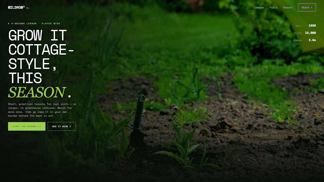
We built a website on a 3-second rule — and it forced me to unlearn everything I knew about web design.
For WILDROW, a cottage-garden studio, we designed a one-page experience around one brutal constraint:
The lesson has to be clear before the thumb scrolls on. Nothing more.
That changed every decision we made:
No jargon. If a clip doesn't read in a single pass, we cut it again.
No soundtrack. A lesson that needs music becomes weak in a muted world.
The loop restarts on purpose. Every pass is a fresh planting — motion that never stops reads like a live border.
So the whole site is built in "threes": 3-second lessons · 3 field moves (sow, tend, cut) · 5 steps for a season · 1 form to start your own garden.
Dark, editorial, chaptered like a field notebook — sticky nav, a stats strip, silent wide loops, and a full-width replay mode.
We've all heard "short is better." But how short is too short?
Is 3 seconds the future of learning everything — or just the future of being ignored?

The network for creativity
Join 1.25M professional creatives like you
Connect with clients, get discovered, and run your business 100% commission-free
Creatives on Contra have earned over $150M and we are just getting started







Related posts

Same brand. Same copy. Two completely different ways to move.
A scrolls like a title sequence.
B snaps like a train arriving.
Taste test: which one would you ship?
15 voted
32%
32 voted
68%
47 votes
Closed

Option 2 stands out more for me!

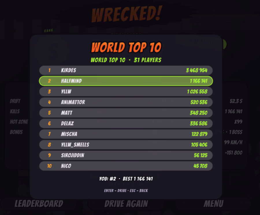
Pick a car. Hit the handbrake. Turn the horde into combo points. 🚗💨
Play free: www.animattor.co/zombie-drift (live leaderboard, beat me!)
Desktop (keyboard or gamepad), mobile (gyroscope).
🏆 Top 3 on October 18 get 1 year of Rive Cadet from me. Post a screenshot in comment of your score on X, LinkedIn or here and tag me and Rive.
🚙 Real drift physics. Every car handles differently and is fun in its own way
🔓 Monster truck unlocks once you pass 500,000 points
💨 Drifting to stack combos
🛞 Ramps with slowmo its something, fix your car in repair garage
I started building it right before the weekend. By Sunday I was already beating my own high scores.
Built in Rive with the Rive CLI and Claude. Zombies are animated vectors, the cars are custom vector designs, and the HUD runs on data binding [+ GPU Canvas / Luau]. The whole game is just 2.37 MB.
Drop your score below 👇
Got feedback or something's not working? Let me know.


@Rive @Matt Jedrzejewski very fun game! Frames really get low with a lot of zombies on the screen!

Primland puts a whole mountain resort on one interactive 3D map. You start high above the Blue Ridge Mountains with clouds drifting through the valley, then pick a pin and fly down to the lodge, the pool, or the mountaintop restaurant. The terrain, the trees, and the smooth camera moves make you want to book a trip.
Big shout-out to Robert Borghesi for building this. The scale and the attention to detail are impressive.


