The network for creativity
Join 1.25M professional creatives like you
Connect with clients, get discovered, and run your business 100% commission-free
Creatives on Contra have earned over $150M and we are just getting started
Back to feedPost

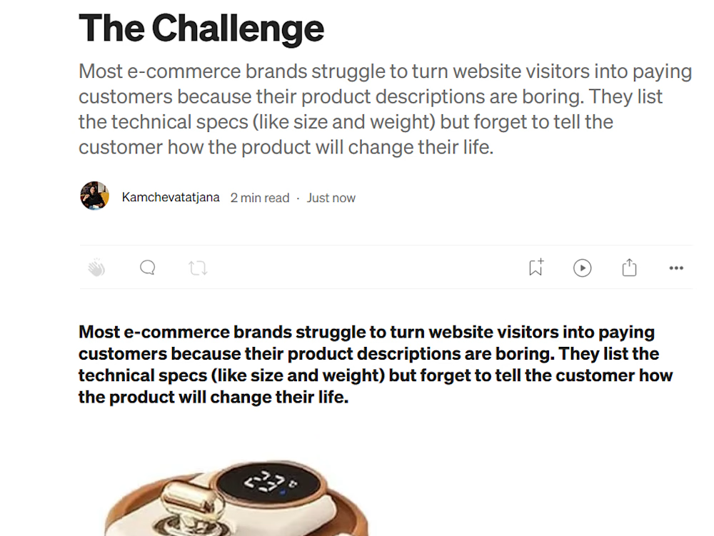
This sample showcases my ability to write persuasive, benefit-driven product descriptions for modern e-commerce brands. The text is optimized to grab attention, build desire, and convert casual visitors into paying customers.


The network for creativity
Join 1.25M professional creatives like you
Connect with clients, get discovered, and run your business 100% commission-free
Creatives on Contra have earned over $150M and we are just getting started











Related posts

Title: Modern Website Portfolio | Clean UI & Visual Design
About this work:
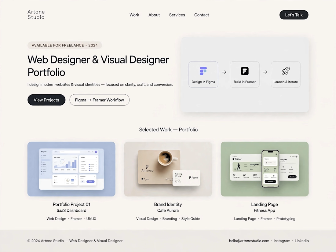
I designed a modern, light-themed portfolio concept with a focus on simplicity, visual consistency, and a smooth user experience. The layout presents a structured design workflow, from initial ideas and interface design to website presentation.
The portfolio includes sample concepts for SaaS dashboards, brand identity, and landing pages, demonstrating how thoughtful layouts and consistent visual styling can help businesses present their services effectively.
Skills: Web Design, Visual Design, UI Design, Landing Page Design
Tools: ChatGPT, Figma, Framer



Not bad but need more improvement

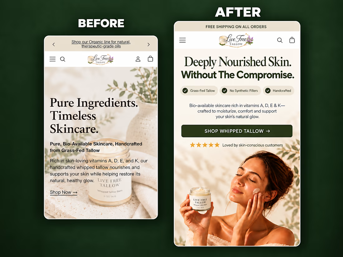
A self-initiated homepage hero redesign concept for Live Free Tallow, created to demonstrate how stronger visual hierarchy and clearer messaging can improve the mobile shopping experience.
The original hero had a compelling product, but the copy competed with the imagery, the product lacked visual prominence, and the next action wasn’t immediately clear.
For the redesign, I focused on:
• A sharper product-in-use lifestyle visual
• A clear, benefit-led headline
• Scannable product differentiators
• Improved spacing and visual hierarchy
• Social proof positioned near the CTA
• A prominent, action-focused shopping button
• Keeping the product and CTA visible above the fold
The result is a cleaner and more premium hero section that helps visitors quickly understand what the product is, why it is different, and where to go next.
I design and build conversion-focused Shopify landing pages, product pages and homepage sections for DTC brands.
Need help improving your store’s customer journey? Let’s work together.



Putting the proof next to the CTA is the right call on mobile. Did you check how much of the hero fits above the fold on a 390px-wide screen once the browser bar is counted? That's usually where the review stars get pushed out.

Designing a fragrance website with 2 sections that feels as premium as the product.
Built a fragrance experience where the product takes center stage.
I wanted the website to feel as refined as the fragrances themselves minimal layout, strong typography, immersive product visuals, and subtle interactions that make exploring each scent feel premium.
The goal wasn’t to fill the page with elements, but to give every product enough space to create its own presence.
Built with Next.js, with a focus on responsive design, smooth interactions, and a polished browsing experience.


The product imagery is doing most of the work here. Did you use art-directed mobile crops, or keep one image with a different object position? That can preserve label detail without loading the full desktop asset.