The network for creativity
Join 1.25M professional creatives like you
Connect with clients, get discovered, and run your business 100% commission-free
Creatives on Contra have earned over $150M and we are just getting started
Back to feedPost

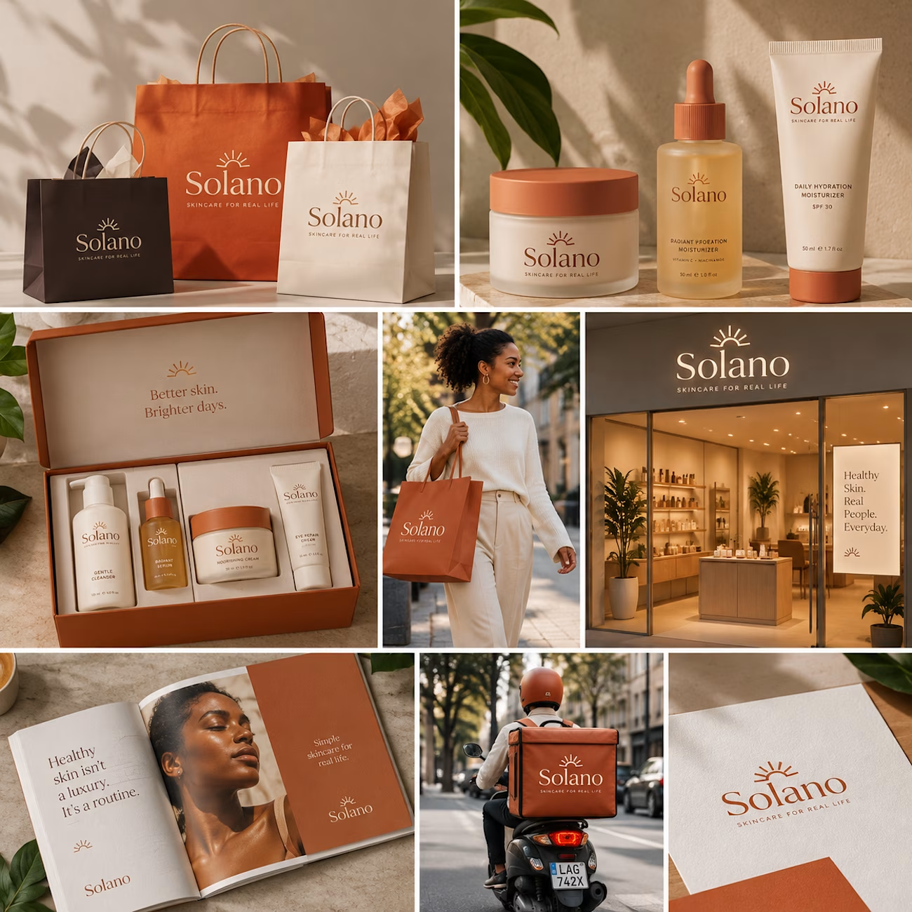
Solano — Skincare Brand Identity & Packaging
For Solano, I wanted to create a skincare brand that felt warm, confident, and contemporary without falling into the usual clinical skincare aesthetic.
The identity was built around a simple sun-inspired symbol, an understated serif wordmark, and a terracotta, cream, and earthy brown palette. From there, I developed the packaging around a consistent visual language across skincare tubes, serum bottles, cream jars, cartons, and a curated gift set.
I also extended the brand beyond the products themselves into shopping bags, tissue, retail displays, editorial pieces, and branded delivery packaging to show how Solano could exist as a complete beauty brand rather than just a collection of products.
The result is a visual identity that feels natural and premium, but still approachable enough for everyday skincare.


The network for creativity
Join 1.25M professional creatives like you
Connect with clients, get discovered, and run your business 100% commission-free
Creatives on Contra have earned over $150M and we are just getting started





Related posts

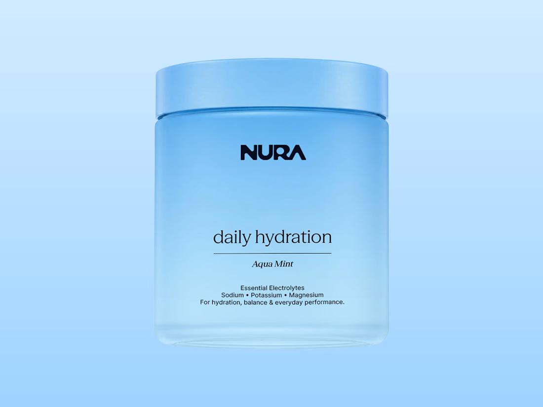
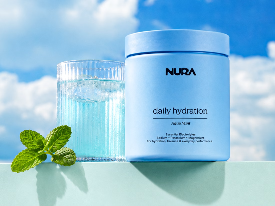
Nura - Hydration Drink Branding and Packaging Design

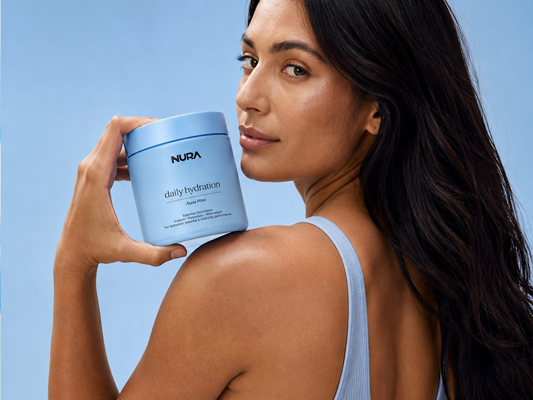

wonderful branding man

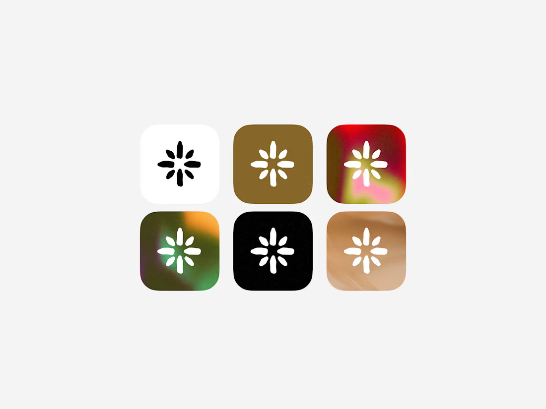

Currently building a new identity for an AI + fintech company in Dubai.
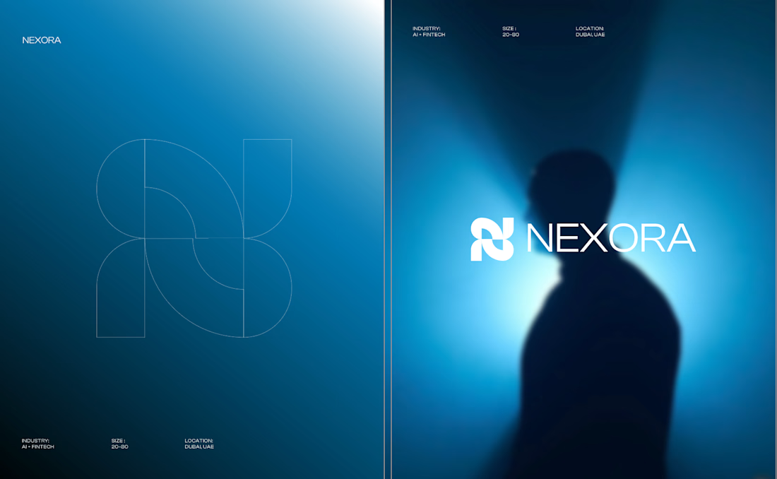
Still early, but this is one of the directions we’ve been exploring for the brand.
The idea was to avoid the usual “AI company” visual language and build something that feels more established, precise, and quietly futuristic.
We’ve been playing with geometry, light, and a much more restrained visual system around the mark.
Still developing this one, so I’m curious:
Would you push this direction further, or keep it this restrained?
Honestly the logo presentation is impressive