The network for creativity
Join 1.25M professional creatives like you
Connect with clients, get discovered, and run your business 100% commission-free
Creatives on Contra have earned over $150M and we are just getting started
Back to feedPost
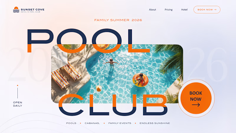
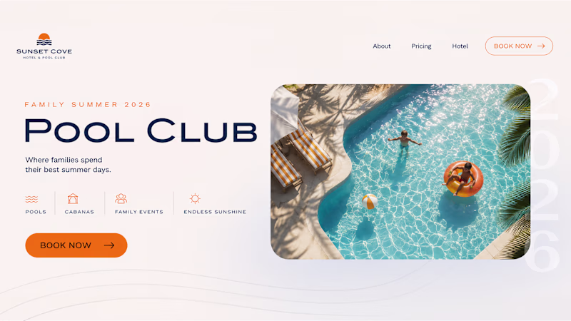
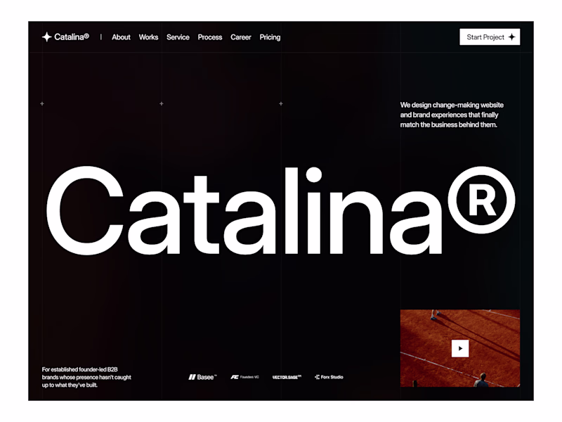
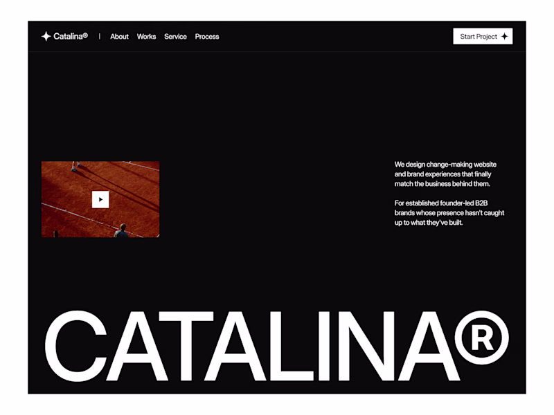
Taste Test
Summer inspired a small design experiment ☀️ We created two hero concepts for the same website. One follows a classic layout. The other takes a more editorial approach with oversized typography and a less conventional composition.
Which direction would you choose for a real project? 1 or 2?
72 voted
62%
45 voted
38%
117 votes
Closed
Definitely 2! The editorial approach with the oversized typography is so much more memorable and premium-feeling. Option 1 is clean but 2 actually makes you feel something when you see it. That's what you want for a Pool Club brand 🏊
Both look excellent but the moment I stumbled upon this post "2" took my attention immediately, in just a blink.
2 definitely, bigger image and clear typography are making the hero section more focused and promising with a clear, rounded CTA. Great work!
As for me, I choose on 2
For me, it's 2, the 1 is pretty basic but the 2 is the design where you have really put some creativity on the table
At a glance I catched the #2 (left)
I will go with 2! It looks cool to me.
I think 2 is better
Definitely go with two of the bolder choices and more unique.
the left option looks great, but I’d change the color of the text where it overlaps with the image
2 looks good
they both amazing but the one on the left is very unique
its looking cool actually very cool and design in creative and awesome
Team 1 😭✨ The second one is visually bold, but the first feels easier to navigate and instantly tells me what the page is about.
Option 2 looks classic but option 1 has more storytelling
direction 2 plsss! screams rebellion and uniqueness. Kudos!
I choose 1😍
They are both beautiful
Both the classic structure and the editorial composition look beautiful.
I love the second one
both look good but there is reason 1 st look more good and attractive cause of that mid image in pool with the half color half diff its look highly attractive to customer
I prefer Slide 1 as it has a cleaner layout and feels less cluttered, making the overall design more visually appealing.
The "for a real project" part is where my vote splits from the feed. Editorial type wins the thumbnail because it stands out while scrolling, but a real hero has about three seconds to answer what this is and why I should care. Concept 2 earns that confidence when the audience...
Option 1 is cleaner!
The network for creativity
Join 1.25M professional creatives like you
Connect with clients, get discovered, and run your business 100% commission-free
Creatives on Contra have earned over $150M and we are just getting started
Related posts
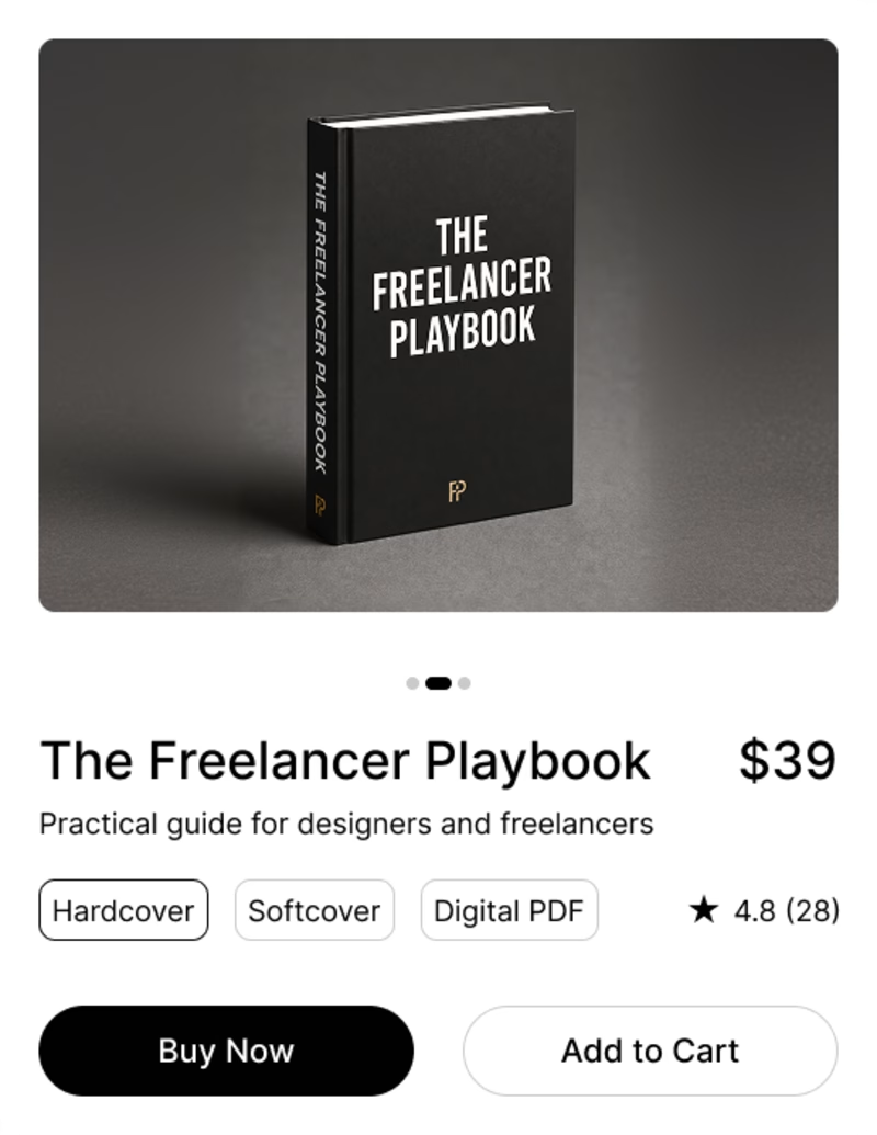
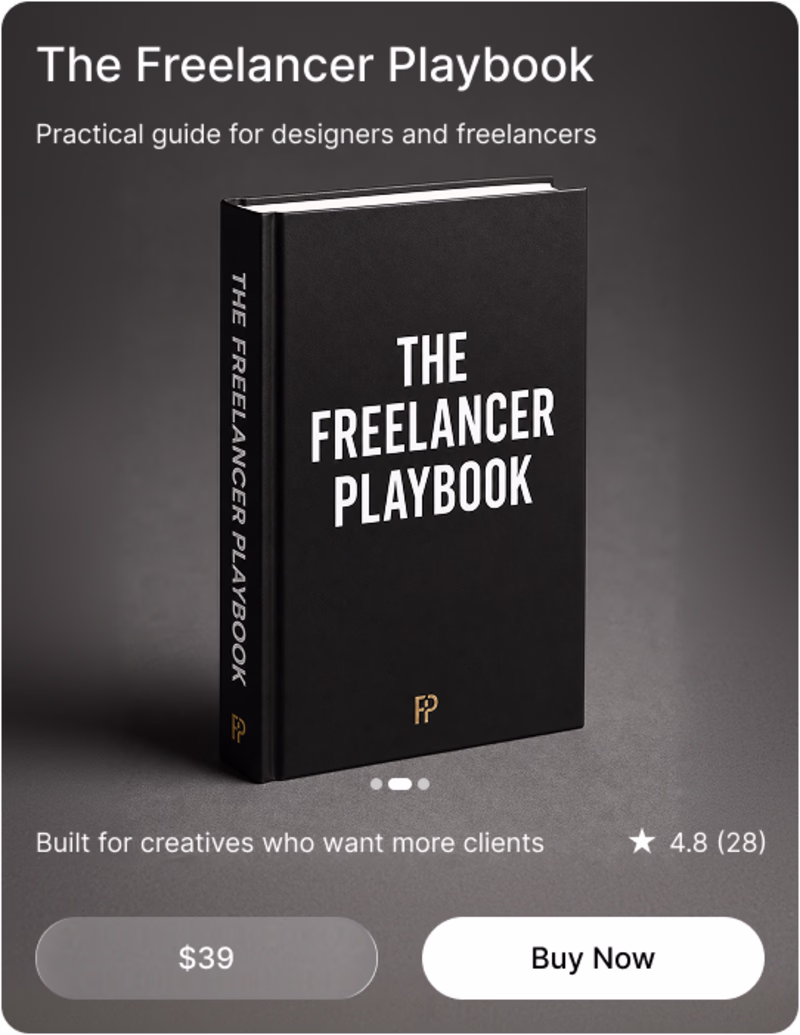
Clean shop
Quick one guys, which takes it for you, while both a similar, the suble difference communicates different feelings. Which is your preference
9 voted
64%
5 voted
36%
14 votes
Closed
As for me.... Am going for option 1
Same layout. Completely different feel.
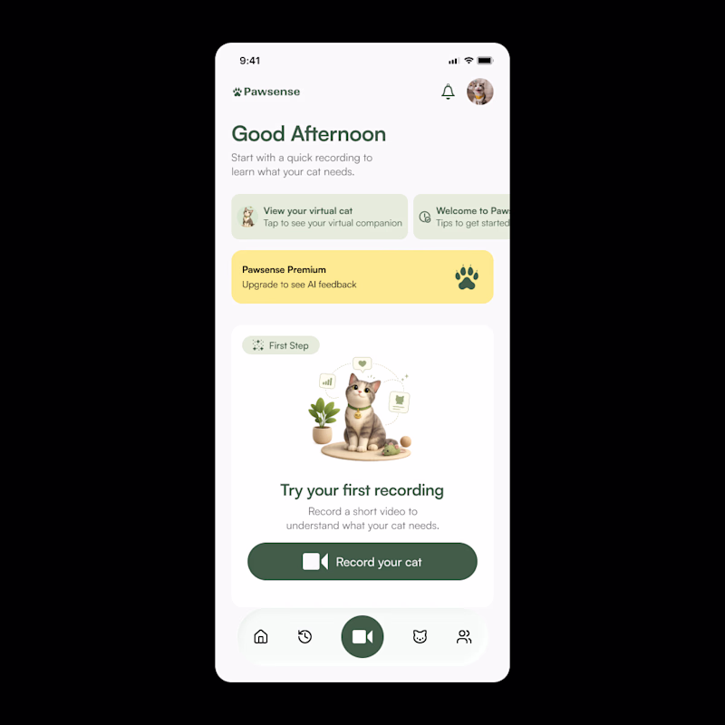
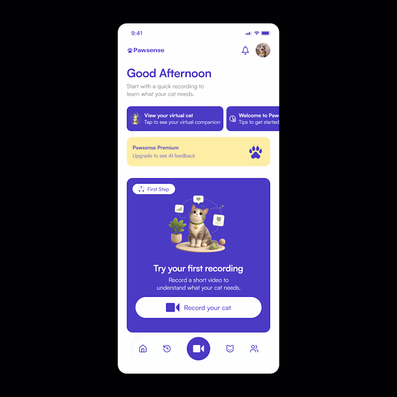
I’m exploring two visual directions for a cat care app concept.
Direction 1 feels softer, calmer, and more natural.
Direction 2 feels bolder, more playful, and more distinctive.
The challenge is finding the right balance between trust, warmth, and personality.
For a pet app, the visual direction matters because it shapes how users feel before they even take action.
Which direction feels stronger at first glance?
1 = softer / natural
2 = bolder / more playful
16 voted
84%
3 voted
16%
19 votes
Closed
Softer and natural
Trending
Claude
Claude has entered the design space. How are you using Claude Design?
Contra University
Learn from expert creatives how to earn more using next-gen AI tools.
MagicPath
The canvas is infinite, and exploration is becoming the workflow. How are you using MagicPath?
creativeaiflow
Creative AI workflows are evolving. What tools do you use, and what are their strengths and weaknesses?
freelancerlife
Freelancer life is wins, pivots, and everything in between. What’s yours right now?