The network for creativity
Join 1.25M professional creatives like you
Connect with clients, get discovered, and run your business 100% commission-free
Creatives on Contra have earned over $150M and we are just getting started
Back to feedPost

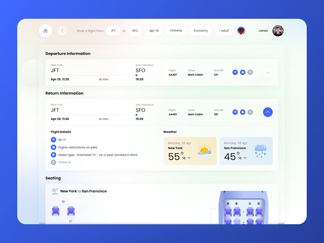
Flight booking detail screen.
Most booking UIs are built around the transaction - pick, pay, done. This one is built around the questions people actually have open in another tab while they book.
Destination weather sits inside the flight card, because the moment you're choosing a date is the cheapest possible moment to answer "what do I pack." Seat pitch is drawn in inches against an illustrated seat instead of buried in a spec footnote, since legroom is the real anxiety in economy. Amenities appear twice at two densities - icons when the card is collapsed, labelled rows when it's open.
And the search parameters stay as editable chips in the top bar, so changing your mind never means going back a step.


The network for creativity
Join 1.25M professional creatives like you
Connect with clients, get discovered, and run your business 100% commission-free
Creatives on Contra have earned over $150M and we are just getting started


Trending
retrofuturism
Share your favorite designs from the past exploring the distant future. Or your own take on the aesthetic 🚀
halftone
Dots. Texture. Grain. Let's see your designs using the halftone technique.

Midjourney
Creatives are showing off what they're making with Midjourney.
colorgrade
Video editors sound off: How do you enhance the mood of your video in color grading?
Related posts


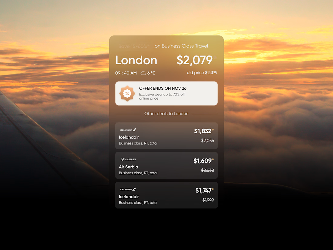
VIP Skies — Business Class Deals
A premium flight deals interface designed to make exclusive business class offers feel clear, effortless, and desirable.


One of the more fun websites we’ve built at Formeta.studio
Dulce Oro started with a brand we built from the ground up, and the website had to carry that same thinking into every interaction.
We built the site architecture around the brand story, wrote the entire website, created a scalable CMS for their US store locations, built a custom age gate, integrated accessibility support, and connected the shop directly to purchasing.
There’s a lot happening underneath what looks like a fairly simple spirits website.
And honestly, that’s our favourite kind of work.
The finished site feels calm and considered, but there’s a proper system holding it all together.
Here’s a little walkthrough of what we built ↓


Fantastic!!


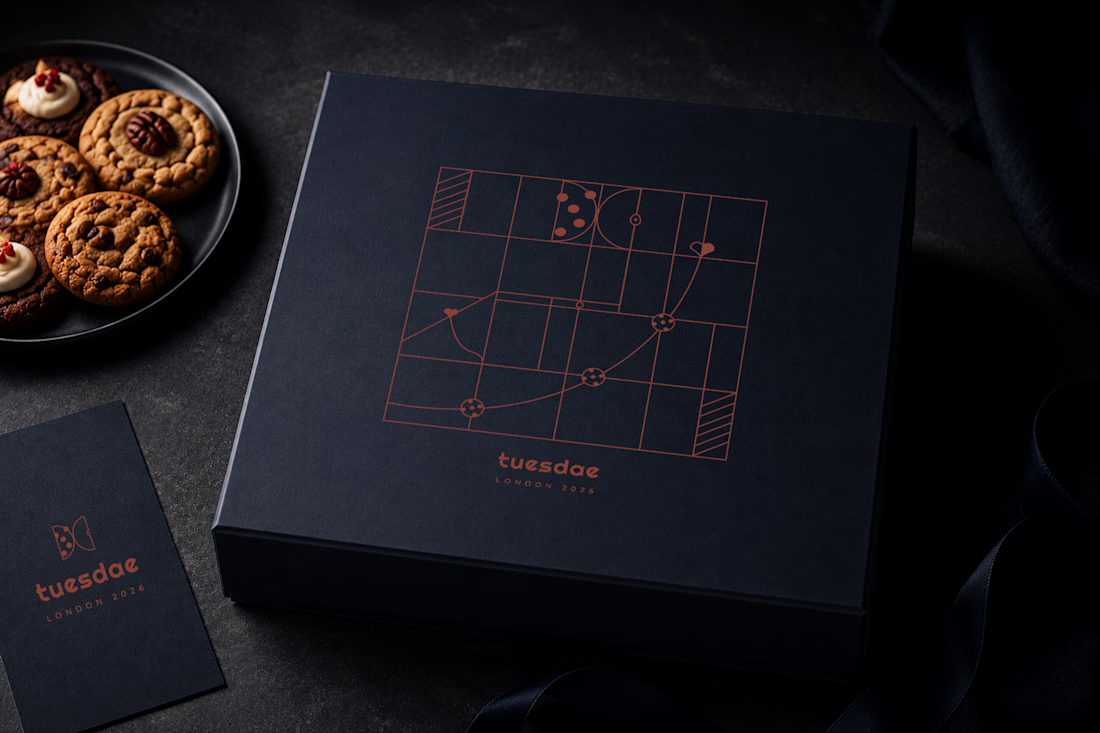

That makes sense, letting the system lead rather than starting from the logo usually reads as less forced. Translating a flat grid piece onto a box with actual folds and edges seems like it'd behave differently than on paper, did the pattern need much adjusting once it wrapped around the corners?